pamcakes
pamcakespics
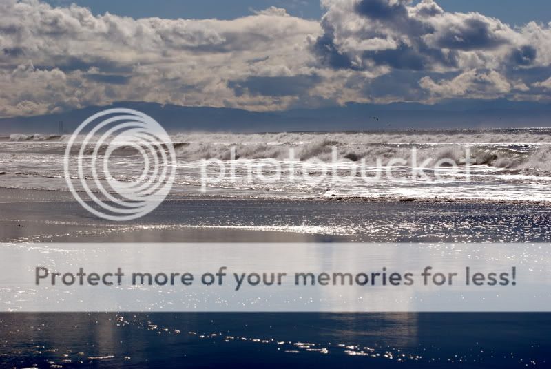
shot yesterday at the beach with my nikon D80
Follow along with the video below to see how to install our site as a web app on your home screen.

Note: This feature currently requires accessing the site using the built-in Safari browser.
I'd crop out the dark part of the reflection (it would put the horizon in the middle tho) and clone the tower out.
Looks nice.
Can I try an edit?
 I don't get to the ocean too much anymore and am looking forward to my trip in August (delayed from next week).
I hope this turned out cool for you. I softened the sky a bit (and lost the mountain) and sharpened the waves. I took out the tower and cropped the bottom (the reflection looked, maybe urban or something to me).
I enjoyed looking at it while I was editing.
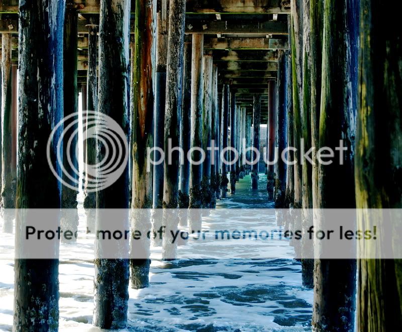
I'll take a look at the pier shot and get back. Thanks for letting me work on your shot.
) and think I know where you were going with it, but it just seemed like too much of a flash.
I so LIKE the reflection and think it IS the foreground element, a good one even!
The added sharpness in your edition, Walter, sure helps a lot, though, too! The colours are more natural, too, now.
Even if the camera produced such a blue original, that does not mean the camera did it RIGHT, it does what was programmed into it by the camera builders, so someone has already put "a hand" in the way your photo came out, so if that is a tad unnatural, there is pp-software to make it more right again.
And yes, the two towers on the left are a bit distracting, but the birds are not, I say.
Glad you like it. --I miss the ocean!
This next shot might not be so good,... I lost a lot of the good things you had in it, but I tried to correct two things.
1), It looked a bit tilted, so I moved it ccw about 1.7.
2), I like saturation, but this seemed to have a bit too much even for me. I tend to maybe over do it too, so I brought this down a bit. That and it had too much blue (IMO). I've been under a few piers in my day (
I've been wanting to experiment with dodge and burn so I figure I'm far more reckless with other people's stuff and had at it.
Hope it's not too offensive.

![[No title]](/data/xfmg/thumbnail/40/40310-01bec1b9b7918522bf21a09cf75c5266.jpg?1619739414)
![[No title]](/data/xfmg/thumbnail/40/40311-715dda8167abb793178d6abf7e8136fe.jpg?1619739414)
![[No title]](/data/xfmg/thumbnail/41/41493-60071420f928565170996b4edc3de2f0.jpg?1619739820)

![[No title]](/data/xfmg/thumbnail/40/40312-7470c3c8f9e3a40e6b44c423096f188d.jpg?1619739414)

![[No title]](/data/xfmg/thumbnail/39/39439-d0a6beaaf39993860b74ccbd81fdd122.jpg?1619739032)