How tough are ya'?

25zgs43.jpg

egqqtk.jpg

2rdj4ue.jpg

1hdo91.jpg


Thanks!
Btw on the first one, I made a clone stamp mistake on the left side, and I am planning on fixing it soon.
 
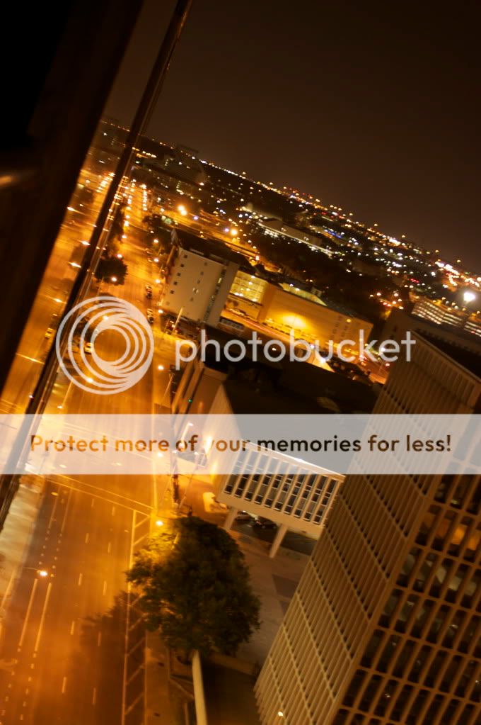
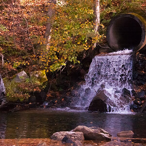
Put one image up and maybe manaheim will feel the compunction to chime in. I'll note something though: Your first image is cool, but it has noise. Get rid of the noise. All of it. It very much detracts from the image.
 
IMG_0142_2.jpg


Go for it.

Hm... technically this seems fine enough. A little blurry, perhaps... I'm guessing you weren't using a tripod, which you should do if possible, but it looks like this angle might not be best for that.

Also on night shots...

1. Manual focus. (often to infinity, but depends on lens and distance from subject)
2. Use mirror lockup if available.
3. Use somewhere around F8-F11 to create "star effects" on the lights. (look at the night shots on my website and you'll see what I mean)

The problem with this shot, in my opinion, is that it's just pretty dull.

1. The buildings themselves aren't that interesting or varied.
2. There is essentially only one color of light. (you may want to pull the yellow out, btw...)
3. The horizon is obviously the outskirts of the city, so the tallest buildings are wherever you are and then they flatten, so it gets pretty dull.
4. The sky is dead (not unusual in night shots, but made worse by other elements)
5. No traffic (also not necessarily unusual, but some traffic might have helped where there was nothing else)

That being said, I think you exposed this reasonably well which is often a problem people struggle with. I can see detail in buildings and such and that is good. Find a more interesting subject and make sure your focus is on and I think you'll be in good shape.
 
And yes, I would pick one image of the set. (snow)

That being said, a few comments...

1. Neat image, but seems overly centered and it makes a pretty powerful image kinda dull. Also oversaturated, IMO.
2. Not bad but I think you may have missed the focus and the oversaturation doesn't help. I also don't personally care for the orange, but that's a personal thing.
3. Again, oversaturated for my tastes. The sky is very pretty, but I don't see a real subject here. The shack thing sorta, maybe, but not really... there's just nothing to really focus on.
4. Best shot of the bunch I think. Needs some more contrast and may be a bit washed out, but the expression is great and the angle is kinda "fun". The image made me smile, so I got fun and happiness from it. I might crop in a bit, but I think it might be fine as is. Not sure I feel about her head being cropped. (part of why I think maybe you should push the crop a bit more)
 
P1000948.JPG


P1000181.JPG


If you're still bored (and in the critique mode), I'd appreciate any comments on these 2 pics.
Some other pics of mine can be found here:
Picasa Web Albums - Na22ash - Croatia - Fav...

ps. I'm a beginner (very) and this is my first post on TPF or any photography forum... so bare with me :)

cheers..
Rami
 
407_edited-1copy.jpg


how bout this one?

Whoops, I see I'm overdue on a few here.

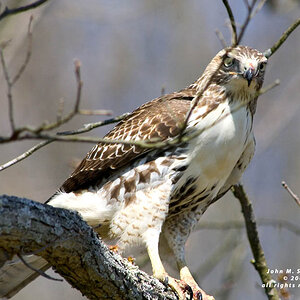
Well, what's interesting here is you have a very majestic bird taken in a very dark and disturbing way. That's an interesting perspective.

However, the image is a bit soft, and (probably obviously) dark... it appears more than you underexposed it than you chose to go dark with it. In either case, it makes his midsection (all except his head and feet) very very dark and thus loses all detail.

He's also at a bit of an odd stance, and while he takes up a lot of the frame, he almost takes up too much... with him more in the light, you could have had a more typical majestic eagle shot, perhaps. With him more in dark but set against a backdrop of some kind (think trees and all you see is darkness, a bit of tree, and an ominous head peeking out), you might have been able to play some sort of looming doom angle.
 
AveryIsl024a.jpg


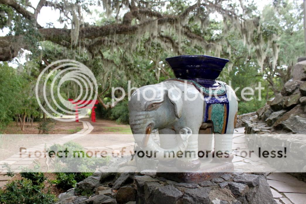
What was i trying for? Idunno. The elephant is a little too centered I guess. Oops, that's your job isn't it?

hehe, yeah maybe a bit... though it's fine enough I think. It actually looks like some of the background here was washed out a bit... was it brighter in the background than on the subject?

Compositionally, it's probably fine. You could spread apart the red arch and the elephant a bit more in the frame, perhaps... possibly turn a bit more to take more advantage of the path to carry your eye through the frame, but honestly in the end it's just not an exciting subject. Pictures of fairly static objects like statues tend to be hard to make interesting unless you do weird things with angles, lighting, perspective, or juxtaposition against other items in frame. (such as a statue that points to the heavens surrounded by very syemmetrical ceiling architecture or something)
 
P1000181.JPG


If you're still bored (and in the critique mode), I'd appreciate any comments on these 2 pics.
Some other pics of mine can be found here:
Picasa Web Albums - Na22ash - Croatia - Fav...

ps. I'm a beginner (very) and this is my first post on TPF or any photography forum... so bare with me :)

cheers..
Rami

Welcome to the forum.

I'm not much of a macro photog and I HATE pictures of bugs, so let me just toss that in as a warning. :)

Generally with close up shots of bugs you're looking for some serious detail. I think the subject here is probably interesting... capturing ants at what they do. I might have tried shooting it from the right and getting in closer, but I also suspect this wasn't a macro lens (50mm perhaps?) (I can't check from here) so you may not have been able to get closer.

I actually really like the second one. The colors are beautiful, the silohettes are very pretty and not overdone (I can still see some detail in the objects), the crop is really nice and the slope of the land curving down and into the left hand of the frame is very appealing. I might try boosting the saturation a little bit to make it pop a bit more (esp. if I were to print it), but I think it's a very appealing image as it is.

EDIT: BTW, it looks like you may have a lot of sensor dust... lots of little dots on that second image are visible. You should get that cleaned.
 

Most reactions

New Topics

Back
Top