Navigation
Install the app
How to install the app on iOS
Follow along with the video below to see how to install our site as a web app on your home screen.

Note: This feature currently requires accessing the site using the built-in Safari browser.
More options
You are using an out of date browser. It may not display this or other websites correctly.
You should upgrade or use an alternative browser.
You should upgrade or use an alternative browser.
i just started so be gentle, lol
- Thread starter KristinA
- Start date


KristinA
TPF Noob!
- Joined
- May 12, 2010
- Messages
- 10
- Reaction score
- 0
- Location
- Germany
- Can others edit my Photos
- Photos OK to edit
I really like the composition of the shots,
PP is not bad but i dont like the tones and colors you went for.
overall they are good picture!
this may sound dumb, but I gotta ask, what is PP???
Thanks for the input, I was going for a rugged look, something that would go in a western type room... that's the reason i chose the colors
bigtwinky
No longer a newbie, moving up!
- Joined
- Oct 6, 2008
- Messages
- 4,821
- Reaction score
- 286
- Location
- Montreal
- Website
- www.pierrebphoto.com
- Can others edit my Photos
- Photos NOT OK to edit
Why would you want people to be gentle? Are you looking for "great job, I like that"? Alot of people do that here.
If you want to learn, you should seek harsh but constructive critisism. I've had some images torn apart on some websites and while its a huge ego hit, they are the ones that help me the most.
")
If you want to learn, you should seek harsh but constructive critisism. I've had some images torn apart on some websites and while its a huge ego hit, they are the ones that help me the most.
bigtwinky
No longer a newbie, moving up!
- Joined
- Oct 6, 2008
- Messages
- 4,821
- Reaction score
- 286
- Location
- Montreal
- Website
- www.pierrebphoto.com
- Can others edit my Photos
- Photos NOT OK to edit
this may sound dumb, but I gotta ask, what is PP???
PP = Post Processing
Any type of modification done after the image has been taken.
SrBiscuit
TPF Noob!
- Joined
- Apr 22, 2008
- Messages
- 2,716
- Reaction score
- 44
- Location
- NH
- Can others edit my Photos
- Photos OK to edit
Why would you want people to be gentle? Are you looking for "great job, I like that"? Alot of people do that here.
If you want to learn, you should seek harsh but constructive critisism. I've had some images torn apart on some websites and while its a huge ego hit, they are the ones that help me the most.
good call.
plus, this is the pro gallery.

im diggin the first one, as a smaller version.
when i expand to see the big version, i see evidence of very poor PP, and what appears to be some pretty obvious CA.
robertwsimpson
No longer a newbie, moving up!
- Joined
- Aug 3, 2009
- Messages
- 2,471
- Reaction score
- 30
- Location
- West Palm Beach, Fl
- Website
- www.flickr.com
- Can others edit my Photos
- Photos NOT OK to edit
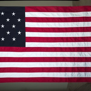
Is the hat the main subject of the first 2 photos? That's all I can see in them.
If I didn't know any better, I'd say the first one is a composite image. There's some really sloppy tearing and jagged pixels surrounding the man. The background looks like it's a lower res image as well with some jpeg compression, that isn't in the foreground. I dunno, it just looks weird to me.
I really like the composition, but the colors and post work you've done, really ruins it for me.
I really like the composition, but the colors and post work you've done, really ruins it for me.
Sbuxo
TPF Noob!
- Joined
- Aug 29, 2008
- Messages
- 973
- Reaction score
- 6
- Location
- somewhere :)
- Website
- www.instagram.com
- Can others edit my Photos
- Photos NOT OK to edit
If you can't take real critiques, then photography or any type of art in that case, isn't for you. Especially if you want to be a 'professional'. How will you grow if you can't take constructive criticism? If you're taking bad photos (it happens...) or making mistakes, you'd want them pointed out so you can learn and become a better artist. Plus, you can get so many pointers here, so don't say 'be gentle', say 'gimme whatchu got!" take whatever is thrown at you and use it to your advantage. This doesn't mean you have to agree with what everyone says, sometimes others see what your eyes miss, and you'll see that some things will be said repeatedly, and chances are, they're right.
#1: way too much contrast, look at the hat, it doesn't look too bright to you? there's no detail! The shine on the horses is disgusting..don't go overboard with contrast. It can help, but too much will ruin a photo! When increasing contrast: the brights get brighter and the darks get darker. Do you see the shirt? The shadows are engulfing it, still, yes, we can see the wrinkles but it is obvious that it's darker than it should be.
#2: Again, too much contrast. The brim (?) of the hat is way too white; hindering detail. The highlights on the shirt are also too bright, control your PP!
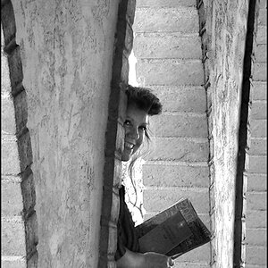
#3: Looks like you focused on his lips. There's a major hot-spot on his nose, but surprisingly, excessive contrast is not an issue in this one. In fact, it's quite the opposite, it's actually, really flat. This means it's really gray (brown in this case) and lacks contrast, nothing pops. Everything almost blends in with eachother. Except for the horrible hot spot. -_- We know that the hat is white, so it should be the lightest thing in the photo..which it is not right now.
Overall: I do not like the treatment you gave the photos. I've never been a fan of sepia, I think B&W would have suited them better and added more personality. Although the compositions aren't horrible, you want to watch out for amputation and leaving things 'unfinished'. This means paying attention to what you see in the viewfinder and looking to see if you'll be cutting anything off and/or including unnecessary distractions before you click the shutter. Take more than one frame of the same pose/angle, but experiment with new ones as well!
**Woo, what a long one! I understand how others' opinions can be intimidating, but you have to learn to embrace it (most of the time!) :taped sh:
#1: way too much contrast, look at the hat, it doesn't look too bright to you? there's no detail! The shine on the horses is disgusting..don't go overboard with contrast. It can help, but too much will ruin a photo! When increasing contrast: the brights get brighter and the darks get darker. Do you see the shirt? The shadows are engulfing it, still, yes, we can see the wrinkles but it is obvious that it's darker than it should be.
#2: Again, too much contrast. The brim (?) of the hat is way too white; hindering detail. The highlights on the shirt are also too bright, control your PP!
#3: Looks like you focused on his lips. There's a major hot-spot on his nose, but surprisingly, excessive contrast is not an issue in this one. In fact, it's quite the opposite, it's actually, really flat. This means it's really gray (brown in this case) and lacks contrast, nothing pops. Everything almost blends in with eachother. Except for the horrible hot spot. -_- We know that the hat is white, so it should be the lightest thing in the photo..which it is not right now.
Overall: I do not like the treatment you gave the photos. I've never been a fan of sepia, I think B&W would have suited them better and added more personality. Although the compositions aren't horrible, you want to watch out for amputation and leaving things 'unfinished'. This means paying attention to what you see in the viewfinder and looking to see if you'll be cutting anything off and/or including unnecessary distractions before you click the shutter. Take more than one frame of the same pose/angle, but experiment with new ones as well!
**Woo, what a long one! I understand how others' opinions can be intimidating, but you have to learn to embrace it (most of the time!) :taped sh:
Last edited:
Jeff Colburn
TPF Noob!
- Joined
- Aug 6, 2007
- Messages
- 300
- Reaction score
- 0
- Location
- Sedona, AZ
- Website
- www.thecreativescorner.com
- Can others edit my Photos
- Photos NOT OK to edit
Overall, I like the shots, but there are a few things I would change.
Image 1 - Crop more of the hat, or none at all. When you get something (arm, face, etc.) close to the edge of a photo, it causes tension. Which is fine if that's what you want, but I would prefer to see the hat uncropped, so the sky wouldn't be bisected. And I would like to see a little more of his left arm.
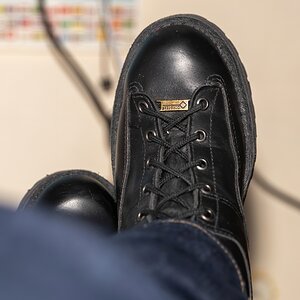
Image 2 - Looks fine, but I would like to see a little more detail in the white areas.
Image 3 - Crop out the ear as it competes with the face for attention, and make the tones a little less flat by kicking up the contrast a little.
Keep up the good work.
Have Fun,
Jeff
Image 1 - Crop more of the hat, or none at all. When you get something (arm, face, etc.) close to the edge of a photo, it causes tension. Which is fine if that's what you want, but I would prefer to see the hat uncropped, so the sky wouldn't be bisected. And I would like to see a little more of his left arm.
Image 2 - Looks fine, but I would like to see a little more detail in the white areas.
Image 3 - Crop out the ear as it competes with the face for attention, and make the tones a little less flat by kicking up the contrast a little.
Keep up the good work.
Have Fun,
Jeff
gsgary
Been spending a lot of time on here!
- Joined
- Oct 31, 2008
- Messages
- 16,143
- Reaction score
- 3,002
- Location
- Chesterfield UK
- Website
- www.gsgary.smugmug.com
- Can others edit my Photos
- Photos OK to edit
What are the first 2 shots for ? A hat manufacturer ?
- Joined
- Apr 9, 2009
- Messages
- 41,401
- Reaction score
- 5,706
- Location
- Iowa
- Website
- kharrodphotography.blogspot.com
- Can others edit my Photos
- Photos OK to edit
i just started so be gentle, lol
As a professional?
Please resize huge photos before you post them;
http://www.thephotoforum.com/forum/...forum-functions-pictoral-guide-using-tpf.html
TPF asks that you resize to no longer than 800 pixels on the long side, though many other forums are now going with 1028 pixels on the long side as being acceptable since more and more people have larger monitors.
travistank
TPF Noob!
- Joined
- May 14, 2010
- Messages
- 34
- Reaction score
- 0
- Location
- Austin, Texas
- Can others edit my Photos
- Photos NOT OK to edit
My problem with the first photo is that everything is sharp, I like some depth of field but thats just my opinion, hope it helps.
Most reactions
-
 416
416 -
 313
313 -
 282
282 -
 271
271 -
 264
264 -
 230
230 -
 196
196 -
 182
182 -
 165
165 -
 156
156 -
 142
142 -
 139
139 -
 135
135 -
 122
122 -
 104
104
Similar threads
- Replies
- 4
- Views
- 94
- Replies
- 2
- Views
- 120
![[No title]](/data/xfmg/thumbnail/40/40308-f92e28f094216c151f3ad1fd7453c99b.jpg?1619739413)

![[No title]](/data/xfmg/thumbnail/33/33029-f4556b4c89cecbad12ebe6b782a51ef5.jpg?1619735843)

![[No title]](/data/xfmg/thumbnail/40/40311-715dda8167abb793178d6abf7e8136fe.jpg?1619739414)
