I know light trails are overplayed, but...

Jbs

TPF Noob!
Joined
Nov 18, 2007
Messages
215
Reaction score
0
Location
Santa Monica, CA
Website
www.jc-detail.com
Can others edit my Photos
Photos OK to edit
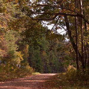
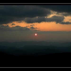
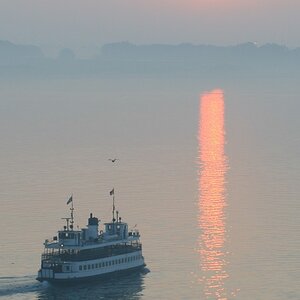
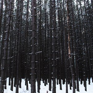
i thought these were cool anyway :greenpbl:

img0489sv4.png


img0490jk2.png


c&c please! :)
 
The bottom one is suffereing from camera shake, which makes it a little less "cool" in my estimation, more so since the shake looks unintentional.

The fog adds nicely ... and after I thought "Britian" when I saw your other post, I am now beginning to wonder :scratch: ... maybe ... southern hemisphere? The street sign does not look British to me ... and the Australian ones are like that... :scratch: ... or are they not? It's been too long since I was there for only 14 days ... 11 years ... tell me. Will you?

Oh, and welcome to ThePhotoForum! :D
 
haha yea i don't have a tripod so i set these on my car (while the engine was running so i guess there was shake, although if you look at the dividers in the road, they are in focus...)

Haha, this was taken in malibu (these are of PCH), along with my other shots; i just realized i need to put my location!
 
Australian headlights would be on the right hand side, and we also don't have well to my knowledge, in this state, have Yellow lines in the middle of the road, we've all white lines.

I haven't a problem with the first shot. I think its good. Second is out of focus, as was mentioned. The first is good, for I love the number of colours in the shot but its not going over the top. These colours are surrounded by great darkness. I think it looks great. I'm not sure as I've only taken a few night shots, but taking shots in complete dark, I find any still lights bulb out and flare. I'm not sure If you can stop this but its a little off putting. I'd probably try this under better light maybe full moon, or in twilight.
 
I also like the first one, both compositionally and colour wise and the ocean fog adds another dimension....second one doesn't work on a number of levels.
 
I think the first would benefit from a crop. I feel there is too much empty space above the light trails. I'd say cut off 1/3 of the pic length-wise. Just my thoughts.
 

Most reactions

New Topics

Back
Top