C&C per req:
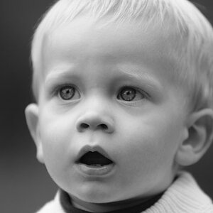
1, 2: The skin tones are a little warm for my taste, and the very busy background is rather distracting, however the main issue is that she appears to be forcing her smile. I think for this subject, something to distract her just a little so that she isn't looking directly into the lens.
3. Much nicer, but crop the RH side to move her out of the centre.
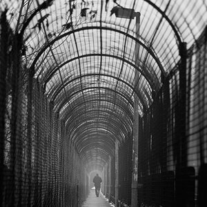
4. Very nice image, but too much else going on; the very busy background is a major detractor; in this context, the sign doesn't really work, but if it's part of something bigger, it might.
Just my $00.02 worth - your milage may vary.
~John
I agree with tirediron about skin tones on #1, although I LOVE the color you're getting on her eyes. If I look at by itself without having #2 to compare it to, I really don't mind the color cast.
Absolutely love #4!!! I would love a little sign like that!
Love her eyes! I agree that in #1 and 2 that the smile looks very forced and like you were saying "SAY CHEESE!!!"
#3 is the best, IMO
#4 would be a lot better if the background was simple, and the white thing hanging down in the middle of the sign wasn't there. I think maybe it being in color would help...I dont know though. It just seems like your eyes don't know where to go first when you look at it, and you have to make an extra effort to read the sign.
Thank you all for the real responses..just what I needed..I kinda weeded out the ones I really wanted hard hitting on and left out the ones I thought would get good feedback ... I need to snap & learn and you guys help me do that!!


")


![[No title]](/data/xfmg/thumbnail/34/34347-8b81549fefc38aca163688d07a9f5ced.jpg?1619736384)

![[No title]](/data/xfmg/thumbnail/34/34591-00eecceb873550182f83f33a45a9460c.jpg?1619736565)

![[No title]](/data/xfmg/thumbnail/34/34592-a6ba64e21d4257d5df6832c1bc9691f1.jpg?1619736566)