I need your opinion: which one looks correct?

Harpper

TPF Noob!
Joined
Feb 4, 2004
Messages
810
Reaction score
0
Location
USA
I normally don't browse this forum on a PC since I primarily use my Mac, but today I got a chance to see my pictures for the first time on a PC. Wow, was I amazed at the difference. I then checked my pictures with a different PC and noticed that it was closer to what I saw on my Mac but it was still not the same.

I knew that Macs and PCs don't display the exact same image but I've never compared them head to head before. The problem I saw was the gamma brightness was completely different. This leads to improper exposure corrections.

Macs have brighter screens than the Windows default. If you have Photoshop you can see the difference yourself. Just choose "save for the web" option and click the right arrow at the top of the window that comes up. It's just above the image display window on the right side. Anyway, select "standard windows color" and then select "standard macintosh color" to see the difference. The Mac version is brighter.

This will also help some of you solve the issue of brightness difference when using the save for web feature.

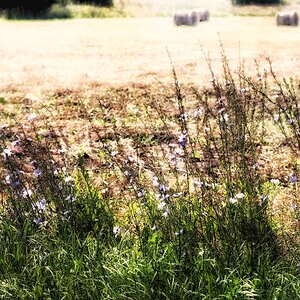
I've been calibrating my monitor to resemble the average PC display profile, but the problem is that every monitor displays images a little different especially if its not calibrated. Some differences are more noticeable than others. Anyway with all that said, can you please look at the pictures below and tell me which one displays a better exposed picture on your monitor? Thanks.


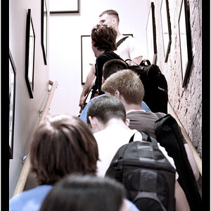
original picture I posted:
sunshine1.jpg


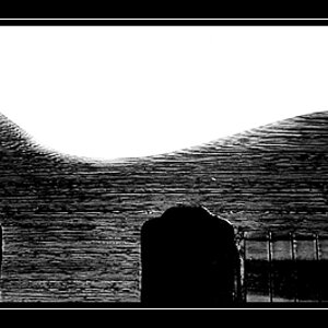
I believe this version below is closer to a PC monitor. The picture above looked more like this one on my Mac before I calibrated it, but then again it looks correct on my monitor and possibly not on yours:
sunshine1a.jpg
 
One of the problems is all macintosh screens are pretty bright. Most PC monitors are cheap POS and go dark after a month of use.

When I bought a nice monitor the difference is exactly the way you noticed going from pc to mac. It's night and day (literally)

Edit to say #1 looks better. #2 has blown out highlights.
 
voodoocat said:
When I bought a nice monitor the difference is exactly the way you noticed going from pc to mac. It's night and day (literally)
Yes, that's also another factor. The problem isn't too bad when I look at it from a PC hooked up to a good monitor but there is still the difference in default brightness as you pointed out.

Thanks for the input you two. I guess I'm just going to have to start comparing my monitor to more PC monitors to see if they are close. I don't think I have the calibration quite right.
 
Harpper- you can go to System Prefs|ColorSync and change your Gamma to PC. It helps quite a bit.

Unfortunately personal preferences in monitor adjustment will subvert most of what you do, so it's all a crap shoot anyway. :wink:
 
photobug said:
Harpper- you can go to System Prefs|ColorSync and change your Gamma to PC. It helps quite a bit.
I just found out about that but thanks for mentioning it. It does help. I think I calibrated my monitor too dark on the first try because the second does look overexposed now. My original Mac calibration was somewhere in between these two base on my new calibration.

photobug said:
Unfortunately personal preferences in monitor adjustment will subvert most of what you do, so it's all a crap shoot anyway. :wink:
Yeah, you are right about that. I was only hoping to get the average PC calibration but it's probably not worth perfecting. The PC gamma setting you mention does make my monitor look more PC like. I guess that will just have to do.
 
If this is enough of a concern to you, you may want to think about investing in one of these: http://www.monacosys.com/ - it's about $300. Systems like this one are used to calibrate your monitor to get it as close to a print as possible. This is so you can do color-correction on your digital images and be confident that your printshop will give you the same results. If you used it on all your computers, they should at least be close to each other.

Fact of the matter is, you can only be picky about your own equipment that you're viewing the pix on. Not everybody that views your work on the web is gonna have a Mac or a PC. All you can really hope for is that whoever is taking the time to view your work has the cash for decent equipment.

Of the two photos you posted, the top one brings out the clouds and contrasts with the sky more. The second is nearly washed out in comparison. I'm at work on a Compaq S700 monitor. Lord knows how old it is...
 
I was eventually going to get a calibrating tool when I do more print work, but currently my reason for calibration was for posting pictures on this forum and on the internet in general. I mean it's discouraging for me to take all the time and effort to fix a picture and have it look good on my monitor but only to find out that it looks horrible on someone else's.

Anyway like photobug said, people will have their own personal preferences in monitor adjustment or just leave their monitors on default so the only thing I can do is make it look good on my monitor and my own print work but thanks for the link.
 
I have my mac calibrated to Imac and PC standard and s switched between them. I looked at your photos with this comparison on a 20" cinema display, the difference is not great, similar hues saturation etc. but brighter more vibrant on the Imac calibration. I looked at my web site photos on many different PC based monitors and the difference are there and they depend on many hardware variables, they all look good to very good none as good as on my Imac. I stopped worrying about it.
 
Harpper said:
I mean it's discouraging for me to take all the time and effort to fix a picture and have it look good on my monitor but only to find out that it looks horrible on someone else's.

Yeah it is frustrating, since you can never know what people are seeing. I get many comments about my photos being dark, but I see them just fine. There's only so much you can do... and only so many times you can say "then fix your monitor! :x " :p :wink:
 
I like the first one better a/c the clouds have more presence and depth. I'm wondering how I would like the prints if the foreground was opened up and allowed detail.
 

Most reactions

Back
Top