I would love your C&C - street/portrait not sure how to label it

syphlix

TPF Noob!
Joined
Jul 23, 2009
Messages
687
Reaction score
1
Location
NYC
Website
www.gregorytran.com
Can others edit my Photos
Photos OK to edit
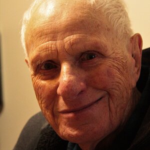
Saw this guy making something today... stopped to talk to him... ended up talking for a long time and I took a cpl photos...

What you guys think? What could I have done differently? Don't be shy just tell me anything i can do better!

One thing i noticed when i looked at the shots later is i wish i didn't have the split background between the black and the granite, but it's kinda just where i was sitting...

Lighting is all natural lighting on an overcast rainy day...

Also, do you like the format of #2 or #3 better?

Thanks!

#1

#2

#3
 
the first and second ones are really nice, but the third seems a bit off, probably becuase you cut off hte hair at the top, very nice pictures anyway, what was he making anyway? from what i can see hes either whiddling or carving something
 
this is the uncropped version... i didn't really like the way i framed it so i messed w/ the crop a bit...

img4241d.jpg
 
First of all, great job of making him feel comfortable... eventhough he knew you were photographing him, he still looks relaxed.
Now for the criticism:
#1
I like the general elements of your composition, but I think that the framing could have been better, for example don't cut off his head (or his feet).
#2
the image does not look sharp and I think that if you were level with his head it would make for a more interesting portrait.
#3
you cut off his head.. and if you were going for a face shot, I would have gone for a tighter face shot.

Hope it helps :)
 
I like #1 the best too, but a little to tight as previously stated. To see his entire body would have been more appealing to me. Still an excellent photo
 
People on here are VERY picky if you cut of body parts...so I've learned :sexywink: lol However, I like the crop job you did on #3. I don't think the top part of his hair missing messes up the photo at all. IMO I really like the look on his face and since you didn't cut any of that off I like it.
 
i like your photos ....but all my opinions are already stated but nevertheless....the fact that you approached him and talked to him and made him comfortable is just great.....if it were me i would have probably returned with a broken lens stuck in my......:lmao:
 
heh - for #1 it was that tight bc i didn't have any space to work with... it was shot w/ a 50mm on a crop body, and i was as backed up against a fence (prob about 6 ft away) as i could be... i realized it was a little tight when i shot, but there wasn't much i could do...

i agree #2 is soft... i think i should have used a smaller aperture... was shot at 2.5 and i think at the short distance it was shot at (maybe 3 feet? i was sitting in the doorway with him) the DOF is pretty small and really easy for me to miss...

on #3 do you guys like the uncropped version more? i didn't really like the dead space behind his head (which is my fault since i should have framed it better in camera) and that's why i cropped it like that... but it obv cuts away more of his head too...
Never make excuses. :lol:

To bad you didn't use some OCF (off camera flash) Just a kiss of added light could have really.......

#1 is an ok environmental. Flash, not nuke 'em flash, low power from low camera left.

#2 you nailed it as far as needing more DOF, but it looks like his lower jaw was moving too, so more SS may also have been in order. He has no eye's. He's racooned, squinting. Is he laughing? Again just a kiss of light 1/128 power or so, chin level camera right to eliminate the racooning.

#3 Easily, the best of the lot. I like the crop. Maybe a little more off the left. A 6x8 bounce card velcro'd to a speedlight at 1/128th just above his eye level camera right and about 8 feet away.
The chin, square jaw, cheeks, deep set eyes, furrowed forehead! I'd have this guy in a studio for a study and contacting some modeling agencies on his behalf.
 
thanks KmH...

i'm actually gonna buy some OCF gear this winter... when it gets cold enough that i want to spend a lot less time outdoors lol.. at least thats my plan...

when you say from low camera left... is that position to give his face a little light?

SS = shutter speed right?

i think when he talks, he squints a lot... i looked through my photos and almost all of them that i took while he was talking, he was squinting lol

one of the reason i liked 3 and picked it to post was cuz i think his eyes were actually well lit there... not the raccoon stuff like #2... and you can actually see how the color goes from brown to grey in the iris...

whats it mean to have a guy for a study?
 
thanks KmH...

i'm actually gonna buy some OCF gear this winter... when it gets cold enough that i want to spend a lot less time outdoors lol.. at least thats my plan...

when you say from low camera left... is that position to give his face a little light? Yes, because his eye are deep set and it would add a bit of depth to the image.

SS = shutter speed right? Yep!

i think when he talks, he squints a lot... i looked through my photos and almost all of them that i took while he was talking, he was squinting lol

one of the reason i liked 3 and picked it to post was cuz i think his eyes were actually well lit there... not the raccoon stuff like #2... and you can actually see how the color goes from brown to grey in the iris...

whats it mean to have a guy for a study?
To move the lights around him and using different light modifiers in exploring the best way to light his facial features to create different moods.

It also gives an idea if the guy can take direction and put up with things like having a MUA (makeup artist) and/or stylist and photographer fussing about.
 
I like #3 the best. Contrary to what others have said, there is nothing wrong with cutting off a little of the top of the head, it's a very common thing to do. Personally I only do it with mostly head-on facial portraits and not somewhat to the side like yours, but I think it works well in this instance.
 
hi,
recently i started taking photos by arranging objects as shapes and i think #1 works well, in fact it's really good!.
having the head and feet cropped makes the way you focus your attention to start from the hands and what he's doing, outwards. (forming the shape of an arrow with his legs pointing at them, and his eyes fixed on what he's holding).
this way, you organize the the way you see the image, which i feel goes:

hands -> guy working -> guy with objects on the left -> entire frame.

not having the granite wall on the shot might mean you loose that last point of view... it would end up being just the guy and his bags against a darker background.
much in the same way, if you had his entire body on the photo, you might put less emphasis on his hands, making the order of view:

guy working -> hands -> guy with objects on the left -> entire frame.

which i feel is a little unpleasant...
well, that's my opinion, hope it helped.
ignacio


pd: english is not my native language so let me know if i didn't explain myself :S
 
My first thoughts were that I know this guy, I just can't place it. I finally figured it out, he looks like Josh Hartnett in 40 years, lol.

Great job capturing this guys emotions, he looks so serene.
 
hi,
recently i started taking photos by arranging objects as shapes and i think #1 works well, in fact it's really good!.
having the head and feet cropped makes the way you focus your attention to start from the hands and what he's doing, outwards. (forming the shape of an arrow with his legs pointing at them, and his eyes fixed on what he's holding).
this way, you organize the the way you see the image, which i feel goes:

hands -> guy working -> guy with objects on the left -> entire frame.

not having the granite wall on the shot might mean you loose that last point of view... it would end up being just the guy and his bags against a darker background.
much in the same way, if you had his entire body on the photo, you might put less emphasis on his hands, making the order of view:

guy working -> hands -> guy with objects on the left -> entire frame.

which i feel is a little unpleasant...
well, that's my opinion, hope it helped.
ignacio


pd: english is not my native language so let me know if i didn't explain myself :S


i *think* i know what you mean lol... i guess the order your eyes travel around the frame... mebbe his hands being lighter than his face draws more attn to it as well...

i've gotten comments that the image is a bit "grey"... do you guys know how i could give it more of the b&w contrast w/out making things look really weird? is that something i should have considered when taking the photo?
 

Most reactions

Back
Top