In The Spotlight

smoke665

TPF Supporters
Staff member
Supporting Member
Joined
Mar 29, 2016
Messages
14,855
Reaction score
8,301
Can others edit my Photos
Photos NOT OK to edit
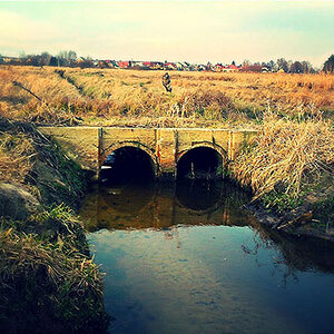
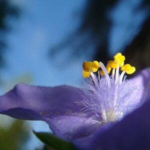
Concept image I've been experimenting with. I know my own criticisms of the image but I'm curious as to what others think, because I've looked at to long now to be rational. C&C please. Good and bad.

no-image-available-grid.jpg by William Raber, on Flickr
 
Last edited:
I love the concept and processing, but there are a couple of niggles. First and foremost, is the fact that her intersects the shadow line. I would prefer to have seen her standing vertical with respect to the viewer (to me, she appears to lean slightly forward and image left), and be more centered in the cone of light. As well, I'm not overly fond of the floor; at a quick glance the lines of the floor planks strongly resemble sun-rays, and it actually took me a second to figure out why they didn't go all the way to the top of the image.
 
Great concept!!!

The angles of the spotlight and the shadow appear to be misaligned -- I believe the "angle of incidence" from optics, should apply that makes my "grumpy guy" inside alert. Considering the direction and source of light, additional highlights on the girls shoulders can be expected while other need to be reconsidered.
The spotlight missed a tiny bit of her head (right side) which is fine if he spotlight edge was adjusted to reflect that. The spotlight had a visible edge at the front but extends all the way to the wall. The illumination between the girls heels all the way to the wall seems uniform which contradicts the Inverse Square Law.

Did your apply the spotlight in Screen Mode? The way it works is by dragging the black spot up, greatly affecting the contrast, especially in the darks which is the case with the girl.

upload_2019-9-25_13-42-8.png
 
I love the concept and processing, but there are a couple of niggles. First and foremost, is the fact that her intersects the shadow line. I would prefer to have seen her standing vertical with respect to the viewer (to me, she appears to lean slightly forward and image left), and be more centered in the cone of light. As well, I'm not overly fond of the floor; at a quick glance the lines of the floor planks strongly resemble sun-rays, and it actually took me a second to figure out why they didn't go all the way to the top of the image.

This was a multi composite image in which the shot of her was slightly leaning. I chose it because I wanted to give the impression she was looking at the spot on the floor. I tried multiple locations for her including centered, finally settling on the off center location. Not sure that it's any better one way or the other. The floor was a screw up on my part. The perspective on the floor shot was off, when I changed that it caused the width to also change. I need to find a different floor.
 
The angles of the spotlight and the shadow appear to be misaligned -- I believe the "angle of incidence" from optics, should apply that makes my "grumpy guy" inside alert. Considering the direction and source of light, additional highlights on the girls shoulders can be expected while other need to be reconsidered.
The spotlight missed a tiny bit of her head (right side) which is fine if he spotlight edge was adjusted to reflect that. The spotlight had a visible edge at the front but extends all the way to the wall. The illumination between the girls heels all the way to the wall seems uniform which contradicts the Inverse Square Law.

Did your apply the spotlight in Screen Mode

I've done limited composites involving adding lights and shadows, so this was good practice for me. The shadows gave me fits. I first tried using a selection of her and transforming, getting frustrated. Finally used an empty layer and painted in with a brush. Being on two separate layers I can adjust them, which on second look might need to be.

The light is composed of two separate layers, one for the spot on the floor and one for the beam. The intensity of the spot on the floor I imagined to be slightly brighter then the beam. The point of origin is considerably above the frame, which was throwing me off slightly when trying to align the shadows. I've used a curves layer in the manner you've described before, but in this case I went with a layer with blank selection filled with white>Gaussian Blur and then pulled a gradient adjustment down from the top to blend and fade the light beam. That may be why you noticed the beam difference at the right side of the head. Rather then Screen I used Luminosity Blend, for a better feel.

The highlights on the head/shoulders/body were on a curves adjustment layer with a black mask, painting in the edges to reveal. The head was intentionally placed outside the edge of the beam on the right, but I see I missed a few spots on the highlights layer.

The light on the floor from the spot to the wall, I missed. I'd thought about how to address that but, forgot about it later. I definitely need to address that.
 
I like the concept of the spotlight. Did you try different colors? I was thinking purple. When I first saw this on my phone the floor didn't look like floor. It looked like lines drawn. It does look much better on my desk top.
 
I like the concept of the spotlight. Did you try different colors? I was thinking purple. When I first saw this on my phone the floor didn't look like floor. It looked like lines drawn. It does look much better on my desk top.

The addition of color was added in Lr, using split toning to add a little blue to the shadows, and the "pink" to the highlights. Let's just say the highlight choice was not mine :anonymous: After 40 years I pick my battles carefully:allteeth:

The floor was a bust, I kept trying to make it work, but in the end I should have trashed it and gone with something different.

One thing that really surprised me (one of my biggest flubs) that no one caught. Check out the brick wall in the background.......ever seen bricks that big? LOL Again transforming can get away from you in a hurry. Thankfully you can hide a lot in the shadows :allteeth:
 

Most reactions

Back
Top