informal portrait attempt

Corry

Flirtacious and Bodacious
Supporting Member
Joined
Feb 5, 2004
Messages
21,168
Reaction score
110
Location
North Central Illinois
Website
corryttc.blogspot.com
Can others edit my Photos
Photos NOT OK to edit
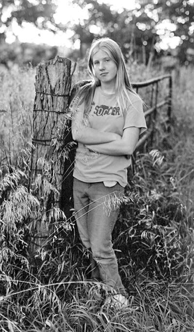
Ok, during the same shoot that I did my emotions entry, I tried several other portraits. I did one of each of the girls in this similar set up. Since portaiture is something I want to get more into, I'd like some critique on this. The sun is going down over the horizon behind her...is it too blown out? Oh, and this is also a bit desaturated. I can post a full color one if you'd like, and also the shots fo the two other girls. Let me know what I could have done better! :)

Reanna.jpg


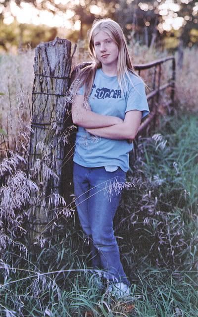
Oh, and I'm aware that the thing sticking out from under her shirt is distracting...maybe I should try cloning it out...
 
I do think the bright highlights behind are a bit distracting...but that light creates a beautiful hair light. Maybe if you could have been a foot or two higher...

Otherwise I think it's fantastic. Nice work Corry.
 
hmmm. for me the desaturation isn't working really well here... would you mind posting up the full color version... or even a B/W one maybe? :) thanks!
 
I'd love to see the full color pic. I agree with Mike about the lighting in this one. Something in the coloring seems weird to me though (grass looks blue)...not sure could be my monitor or something....anyone else see this?
 
Thanks for postin the other pics, I like the B&W the best! Good shot!!!!
 
I agree with ero, the B&W version is the one I like the best!


Zach :D
 
B&W is the winner. I would add a lil more contrast. Good job Corry.
 
Really???? I like the black and white the least! I'll try and play around with it and get it to my liking.
 
I like the B&W. Too points: I would prefer the subject to not be right in the middle, and the pose seems to reserved to me, likes she's trying to hide from the camera the way her body is twisted.
 
If this one's out of the series you took for the "Emotion" contest, I think I voted for your photo, Corry! :D

I, too, prefer the B+W one of all three. The colours in the full-colour version are a bit weird.

True, your "model" looks like she's a bit defiant, not REALLY, REALLY wanting to be in the photo, but I assume that was the effect the two of you wanted to bring about, is this true?
 
Definately the B+W here also. Adds more feeling to it I think. I played around with it A tiny bit and also like a crop without her legs and chop off some of the right side and just a tad off the top. I can post it later if you'd like.
 
You can go ahead and post it...I'd like to see what others come up with, since I can't seem the get the black and white to my liking! (even tho that's the one everyone likes! :) )
 

Most reactions

Back
Top