Input please(DRI)

Leigh Wanstead

TPF Noob!
Joined
Nov 2, 2006
Messages
107
Reaction score
0
Website
www.smootharm.com
Can others edit my Photos
Photos OK to edit
Hello everyone,
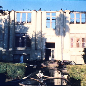
I follow this url http://www.tofahrn-foto.de/index.php?lg=en&pg=tipps.dri

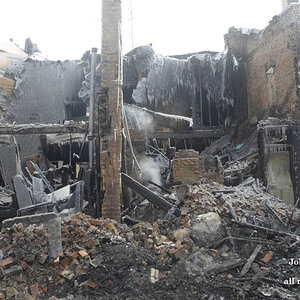
And I compose this picture from several images f-stop f5.6 exposure time 1/15s to 1/500s. Someone told me this looks like painting and that is not what I hope for. Any suggestion?

TIA

Regards
Leigh
normal_IMGA6927.jpg
 
It does kind of look like a painting to me. The colors don't look natural.

What really looks weird to me...is the 'halo' around the trees.
 
is DRI like HDR? judging from the link your provided it is. If that is the case then Im not sure whats going on because to me the picture looks like a painting as well. Perhaps you could post the originals you used to make this picture

if DRI isn't HDR ignore everything I just said.
 
i see what youre trying to do. but you should probably question your photoshop skills before you ask about the picture itself.

the edges of your masks (if youre even using them, which you should) are very sharp compared to the rest of the image. since the image is so grainy, your edges shouldnt be so sharp. the contrast of all the elements you used are off; they should all match. the hue of the grass is way higher than the rest of the image. the reflection of the sky in the water is alot brighter than the "actual" sky. teh reflection should be the same in brightness or a little dimmer because of the algae that looks like its containing. the dpi of each element is also different, you should match them all so that you get a more consistant grain (the sky is alot granier than the sand, ironically).

so fix:
-contrast, make sure all elements are uniform. (trees)
-brightness, '' (sky and reflection)
-match the hues, '' (grass with the rest of the images)
-match the dpi, '' (sky and sand)
-learn to use your masks better. alot of your elements look like cut outs because your masks are nasty. the trees shouldnt have that cloudy halo around them and edges of the water below doesnt look natural, youve got a very sharp edge where the water meets the dry sand.

a couple tools i could suggest you practice with are:
-brushes, learn to match teh softness/hardness of the brush with the rest of your images
-clone tool, could use it on the dry sand to create some wet sand along the water
-layer styles and adjustment layers, itll help you modify an element without making permenant changes
-layer masks*****, hide portions of the elements without erasing them. this would help alot for fixing those edges.

good luck if you decide to redo this. hope my tips could help you.

edit: before i hit the submit button, i re read your post. and i didnt want to delete all that i wrote for you so im gonna just leave it if it applies. is this an actual photo you took? no cutting and pasting?
 
Yeah, from reading the page it's supposed to be like HDR. The problem is that they are just cutting out areas that are well exposed in one image and plopping them into overexposed areas in the other. This throws the relative contrast of the image out of whack. If you are going to do this, you should start with an image that really needs it. Most of it should be well exposed, but one part may be blown out (over exposed to white). You can copy-paste like they did, but can end up with contrast issues. My guess is that your original really didn't need this technique, so you ended up with contrast issues between the water and the sand, and in other areas.

Personally, I would use this technique only rarely. Using his example image of the two neon rings, the water is really brighter than the sidewalk. After his work, they are very close in exposure. This can look okay, if you are careful, but you lose the true relative brightness of the scene, which can look fake. The men working the welder look "wrong" to me.
 
markc said:
Yeah, from reading the page it's supposed to be like HDR. The problem is that they are just cutting out areas that are well exposed in one image and plopping them into overexposed areas in the other. This throws the relative contrast of the image out of whack. If you are going to do this, you should start with an image that really needs it. Most of it should be well exposed, but one part may be blown out (over exposed to white). You can copy-paste like they did, but can end up with contrast issues. My guess is that your original really didn't need this technique, so you ended up with contrast issues between the water and the sand, and in other areas.

Personally, I would use this technique only rarely. Using his example image of the two neon rings, the water is really brighter than the sidewalk. After his work, they are very close in exposure. This can look okay, if you are careful, but you lose the true relative brightness of the scene, which can look fake. The men working the welder look "wrong" to me.

What do you think this one? Two photos combined.
normal_IMGA7217.jpg
 
They both look really over saturated to me, and the masks all have a bad halo effect around them.

But, the second one is an improvement on the first.
 
rwebbart said:
They both look really over saturated to me, and the masks all have a bad halo effect around them.

But, the second one is an improvement on the first.

What I did is first select highlight in color range command, and expand the selection by around 10 pixels and change selection to quick mask mode, blur it by 8 pixels, change back to selection and add selection to layer mask reveal.

May I ask how to make mask not obvious?

TIA

Regards
Leigh
 
markc said:
It still doesn't look like an image that would need this technique. It's meant for images that you can't expose for correctly in only one shot.

But to get a perfect shot needs patience and lots of time.
 

Most reactions

Back
Top