Introducing myself and submitting 2 photos for C&C

Threesia

TPF Noob!
Joined
Jun 15, 2009
Messages
65
Reaction score
0
Location
Louisville, Kentucky
Can others edit my Photos
Photos OK to edit
Hello all,

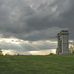
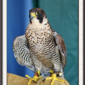
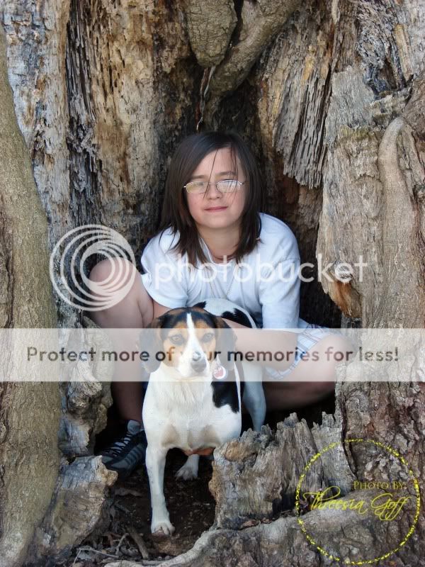
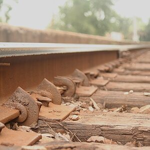
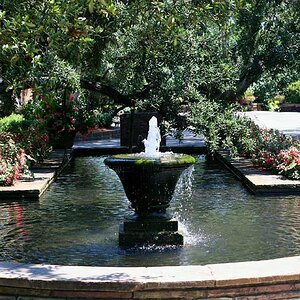
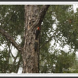
I've been lurking for a few days and really enjoy seeing every one's work. I'm new to photography but I've always loved it. I've been busy trying to learn the basics and more importantly learning my camera. Submitting my photos for C&C makes me nervous but I want to learn so here goes nothing. I know these don't follow the rule of thirds, as I said I'm learning.:blushing:

TGoff0004.jpg


TGoff0007.jpg
 
Pic 1 is good. I like a clean and sharp image. Correct exposure and good composition. I personally don't get hung up on every picture has to follow the rule of thirds. It is a technical composition guide to understand, not to live by.

Pic 2 (for me) would have been better without the tree. In this instance (and silhouette is a great effect, i know its not exactly silhouette but it's close enough), the tree overpowers the shot. I like the sky hue. Also, I see what looks like very slight motion blur (mainly in the illuminated sign). I am sure you used a tripod, but this motion blur may have come from when you pressed the shutter release. If you haven't got one, and you like doing night landscape, I would invest in a remote.

Good luck.
 
Pretty good shots but I find the watermark distracting. As you said yourself, you are learning. No one will be stealing a beginners images, so you don't need them.

Welcome to the forum :thumbup:
 
I like them both. My son has glasses so I understand that its just part of them, but I'd say for improvement in the first shot, remove the glasses. #2 I like the tree, the only thing I don't like is the bank sign. It draws the eyes straight to it. I don't know if it was possible but moving left to get the sign out of the picture would be better.

Every picture probably could be improved in some way or another so take opinions with a grain of salt.
 
Thanks for the replies.

As for the water mark it's really there because I just got married and love using my new name. haha I'll leave it off for posting here in the future. ;)
 
#1 its a nice image. I don't mind the lack of rule of thirds, as there are many other rules of composition that can be followed. As said, they are just guidelines more than anything.

Lines and symetry are just as important in an image. I don't like the empty space over her head, it doesn't do anything to help the image.

I think you should try and fill your frame more with your subject, zoom in or step in closer so we can see details and not just where they are. Both models seem a bit unwilling in the picture as well. While it was probably more of a "honey, go sit in there with the dog, I want to take a picture" moment, the glasses/reflection is distrating as you should see their eyes more clearly. She also has hair in her face, probably there as her hands where busy holding the dog.

On the good side, the exposure is nice, things are sharp as well. I find alot of people new to photography (myself included) have issues with filling the frame with a subject. We are all stuck in the P&S style of shooting which is backing up and getting as much as you can in the image. It works sometimes, but not usually.

#2 I don't like the tree, I find it dominates the image. Mainly because there is alot in the background...heck the lower right hand part of the tree is mixing in with other branches from another tree far behind it. Maybe take a part of the tree, aim more upwards to remove some of the background and try and isolate parts of the branches that have interesting angles or something funky going on. You don't always have to have the full tree in view to tell us the story of the tree.

a) fill your frame with your subject
b) watch those backgrounds
c) think of lines, angles, repeating patterns as well as the rule of thirds when composing images
d) keep practicing!
 
Interesting shots..

The first is nicely exposed........ in this case you should have composed downward and had less space above and more of the opening they are in at the bottom .....moving in closer here would have lost the idea that they are inside a tree hollow, so it's just a slight change in composition suggestion..

The second one is clearly an image of the tree..........however, there is too much that is brighter around it............ this would have been a perfect time for fill-flash.. just enough to bring out the detail in the tree, and to overpower the background, darkening it......then a little post darkening the sign and lights, and you could have a killer tree shot.......

Keep up the good work........:D
 
I see what you all are saying about the extra space in the first. It makes perfect sense.

Yes, the second is about the tree it was covered in ice. I see what you all mean about the sign. If I were could shoot it again I'd go left and shoot from a different angle. But god willing we won't have another ice storm for some years to come so it won't be quite the same. ;)

Thank you all for your help. I means a lot.

I went on the host site and edited the first photo. The water mark is still there sorry it's late and I didn't take the time to edit the upload a new one. Please don't hold it against me. :)

TGoff0004-1.jpg
 

Most reactions

New Topics

Back
Top