- Joined
- Dec 11, 2006
- Messages
- 18,743
- Reaction score
- 8,047
- Location
- Mid-Atlantic US
- Website
- www.lewlortonphoto.com
- Can others edit my Photos
- Photos NOT OK to edit
removed by owner
Last edited:
Follow along with the video below to see how to install our site as a web app on your home screen.

Note: This feature currently requires accessing the site using the built-in Safari browser.
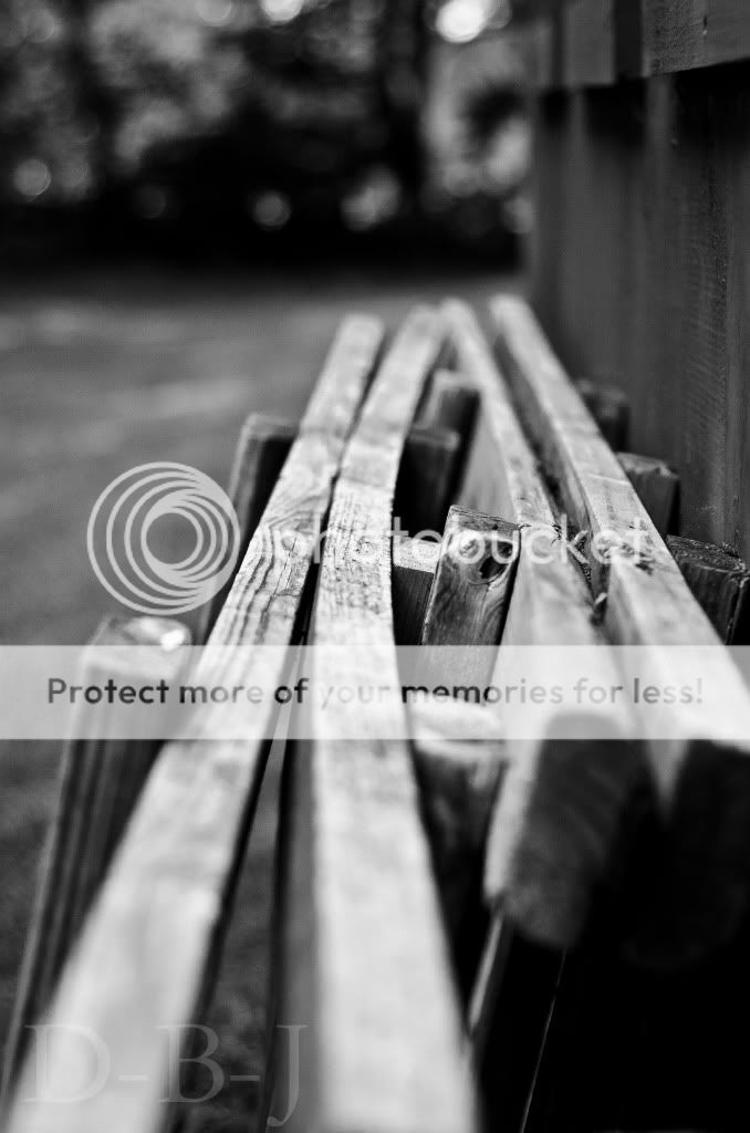
I for one love the DOP in this. The foreground bokeh just magnifies the depth in this. Black and white works fine, and the textures are nice. The line play in this is very nice, imho. And yet, there's just something with this (great) picture that I don't really, what's the word, believes, and part of it is that wall on the right side. Imo, it doesn't do anything for the images; I don't feel it adds to the composition.On a side note, I find that having to scroll the page to see the entire image doesn't let me see the picture as a whole, and I'm left looking at different parts of it at different times. I, for one, would like to be able to "take in" the entire thing - but perhaps it's just my monitor?I don't have anything to say about any technical aspects of the photograph. Can I ask where the sun was located when you shot this?


I'll add a quick edit where I tried to bring out the textures a little more. I also cropped away the stuff behind the... the... erhh... not sure what you call those things
Just did a curves adjustment where I darkened all tones a bit, and burned a little on the shadows to make them stand out more. You'll have to see if it was an improvement or not.
Mayhaps I've just made it under exposed


![[No title]](/data/xfmg/thumbnail/42/42256-dce29145f58094ceabbe05c0c8cef7fc.jpg?1619740065)