Is anyone interested in a real critique thread?

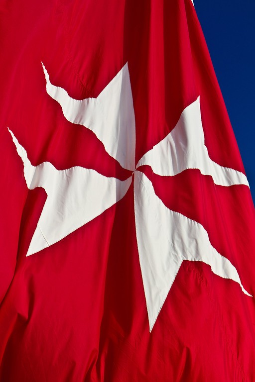
Here's one from me. Flag of Malta.

What I Like: Simple and clean and colorful.
What I Don't Like: I have to edit out the bit of white at the top of the flag that encroaches into the blue sky.

MG5852-XL.jpg
 
Compositionally the foreground should never be out-of-focus because it distracts from the centre of interest. A slightly higher angle with greater depth of field would be better for this shot.

skieur
 
I agree with you georgie girl, it is simple, clean and colourful, the white bit at the top wouldnt bother me too much, it is not a big edit to do. Its a nice shot. For me, it would have been good to see some more "movement" in the flag. I like the ripples in the material but It seems to look a little flat, I agree with skieur that more depth of feild would better the shot. I like the bright colours, it works well with this type of shot. The sky looks very dark blue though... almost not like the colour of sky.. if that makes sense? Was this intentional with post processing to create good contrast? Or was this the actual colour of the sky?
 
I'll have to check the raw file when I get home and see what I did on the edits to boost/saturate color. I did not specifically amp up the sky or use a polarizer; it was Bermuda. Good notes. Thx.

(P.S. at about 12 miles off the coast the water color is purple...its amazing)
 
Last edited:
Here are the LR notes:

i-KvZB7cq-L.png
 
What I like: The narrow depth of focus. The B&W tones. I feel they are just enough to make the scene ominous, but not so much as to give a sense of dread.

What I don't like: The bokeh could be smoother, but that is as good as my Nikkor 50 f/1.8D gets.

I'm ashamed to say that I don't ever have much of a message, vision or anything deep in the photos I take. If I think it looks cool, I shoot it. I hope that changes at some point as the it seems the better photographers usually have some deeper vision or meaning.

6094639953_cd6983be90_b.jpg
 
Maybe require 5 critique's (not one-liners) or submitter's approval to move onto the next photo? I feel like there are things that can still be said about some of the shots that are getting left behind.

As for the carousel, at first it was interesting because it took me a while to first make sense of the scene, but then after I did that, I was faced with a challenge to identify what it was which was fun to do, but didn't take too long. After I had the image figured out, there wasn't much left to enjoy as the light on the most interesting part (to me), the crank shaft, is dim and I don't see much detail. I suppose you probably didn't have much control over the light for this shot, but maybe a kiss of on-camera fill would have helped a bit.
 
I kind of like the idea of not limiting comments to the current photo. Not everyone can check the thread everyday and constructive criticism can be just as valuable today or next week.
 
Seems the highlights are pretty well blown and you already have some blacks bunched up, so I can understand why you didn't up the contrast, but the main subject(at least the part in focus) is pretty flat. The narrow depth of field does add something to this photo, but the lack of detail or anything resembling detail takes away. We can't really see the texture of the tombstones, discern any of the text, or really have anything to hold our attention. It looks like the angle would have been better on the tombstone to the right of the center one. Perhaps, if the focus would have been on that instead of the one in the direct center it could have made this a much more compelling image.

I like the idea, I just wish there was a bit more. As it is, I would probably do a fairly tight vertical crop just keeping the center tombstone and the one just to it's right and bring the blacks up just a tiny bit. I think that could add a lot to this photo.

Just my .02.
What I like: The narrow depth of focus. The B&W tones. I feel they are just enough to make the scene ominous, but not so much as to give a sense of dread.

What I don't like: The bokeh could be smoother, but that is as good as my Nikkor 50 f/1.8D gets.

I'm ashamed to say that I don't ever have much of a message, vision or anything deep in the photos I take. If I think it looks cool, I shoot it. I hope that changes at some point as the it seems the better photographers usually have some deeper vision or meaning.

6094639953_cd6983be90_b.jpg
 
Last edited:
It's a simple and effective shot in black and white. I don't mind that there is little true black, but shades of gray, there is a subtle depth to it.
 

Most reactions

Back
Top