crawdaddio
TPF Noob!
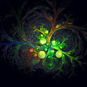
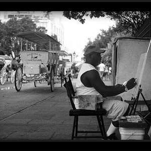
Original, straight from camera:

Adjusted:

Too much fidgeting? Or does it look nice? Hit me with watever you got:blushing::thumbdown::thumbup::mrgreen:")
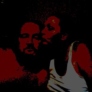
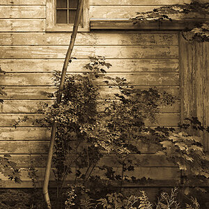
Adjusted:
Too much fidgeting? Or does it look nice? Hit me with watever you got:blushing::thumbdown::thumbup::mrgreen: