Nautifish
TPF Noob!
- Joined
- Sep 15, 2010
- Messages
- 178
- Reaction score
- 0
- Location
- Ontario Canada
- Can others edit my Photos
- Photos OK to edit
Good afternoon everyone.
It has been a while since i was last here i hope everyone had a Fab xmas & Great new yr.
I thought i would share a couple of recent photo's with you all. Would love too hear your comments and feed back.
Thank you so much.
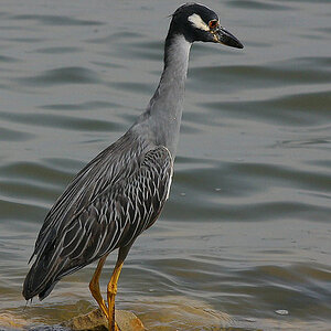
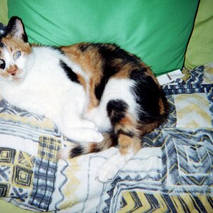
1.

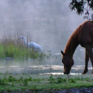
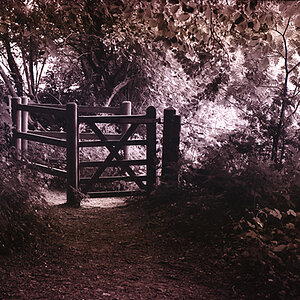
2.

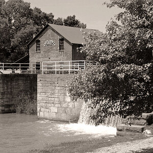
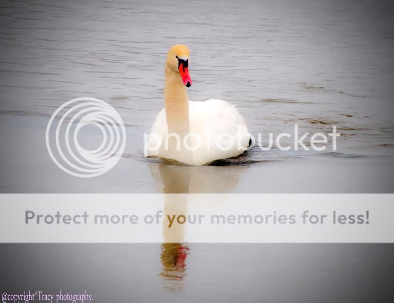
3.
4.

It has been a while since i was last here i hope everyone had a Fab xmas & Great new yr.
I thought i would share a couple of recent photo's with you all. Would love too hear your comments and feed back.
Thank you so much.
1.
2.
3.
4.
")