
Puscas
TPF Noob!
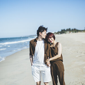
I took a portraiture class and ended up working with studio lights for the first time. Loved it. Hope you like my small selection (I took some very bad ones too). The model's name is Jill. thanks for any c&c.
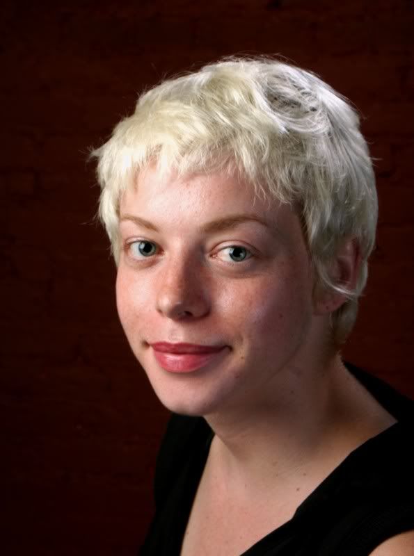
1.
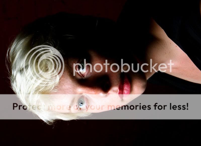
2. (B/W)

3.

4.
thanks for looking
pascal
1.
2. (B/W)
3.
4.
thanks for looking
pascal
 ) and I see that too (a little bit). Oh and I'm not selling these. But I do want to explore studio portraiture more, so any help is appreciated.
 I'll let her know!
![[No title]](/data/xfmg/thumbnail/32/32156-d6cfe2865ceed861a0633752a006ea20.jpg?1619735234)


![[No title]](/data/xfmg/thumbnail/32/32153-05f63098d8752b05df53dfa6ae8d6e7d.jpg?1619735234)
![[No title]](/data/xfmg/thumbnail/30/30863-8c53522e4ed851e96cb7411e74b9fe59.jpg?1619734482)