Journey To Corona Depot

Flower Child

TPF Noob!
Joined
Oct 19, 2008
Messages
778
Reaction score
4
Location
Southeastern Kansas
Can others edit my Photos
Photos OK to edit
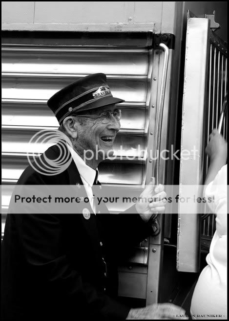
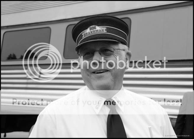
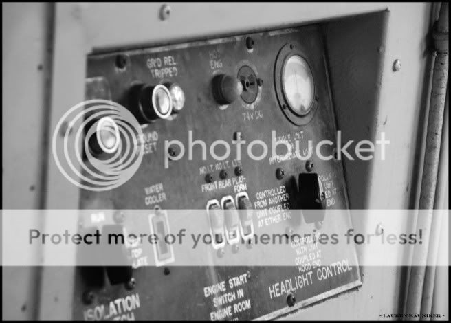
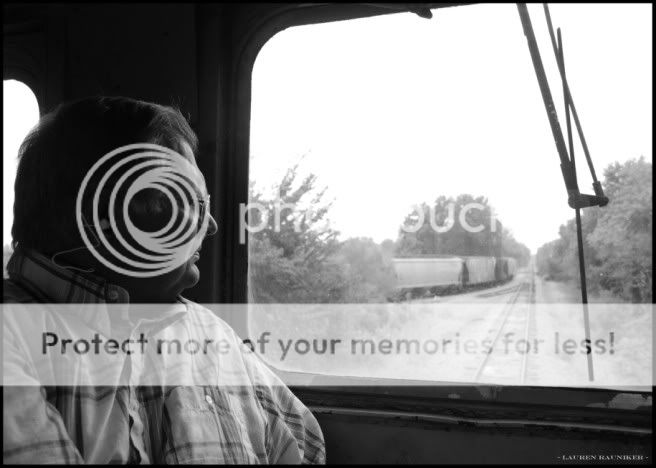
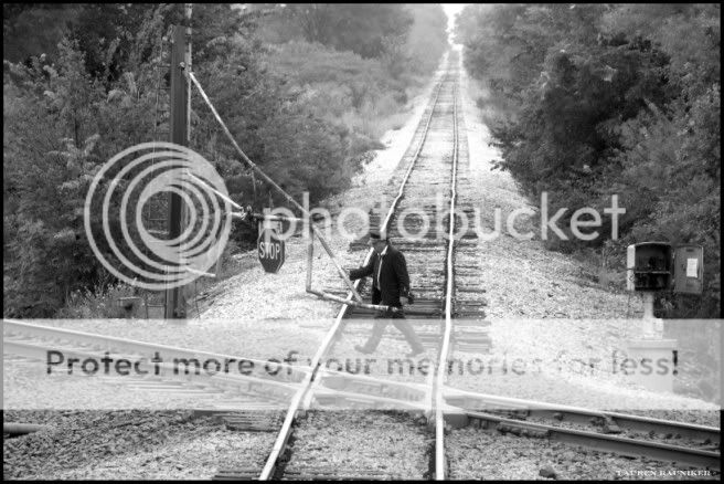
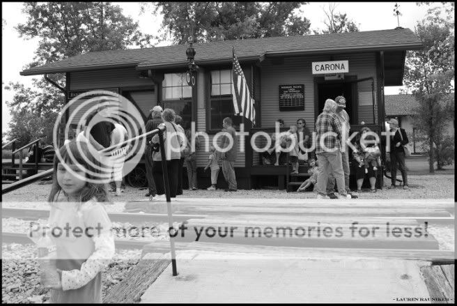
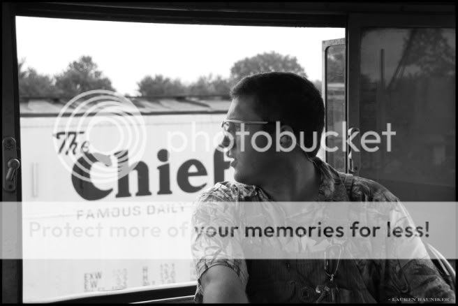
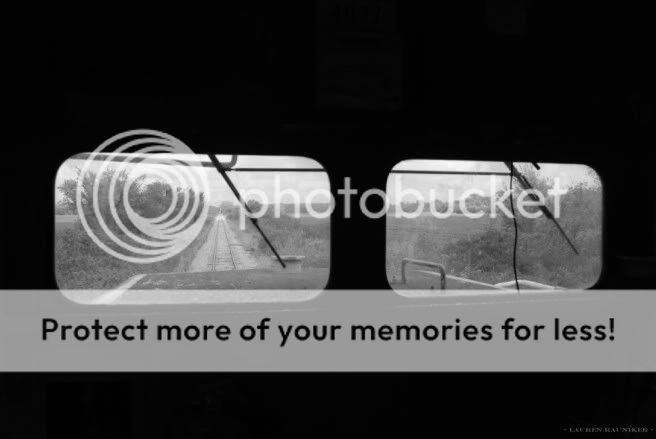
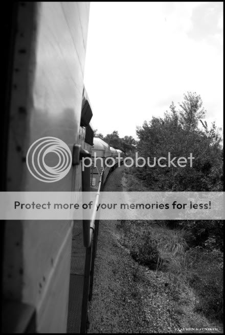
Hello everyone, this is my documentary of a train ride through Kansas. I was lucky enough to get to ride in the engine, so I wanted to capture all of the happenings and goings on with the engineer and the crew etc. I would really appreciate any advice you could give me, if you see anything I could improve on I would love to hear it, and tell me about the things you like! Thanks. I didn't want to post an overwhelming amount of photos so you can see the rest here : Little Balkan's Days Train
1.
LarrySpahngetseveryoneorganizedandr.jpg


2.
Greetingtrainridersandcheckingticke.jpg


3.
Trainassistanthelpingkeepthingsu-1.jpg


4.
JohnSpahntheengineerwaitsforthesign.jpg


5.
LarrySpahn.jpg


6.
Variouscontrolbuttons.jpg


7.
RichardRaunikerwatchesoutthewindowa.jpg


8.
Unlockingthegateatthetrainintersect.jpg


9.
Oldtrainbuddiescatchupanddiscussthe.jpg


10.
Aftertheirchickenmealridersgatherat.jpg


11.
Anassistantcheckinginontheengineer.jpg


12.
Theengineerfiresupthetrainandheadsb.jpg


13.
Blowingthetrainshorn.jpg


14.
InsidethetrainlookingoutattheKansas.jpg


15.
Adogcrossingthetracksinfrontofthetr.jpg


16.
Heretheengineerreachesforhiscbtocom.jpg


17.
Takingthecurve.jpg
 
Last edited:
#10 is my favourite, i think some could have been shot a bit wider to make them more of an establishing shot, but they are a good start
 
I dont trust the looks of the crooked tracks in #8.
Let me tell you, those rotten tracks made the train sway back and forth so much I thought we were going to turn that train over on its side a few times. It made for an interesting ride, though.

Any particular things you like/dislike about the photos?

#10 is my favourite, i think some could have been shot a bit wider to make them more of an establishing shot, but they are a good start

Hey gsgary, thanks for taking a look! I really appreciate it. I'm curious as to what you mean by shooting them wider. Is my cropping job not that good? I put the majority in 4x6 and the others in 5x7. Do you think that is not the right approach?
 
Quite a beautiful set. Is there more?

Some of them could use a boost in contrast. Some of them could use some burning. But overall quite a nice set. Lucky you getting to ride the engine.

I believe gsgary is talking about including more in the photos, maybe through the use of a wider angle lens. They are a couple where I see that to but, then, they would become a different image so I wouldn't say it was necessary.

Good job.
 
I agree with cloudwalker.... they seem to be a tad "flat". I know there's blacks & whites, but I think you're missing quite a bit a mid-tone detail. And once you get some of those mid-tones in, you'll have to bump the contrast.

This could be a cool tinted series. An old-time transportation maybe would look cool "sepia like" series. I say sepia like because I would never click a "make this a sepia tone" button. I prefer making my own duotones.

Nice set though! Looks like it was a great day for you.
 
Quite a beautiful set. Is there more?

Some of them could use a boost in contrast. Some of them could use some burning. But overall quite a nice set. Lucky you getting to ride the engine.

I believe gsgary is talking about including more in the photos, maybe through the use of a wider angle lens. They are a couple where I see that to but, then, they would become a different image so I wouldn't say it was necessary.

Good job.

Hi c.cloudwalker! I really appreciate the advice, and thank you for bringing up the fact that they need more contrast. I felt they were a little dull, but I thought it might have just been me, so I will definitely boost the contrast. So where would you suggest the burning be done? On the people's faces?

Okay I suppose a wider angle lens would have been nice for these photos. Unfortunately I only have one lens, an 18-135mm 3.5-5.6, but I will try to save up for a wide angle in the future to give it a more established look.

I agree with cloudwalker.... they seem to be a tad "flat". I know there's blacks & whites, but I think you're missing quite a bit a mid-tone detail. And once you get some of those mid-tones in, you'll have to bump the contrast.

This could be a cool tinted series. An old-time transportation maybe would look cool "sepia like" series. I say sepia like because I would never click a "make this a sepia tone" button. I prefer making my own duotones.

Nice set though! Looks like it was a great day for you.

Hi Chris, thanks for you help! I agree with you on the photos being flat, I seem to have a bit of trouble with my photos being flat. I will use your advice and bump up the contrast. I'm not really sure how I can fix my lack of mid-tone details, do you have any suggestions? Is it something I could do in post processing?

And I appreciate your suggestion of a sepia tone. I will try a few and post them.
You do cool stuff!

You need to come down and ride the Branson Scenic Railway. There are lots of observation cars and very pretty equipment.

Tell me more about the train ride. Is it just during Little Balkan's days?

Hi RLJ, that sounds like it would be pretty neat. I go to Branson quite often, so I will have to give it a go, thanks!

Yes, that is a passenger train that just runs during Pittsburg, Kansas's Little Balkan's Days festival. Its just something fun that the city does every year. Its a pretty short jaunt, as the train has to go fairly slow because of the terrible condition of the tracks, but it was a fun experience. Luckily my grandpa knows all of the guys who run the show, so I had the privilege of getting to ride in the engine, which was also really fun, and which opened me up to some really great subjects to shoot.
 
Hi c.cloudwalker! I really appreciate the advice, and thank you for bringing up the fact that they need more contrast. I felt they were a little dull, but I thought it might have just been me, so I will definitely boost the contrast. So where would you suggest the burning be done? On the people's faces?

Okay I suppose a wider angle lens would have been nice for these photos. Unfortunately I only have one lens, an 18-135mm 3.5-5.6, but I will try to save up for a wide angle in the future to give it a more established look.

18mm is wide angle. :D The problem with a wide wide angle lens is that you start getting distortion. Especially in a tight space. So, that is for you to judge when to use or not a wider angle. It is after all only a question of preference.

As far as contrast is concerned when you boost it you can start losing details in the lightest areas (and you need to burn those somewhat to bring the details back) and in the darkest areas (in this case you dodge to bring the details back.) I only mentioned burning because I didn't see any dark areas where you would lose much but it my be a different story when you get started.

B&W is beautiful but it often requires some good PP skills. To get a sense of where your contrast level should be, look for b&W work in books or on the web and decide which one fits you. Different people like different levels of it. But overall, a lack of it can leave a photo somewhat lifeless (blah) but it is no worse than too much of it. And it can be a fine line.
 
2, 5, and 13 were my favs, and a great lens to look for would be the Nikkor 20mm 2.8, on your camera it's a 30mm, small light and fast. You can find them used on the 'BAY, I have an older D-70 and it's always on the body. :thumbup:
 
18mm is wide angle. :D The problem with a wide wide angle lens is that you start getting distortion. Especially in a tight space. So, that is for you to judge when to use or not a wider angle. It is after all only a question of preference.

As far as contrast is concerned when you boost it you can start losing details in the lightest areas (and you need to burn those somewhat to bring the details back) and in the darkest areas (in this case you dodge to bring the details back.) I only mentioned burning because I didn't see any dark areas where you would lose much but it my be a different story when you get started.

B&W is beautiful but it often requires some good PP skills. To get a sense of where your contrast level should be, look for b&W work in books or on the web and decide which one fits you. Different people like different levels of it. But overall, a lack of it can leave a photo somewhat lifeless (blah) but it is no worse than too much of it. And it can be a fine line.

Okay, so I took your advice and I just went through each and every picture and tweaked the levels, boosted the contrast, and dodged and burned. I'm absolutely thrilled with the results! Such a pop of life, and so much more vibrant and alive they seem. I updated all of them on my site and I'm much, much, much happier with them. In particular, this one:
BEFORE
LarrySpahn.jpg

AFTER
LarrySpahn-1.jpg


Do you think that is better c.cloudwalker? I even cropped it a bit.

2, 5, and 13 were my favs, and a great lens to look for would be the Nikkor 20mm 2.8, on your camera it's a 30mm, small light and fast. You can find them used on the 'BAY, I have an older D-70 and it's always on the body. :thumbup:

You know 2 and 5 are at the top of my list too. :mrgreen: Thank you very much for taking a look, and your lens suggestion was very helpful! I've been wanting a good portrait lens for ages, and this looks like a great one.
 
WOW!

Much nicer but, don't hate me, it still needs work. However, you see the difference so you will be happy to work on it till you get it right. ;)

You know, that's how we learned darkroom work in the film days. Do it again and again and again until you get it right.

His face (look at his eyes now) and the "brakeman" plate look much better. But you have lost details in his shirt so that needs some burn in work. And the dark part of his cap is now a bit light so it needs a little burn in also. Not too much though. And, I just noticed, you lost the details in his tie.

And your crop is good too. You got rid of the unknown shoulder and moved him enough off center to make the whole image more interesting.

It takes a while to learn all of this stuff but think how happy you'll be when you get it right compared to how happy you thought you were so far.

Keep it up, you are doing great. :thumbup:


Edit = The tie will require a bit of a dodge job. Is that even the right term? Sometimes I think I'm losing my mind...
 
Nice photos ..

remember ,, photography on a sunny weather is better than the cloudy weather ( talking about the sky exposure )

Thank you :)
 
Thank you Muhammad Almarri, I appreciate it! Yes, I wish the day was a little sunnier so I could have had some better shadows and natural contrast, but I guess you just have to work with what you've got. :wink:
 
enjoyed your pics of Carona Depot, but.....please, no mexican beer! When the town was being organized, they were going to call it Fulton, Ks. They did the paperwork for a post office & oops!...there was already a Fulton, Ks. 2nd attempt, they named it Carbona, for the local coal industry. Ah, but fortunately, somebody dropped the b during the application process, it became Carona. I like it that way, and get anoyed when various spell checkers try to change my favorite ghost town to the common and crude Corona. If you wanted to order the finest whiskey in Capone's Chicago, it would be Carona Rye or Cherokee Red. In the book Kansas Bootleggers, Carona is identified as the most notorious bootlegging community and the tiny Ferraro Grocery moved more sugar than any supermarket in Kansas.
 
Last edited:

Most reactions

New Topics

Back
Top