Just joined - Saying Hello (C&C Too)

BJPhotography

TPF Noob!
Joined
Mar 2, 2011
Messages
102
Reaction score
5
Location
Virginia
Can others edit my Photos
Photos OK to edit
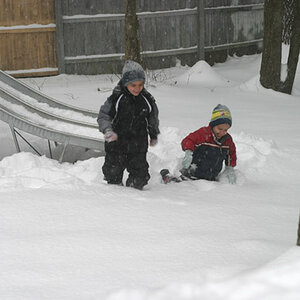
Im new here. Thought I'd post a few pics I've taken recently. Hows everyone's week going? Any C&C is greatly appreciated.
LakeTahoeSummerof2008.jpg

JohnandDevinSummer2009.jpg

SethinSusanvilleatourhouse.jpg
 
Welcome!

Cute images, what are you using to process them? It looks like standard iphone processing, but I'm hoping this is done in Photoshop with some thought behind it.

1- image looks a bit slanted, might need some straightening. The clouds are cool and the added human element on the beach is nice. The image does seem overall dark though, which somewhat lends to the "storm is coming" feel of the image, but could still be brightened some imo.

2- I like this one, mainly for the expressions on the kid's face on the left.

3- This one is a bit no for me. The white vignette is not something I like, I find it tacky. The processing for the blur is a bit odd, seems unnatural. If it was naturally done in camera, then I dunno, still looks odd. The colour processing and what not is a bit murky with the colours and the light is a bit harsh, making the right side of the frame a bit too dark to have that "aww sweet" factor.


Overall, the lots of processing and the rounded edges scream out throwing processing on an image to make it more interesting. I don't think the images (at least the first and second) need too much processing to make them good. Keep it simple IMO
 
These are photo shop edited pics. I agree with your remarks. The top one however was meant to be dark. I liked it this way, without the cropped corners though. The third one is flashy on the left side. The soft effect was added. The vignette was obviously added. I see your point on it. Will revert to original on it.
 
Welcome to TPF!
C&C per req:

1. Very 1970s C-35 looking, however there are some exposure issues and [what I assume to be the subject] the rain squall has lost detail. I would take this back to post and try and adjust the yellow and blue as well as brighten it up.

2. Cute shot, again, very yellow, and appearing slightly out of focus.

3. Blown highlights, very out of focus, distracting background; I'm afraid this one is really beyond saving.

I'm guessing that your monitor colours are probably not correctly adjusted. Overall, the images are a good start, but there are definite areas for improvmenet. Shoot lots, post lots, and use the critique points to improve.

Just my $00.02 worth - your mileage may vary.

~John
 
LOL. I actually added the softness to the bottom one to make it out of focus. Maybe should revert back to originals where they are sharp. But I liked the effects. Maybe not so popular to anyone but me. :)
 
Thats all good, there is no one way to make a good image. What you like I might not and vice versa.

There is however a difference between a bad photo and a good one (just saying that generally). So if you love the image the way it is, keep it that way! Just understand what people are saying (which you seem to - and this is such a breath of fresh air on this forum these days), take it in, apply it or not :)
 
I prefer the edit of the first image to the original, myself.

On the baby, I think your processing was a little over the top, for my tastes, but the original definitely needs some punch. Maybe just stay away from getting the baby too soft? The edit has a weird, almost double exposure offset a couple pixels effect especially on the clothing that is not working for me.
 
I totally agree with you on the baby image. Thanks for the input. :)
 

Most reactions

New Topics

Back
Top