yogi_k
TPF Noob!
- Joined
- Apr 11, 2011
- Messages
- 11
- Reaction score
- 0
- Location
- India
- Website
- www.kshitijyogi.in
- Can others edit my Photos
- Photos NOT OK to edit
Hi Folks,
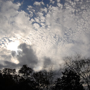
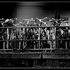
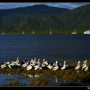
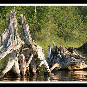
I hope you're doing well. Am a just starting out in photography. I have created a non commercial site(as of now) of my own. It is totally in flash and contains a few pics of mine and am also planning to add some articles on basic photography.
I would like some feedback on the design, pages, anything to add worthwhile or to remove. Any kind of feedback/suggestions are more than welcome")
This is the site :http://www.k****ijyogi.in you'll have to type it manually on your browser due to restrictions on one of the words that appear in my site name
www.kshi_tijyogi.in (please remove the '_' underscore from the name )
Thanks,
I hope you're doing well. Am a just starting out in photography. I have created a non commercial site(as of now) of my own. It is totally in flash and contains a few pics of mine and am also planning to add some articles on basic photography.
I would like some feedback on the design, pages, anything to add worthwhile or to remove. Any kind of feedback/suggestions are more than welcome
This is the site :http://www.k****ijyogi.in you'll have to type it manually on your browser due to restrictions on one of the words that appear in my site name
www.kshi_tijyogi.in (please remove the '_' underscore from the name )
Thanks,
Last edited:

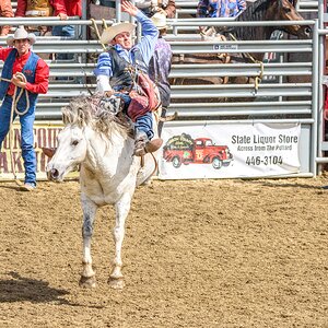
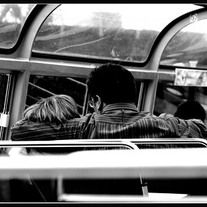
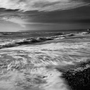
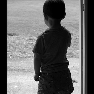
![[No title]](/data/xfmg/thumbnail/41/41758-1a91d93383c843959cb160b7ac7e762e.jpg?1619739883)