Katherine and Ben - Engagement Shoot

twocolor

No longer a newbie, moving up!
Joined
Feb 26, 2008
Messages
1,044
Reaction score
227
Location
Utah
Website
www.twocolorphotography.com
Can others edit my Photos
Photos NOT OK to edit
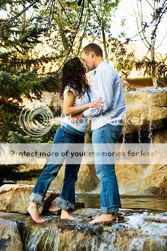
Here is a photo shoot from this weekend. It was a two location shoot with a third location planned for this coming weekend.

The waterfall location is actually the Flying J Corporate Offices in Ogden, Utah, while the other location was the Ogden LDS Temple.


2465486195_f3dde8da33.jpg


2.
Full Color or . . .
2465486129_5b21a063c3.jpg


3.
black and white
2465486029_f671d15fb4.jpg


4.
2465485947_6e9b430928.jpg


5.
2466311028_a2ab51efa7.jpg


6.
2466310872_c19b38b026.jpg


7.
2465485503_d5ffdd9995.jpg


8.
2466310532_748fca2024.jpg


9.
2466310416_f034be3aed.jpg
 
I like all of them, especially 7 and 8. (but definately stick with color for that one shot in). You've got some great locations and tones here.
 
love all of them but you could probably use some saturating here and there. I specially love the last one..=]
 
#1 feels too skinny a crop. Maybe crop a little off the bottom and top?
For #2, I like the B&W a tad better because I think it's easier to focus on the ring in that one. In the color one, I tend to want to only look at the top half of the frame because of all the color going on up there.
I like how she is looking up at him in #4, but there is something about the composition that doesn't work for me. I think it's that there is so much sidewalk in it. I would try and get rid of that long white pole in the background as well.
5.) Not sure about the tilt here, but I personally have a really hard time with them! I feel like this is one of the only ones where I can really get a good look at them and what they look like. (Oh wait, I can in #7 as well)
I dig the long exposure for #6.
I like the composition in #7.
#8 isn't doing anything for me. Maybe a square crop would be cool so you could get rid of some of his legs which I find a tad distracting here.
#9 is romantic. I like their bare feet:)

I also think that most of these could really use a boost in color and brightness as I think the post processing is a little dull in them.
 
I tried an edit of that last one as I really liked it. I really didn't do much. Working in different layers and flattening as I went, I brightened it up with the brighten/contrast tool, and erased back a little from their shirts and arms, I also did a curves layer to lighten it up a tad as well. I did a another layer where I upped the color saturation a bit but erased back his face some because I didn't want it to be too orange. Then I did another layer with soft light at a low opacity. Then another layer with Hard light at a low opacity and erased back the couple so they wouldn't be too contrasty (I was just trying to get the background to pop a little more).
twocoloredited.jpg
 
Not my taste, but good nevertheless.
 
April: I really love the PP on that pic. I will have to play around with some of the suggestions. I agree I don't have a lot of close up pictures, but the specifically asked for some just like that. They want a wedding announcement with text running in front of the background. My normal style with engagements is to do just that, show off the couple. I usually do more close up, giving a good look at the couple.

The cement I agree with. If you were to put text for a wedding announcement there, though, I feel it's a lot less busy than trying to put text over trees and water and such.

Thanks for the critique, Im going to try out your technics. I was having a hard time saturating it because neither him nor her wore anything but white. But, obviously there are ways to make them pop!
 

Most reactions

New Topics

Back
Top