Ken and Heidi C&C

Pallycow

TPF Noob!
Joined
Nov 16, 2012
Messages
1,697
Reaction score
520
Location
United States
Can others edit my Photos
Photos OK to edit
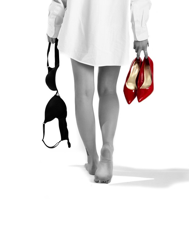
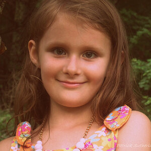
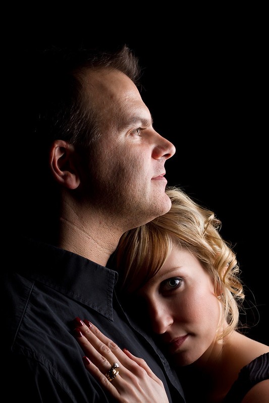
So I had Ken and Heidi in the studio today doing some valentines shots for my promo I'm going to run for V day specials. When processing the photos I came across this one, and never even finished the sets yet. lol. I really like this one so I wanted to put it up here for some C&C to see what any thoughts might be.

Funny thing, I got a new monitor, external, and on there I do my editing now and it looks dark/black with warm tone. yet on my laptop it's kind blue/black with cool tones. lol. I'll find out which is true at work tomorrow in the lab, but for any of you with calibrated monitors, I'd appreciate feedback specifically on that part.

any other C&C as well.

This was a fun/experimental part of the shoot, not one of the V day shots.

Now I spent time on this I'll have to finish the sets tomorrow. lol.

anyway, thanks for looking.


8388140067_9abcc63eb8_c.jpg
 
It looks good to me. Yes, warm and dark but not excessively so. Her eye appears to be on a "rule of thirds" intersection line and really pulls the attention. Well lit, lots of texture in his chin! Not so sure about him staring away into the distance but I'd call it good, dam' good! :D
 
Thanks for the feedback. I really liked his head and look from the shot before, but the lighting was a bit different, different enough I could not merge the two. He didn't follow directions, and I didn't catch it, lol. He did have "dog eye" in this original shot from him looking up that direction...so I stole his eye from one of the other shots where the lighting was similar. lol.

I have to give credit to Heidi. I was actually working on some practice with dramatic lighting from a video I watched last night in preparing for the shoot, and she said "hey....what if I put my head on his shoulder?" SHe was thinking the front shoulder, so I let her try, I didn't think it would work..and it didn't...I could not get any fill on her face. So I put her behind his head on the other shoulder so some of the main light would roll over to her face.

Worked well, and I was pleasantly surprised. :) I'm glad she thought of that. We were doing couples profiles/dramatic before this and I just wasn't getting it right like I visioned....so I'm really glad she thought of putting herself in this shot I was doing of him.
 
It's funny you should say that, I'm taking a break at the moment from working on some "couples" photos, she's a natural model and he manages to spoil almost every shot! She's starting up as a wedding "first Dance" teacher and she roped her friend in as the bloke because he's an ex marine and she wanted some action shots of her being lifted into the air as they danced - Unfortunately on the first lift he pulled a muscle in his shoulder so that was that!

Hopefully I'll get her in front of the camera again soon by herself. She's very pretty and has a great personality that really shines through.

I understand what you mean about substituting body parts from shot to shot, I did a group of 12 a couple of months ago and substitution was the only way I could get them all looking good at the same time... If only they knew! :biglaugh:
 
Very Nice Pallycow, intimate! I like it! :thumbup::thumbup:
 
I love the lighting in this! My critique would be 1) include more of her hand and 2) have him looking down at her even if it is just with his eyes kwim?
 
Pallycow said:

They do not seem connected at all. He's looking outward and into the distance at a high angle, and she is looking directly into the lens. The have widely disparate angles of gaze, and the distance between her head height and his is greater than a "classical" head spacing...I know he is taller than she is, but with the heads spaced that far apart (a full head-height apart), and with the disparate angles of gaze, these two feel distant. He is also faced directly into the light in profile, and she is shown one-eyed in a very strong broad, split-lighting scheme. Honestly...I don't like this at all. It has a negative vibe to me. I just cannot buy into this...her expression seems doubtful or sad, or somehow not positive. I see the big, obvious wedding ring on her finger, but paired with her expression and his gaze, he in the light and she in the gloomy dark...this seems not-so-Valentine-ish to me...


thanks for the in depth assessment and c&c. I like what you had to say because honestly, you picked up a bit on what I was going for. I thought I put it in earlier, but this was not part of the valentines theme. Just something I was playing with for lighting practice while I had them in studio shooting the V day stuff.

I'm glad you picked up on the distance, 'cause that's what I was going for. I wanted there to be separation and distance. I wanted her to be coming to him, to love up on him and he be a bit distant in it. ;-)

at first glance the viewer is thinking "nice lovey dovey" then if they pay attention they are like "hey...wait a minute...." and they notice the distance.

anyway, just an experiment...

I do wish I had brought her hand up a bit more over the top of shoulder a bit.

For him too...to me...it's almost as him being a tyrant or king type of demeanor back in the day..."this is my woman...I am man" sort of thing, they show love and emotion...but not men. Not quite but I almost got it anyway. lol
 
I like it ...I would give it a little trim off the top to keep it well contained

I was not sure if to crop, so I left it as I shot it. That's original framing. I agree the top needs a bit off, but was not sure yet where or how much.
 
Here's one of the vday theme for ya derrell...lol

I'm thinking of finishing this one up, there's a few things in it I don't like still. And using it for one of my promo's. Adding text along the lines of "She's ready...are you? Be my Valentine" or some chit like that. lol

I usually hate selective color, but client wanted it, so I did it. I think it kinda works here though.

8389279867_008ef2fb5a_c.jpg
 
^^^

Not sure if that is a man or woman.

As for the first shot, I dont think a profile of this guy was the best way to go. His wife has a great pose and he is sitting there with the big nose profile. A 2/3 pose would have been better.
 

Most reactions

New Topics

Back
Top