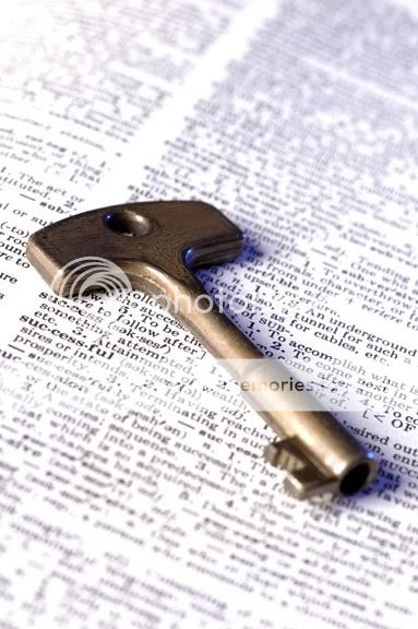
yes i think a slightly larger dof, or perhaps a more central focus point would have made it better, nevertheless, great idea with the dictionary heading, good pic..
I like the idea behind this especially. IMO the DOF is good b/c it takes away from other words that would be distracting and makes you focus in on success...I think it might also be pretty cool in B&W, but I like what you've done with this one!!!
I agree with Amanda on this one, the selective words in focus are a nice touch, though I didn't see them right away. I'd like to see a black and white version as well, but you've done a great job with this shot :thumbsup:
Thanks gang. I actually had concidered this with BW in mind but found it boring as I set up, so shot with a couple different shades of blue gels instead.

![[No title]](/data/xfmg/thumbnail/33/33341-3a6934b6cdb015b5acf31087acdcd278.jpg?1619735910)

![[No title]](/data/xfmg/thumbnail/31/31045-f4eb92f5d5eaca89ec5966763eea2dae.jpg?1619734585)