Ankit
TPF Noob!
- Joined
- Feb 27, 2012
- Messages
- 88
- Reaction score
- 7
- Location
- Delhi, India
- Can others edit my Photos
- Photos OK to edit
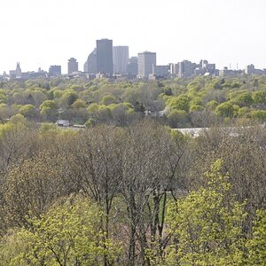
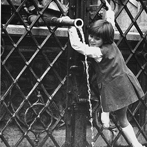
Some shots that I have taken. Kindly give your comments.
1.
2.

3.
Thanks
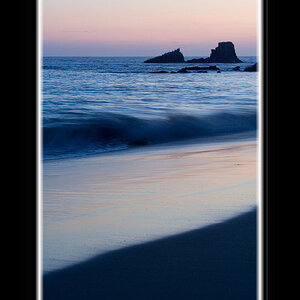
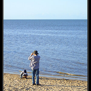
1.
2.
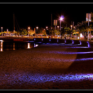
3.
Thanks
![[No title]](/data/xfmg/thumbnail/42/42025-fa343f816d0cedc45447aa0b300e301e.jpg?1619739982)

![[No title]](/data/xfmg/thumbnail/42/42024-bf0604d67b26c7acb5e4d59254692618.jpg?1619739981)
![[No title]](/data/xfmg/thumbnail/42/42494-ba608b57b09b00c0ee005a2360a510f5.jpg?1619740198)

![[No title]](/data/xfmg/thumbnail/42/42021-ffc326f5dc5b4c65ce53935e6e9e4338.jpg?1619739980)
![[No title]](/data/xfmg/thumbnail/37/37488-1946adf246ec6e047915c668d3dcff15.jpg?1619738111)