lady

spako

TPF Noob!
Joined
Jan 24, 2006
Messages
1,097
Reaction score
10
Location
Luxemburg
Website
spako.deviantart.com
Can others edit my Photos
Photos NOT OK to edit
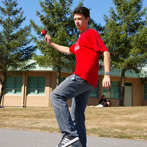
I took several different shots of this statue and this one is my favourite...
does the composition work?

Any comment would be appreciated!

IMG_5454_2.jpg
 
I agree, I think it's a great shot but there seems to be a bit much of the grey part on the left. If you make her the center of attention since she is the subject of the pic she would stand out a lot more. Other then that I think it's a great B&W shot.
 
i think the rules of people portraits would apply to this photo, you shouldn't cut of limbs at akward points. to me in seems like you just cut her off at her shins, which is kind of weird to look at in photos. try getting her whole body in and cut off the base of the statue, or cut her off right above her hips. please take this as constructive criticism!
 
Thank you for the critique JEazy! I can only learn how to improve when I'm getting honest critiques, so thank you!

I had to cut her off on her shins because the podest on which she is standing was in the way...I didn't want it to be in the picture...

Here is the original crop of the picture

IMG_5454_1_2.jpg


And here is another shot, I just desaturated this one a bit...Is this crop better? or should I use the above picture and crop in closer to the statue an leave it in the right corner with just a little bit less of the grey on the left side?

any help is welcome!
IMG_5461_1.jpg
 
mind if i play around with the original then repost it in this thread?
 
what if you cropped it a little tighter like this? give a little more intimacy with the subject and the viewer? i do know what you were going for with the original comp, but im my opinion the "dead space" was unneccesary. but hey, it's just my opinion!

ladystatue.jpg


edit: oo i really like that last one you just posted!
 
Thank you JEazy!

I think if I was going for this tighter crop I'd go for the last picture I posted as it is closer to the subject. Maybe the first image just isn't any good...
 
no i think the first image is definantly good! it's just that i think it needs that base like the un-cropped version you posted has.
 

Most reactions

New Topics

Back
Top