Navigation
Install the app
How to install the app on iOS
Follow along with the video below to see how to install our site as a web app on your home screen.

Note: This feature currently requires accessing the site using the built-in Safari browser.
More options
You are using an out of date browser. It may not display this or other websites correctly.
You should upgrade or use an alternative browser.
You should upgrade or use an alternative browser.
Latest newborn pics
- Thread starter janineh
- Start date

Derrel
Mr. Rain Cloud
- Joined
- Jul 23, 2009
- Messages
- 48,225
- Reaction score
- 18,941
- Location
- USA
- Website
- www.pbase.com
- Can others edit my Photos
- Photos OK to edit
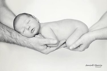
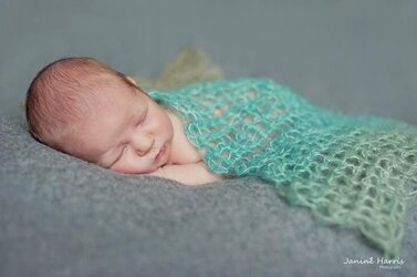
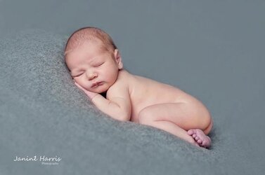
#2 is VERY cute! I've seen it done that way like a ZILLION times--on BLACK. It looks sooooooo much better done against a light backdrop! Good job on that. It's pretty close to perfect, I think. #1 IS QUITE "okay", while #3, ehhh, seems like it's just too far-away...the baby is so smalllllllllll...and it looks like just placed on top of a fabric-covered shooting table in front of a white screen. It's just not framed as tightly as I'd like to see it. Again,shot #2 though, dad and mom holdin' the newbie--YES! Skillfully done!
OP
OP
janineh
TPF Noob!
Derrel said:#2 is VERY cute! I've seen it done that way like a ZILLION times--on BLACK. It looks sooooooo much better done against a light backdrop! Good job on that. It's pretty close to perfect, I think. #1 IS QUITE "okay", while #3, ehhh, seems like it's just too far-away...the baby is so smalllllllllll...and it looks like just placed on top of a fabric-covered shooting table in front of a white screen. It's just not framed as tightly as I'd like to see it. Again,shot #2 though, dad and mom holdin' the newbie--YES! Skillfully done!
Got that one closer too...
Attachments

OP
OP
janineh
TPF Noob!
Derrel said:#2 is VERY cute! I've seen it done that way like a ZILLION times--on BLACK. It looks sooooooo much better done against a light backdrop! Good job on that. It's pretty close to perfect, I think. #1 IS QUITE "okay", while #3, ehhh, seems like it's just too far-away...the baby is so smalllllllllll...and it looks like just placed on top of a fabric-covered shooting table in front of a white screen. It's just not framed as tightly as I'd like to see it. Again,shot #2 though, dad and mom holdin' the newbie--YES! Skillfully done!
Thanks for the feedback. Is there anything you would critisis on the first one?
amolitor
TPF Noob!
- Joined
- May 18, 2012
- Messages
- 6,320
- Reaction score
- 2,131
- Location
- Virginia
- Can others edit my Photos
- Photos OK to edit
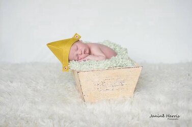
I find the grey in #1 kind of gloomy. It makes the kid pop, and, good job getting the hat separated from the background, but it's an uncomfortable color. Like concrete, or a rain cloud. It feels cold and dead, which provides a great contrast, but not so good context. For me, anyways.
OP
OP
janineh
TPF Noob!
amolitor said:I find the grey in #1 kind of gloomy. It makes the kid pop, and, good job getting the hat separated from the background, but it's an uncomfortable color. Like concrete, or a rain cloud. It feels cold and dead, which provides a great contrast, but not so good context. For me, anyways.
Get what you mean. Thought its nice for a boy.
OP
OP
janineh
TPF Noob!
janineh said:Get what you mean. Thought its nice for a boy.
Does adding some colour help??
Attachments
paigew
Been spending a lot of time on here!
- Joined
- Nov 15, 2011
- Messages
- 3,880
- Reaction score
- 1,826
- Location
- Texas (Hill Country)
- Website
- www.paigewilks.com
- Can others edit my Photos
- Photos NOT OK to edit
1 is my favorite but I would angle it a tiny bit so his head is higher than his body. I don't care for #2 (not my style) but it is done well!
OP
OP
janineh
TPF Noob!
paigew said:1 is my favorite but I would angle it a tiny bit so his head is higher than his body. I don't care for #2 (not my style) but it is done well!
I have one like you said too...
Attachments
Derrel
Mr. Rain Cloud
- Joined
- Jul 23, 2009
- Messages
- 48,225
- Reaction score
- 18,941
- Location
- USA
- Website
- www.pbase.com
- Can others edit my Photos
- Photos OK to edit
Derrel said:#2 is VERY cute! I've seen it done that way like a ZILLION times--on BLACK. It looks sooooooo much better done against a light backdrop! Good job on that. It's pretty close to perfect, I think. #1 IS QUITE "okay", while #3, ehhh, seems like it's just too far-away...the baby is so smalllllllllll...and it looks like just placed on top of a fabric-covered shooting table in front of a white screen. It's just not framed as tightly as I'd like to see it. Again,shot #2 though, dad and mom holdin' the newbie--YES! Skillfully done!
Thanks for the feedback. Is there anything you would critisis on the first one?
Well, on shot #1, the camera is above the baby,looking down at him, and there's a little bit more top-space above than is ideal, IMHO. I think it would look a bit better if it were cropped say, 20% closer, and less space were left above the baby. The camera is only a tiny bit above his back-line, so I think cropping off the extra space above him would really focus more attention onto his cute little face, sleeping expression, and chubby little baby arms. I would remove about half of the top space, and crop off MOSTLY on the left-hand side, and a crop off less on the right hand side, and it would entirely change the dynamic of the shot. As amolitor mentioned, the all-gray color scheme is, uh...a bit...let's call it "all-neutral" ! (lol)...so, I think cropping the frame the way I am talking about would give the shot more impact, more "immediacy"...all that expanse of gray,gray,gray is easily grasped just by color harmony, so I think eliminating the large,empty expanses of gray would really move the focus back onto the BABY, in a very good way.
here's a QUICKIE crop of it.
 If I were gonna make this as a final print, I would rotate it clockwise about 3-5 degrees, to get the head a bit higher than the buttocks are, and then crop it sort of like this.
OP
OP
janineh
TPF Noob!
Derrel said:Well, on shot #1, the camera is above the baby,looking down at him, and there's a little bit more top-space above than is ideal, IMHO. I think it would look a bit better if it were cropped say, 20% closer, and less space were left above the baby. The camera is only a tiny bit above his back-line, so I think cropping off the extra space above him would really focus more attention onto his cute little face, sleeping expression, and chubby little baby arms. I would remove about half of the top space, and crop off MOSTLY on the left-hand side, and a crop off less on the right hand side, and it would entirely change the dynamic of the shot. As amolitor mentioned, the all-gray color scheme is, uh...a bit...let's call it "all-neutral" ! (lol)...so, I think cropping the frame the way I am talking about would give the shot more impact, more "immediacy"...all that expanse of gray,gray,gray is easily grasped just by color harmony, so I think eliminating the large,empty expanses of gray would really move the focus back onto the BABY, in a very good way.
here's a QUICKIE crop of it.<img src="http://www.thephotoforum.com/forum/attachment.php?attachmentid=20584"/> If I were gonna make this as a final print, I would rotate it clockwise about 3-5 degrees, to get the head a bit higher than the buttocks are, and then crop it sort of like this.
Thanks for that. It is better this way.
Most reactions
-
 460
460 -
 291
291 -
 284
284 -
 256
256 -
 219
219 -
 203
203 -
 192
192 -
 185
185 -
 180
180 -
 165
165 -
 153
153 -
 136
136 -
 118
118 -
I
111
-
 102
102
Similar threads
- Replies
- 8
- Views
- 627

![[No title]](/data/xfmg/thumbnail/31/31743-3b294ee78fc71e7bfc025b01eafb0c2d.jpg?1619734986)