wxnut
TPF Noob!
- Joined
- Sep 9, 2004
- Messages
- 594
- Reaction score
- 7
- Location
- Wisconsin
- Website
- www.dougraflikphotography.com
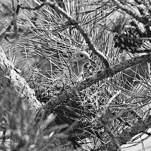
1.

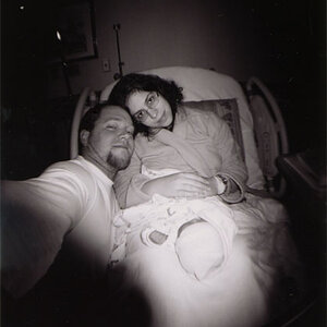
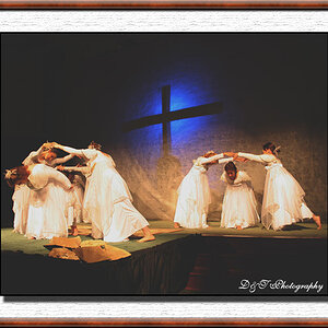
2. I meant this one to be dark, with the highlights of light from behind. Does it look good, or does it just look like a bad exposure?

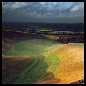
3.

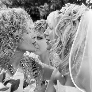
4. I like all the fuss over the bride.

5. Which looks better? 5 or 6

6.

7.

8.

9.

10.

11.

12.

13.

Doug Raflik
2. I meant this one to be dark, with the highlights of light from behind. Does it look good, or does it just look like a bad exposure?
3.
4. I like all the fuss over the bride.
5. Which looks better? 5 or 6
6.
7.
8.
9.
10.
11.
12.
13.
Doug Raflik
![[No title]](/data/xfmg/thumbnail/38/38729-27329be54dcb93a3723bad97259e6428.jpg?1619738702)
![[No title]](/data/xfmg/thumbnail/35/35955-01e9c8140cdcaac10d227d68e42ac0d4.jpg?1619737267)