latest wedding (with new ideas)

wxnut

TPF Noob!
Joined
Sep 9, 2004
Messages
594
Reaction score
7
Location
Wisconsin
Website
www.dougraflikphotography.com
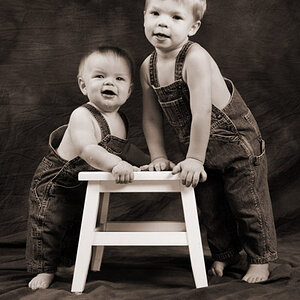
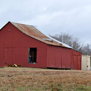
Here is my latest work. On the couple outside ones where it looks "not real", its cause it isnt. It was a BLAH overcast day and I wanted to spice up the pictures. I am going for something that will make people go "hmmm, thats different, but I like it". I selected the sky and used clouds in CS2, and then I darkened the windows and edges of the building. I then added glow. Comments?

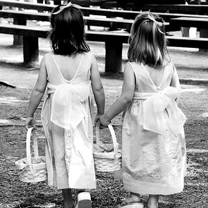
Also, I know most of you frown on selective coloring, but I did some "UN"traditional coloring. Comments?

1
IMG_1076s.jpg


2
IMG_1091s.jpg


3
IMG_1232s.jpg


4
IMG_1250s.jpg


5
IMG_1254s.jpg


6
IMG_1260s.jpg


7
IMG_1345s.jpg


8
IMG_1367s.jpg


9
IMG_1389s.jpg


10
IMG_1551s.jpg


11
IMG_1556s.jpg


Doug Raflik
[email protected]
 
I like the pictures and the Idea in number six, but I don't like the skies in 2 and 11. Maybe if you put a more realistic sky it would look better.
 
Nice work. I don't mind the added sky in #2...but it doesn't look as good in #11.
 
Sorry, but I can spot a photoshop clouds filter from miles away. It just doesn't look real. Take a picture of a nice sky and use that, not the filter.
 
I must agree, I think the skies look pretty bad in both. Too obviously computerized, and for me it actually detracts from the B&G in both shots. They may actually like it, it's all subjective, of course.

I think your strongest images here are the ones with the least amount of processing. Very simple, lovely wedding shots, with nice expressions and poses, ie #7 through 10. :thumbup:
 
Yeah, I agree about the skies. I think if you tried using a blue that was a little closer to white it would look more natural. The sky is never THAT blue. And, it almost never comes out that blue on camera, so that's what really makes it look odd. Those two are great shots, so I would love to see them with the sky redone. I would be willing to give it a shot for you if you'd like.
 
bowronfam3 said:
Yeah, I agree about the skies. I think if you tried using a blue that was a little closer to white it would look more natural. The sky is never THAT blue. And, it almost never comes out that blue on camera, so that's what really makes it look odd. Those two are great shots, so I would love to see them with the sky redone. I would be willing to give it a shot for you if you'd like.

it's not the blue, it's the clouds. They look too fake.

love this series, but no no to the sky.


pascal
 
Here's a quick try, I would certainly redo the clouds, but I think this is a pretty big improvement without having to go through the whole entire process again. What did the sky look like originally? A lot of the time if it's too white, it can be brought back in photoshop without going in and actually adding a completely new sky. Hope my example helps!

img1556smediumgb3.jpg
 
Yeah that IS a big improvement, but I think a real sky would look nicer :p
 
Thanks for the comments everyone. I guess I didnt fully explain in my first post. I was going for the fake look. Something to make it look like they were in some sort of fantasy land. I totally agree the sky looks fake, but I just wanted to try something "different and artistic". BTW the couple really liked them.

Thanks again for looking and commenting.

Doug Raflik
http://www.dougraflikphotography.com
 
You could get a realistic sky via a filter in photoshop.

Render clouds on a separate layer, transform layer/warp layer to get a perspective on it and make more depth to it.

You could the add some layer options and blendingmodes to it to add more drama to it,

the paste it inte the picture and colormatch it.

Added a quick fix, not optimal, but you get the picture :)
http://img01.picoodle.com/img/img01/6/12/25/f_weddingsi_700cm_7a3010a8.jpg
 
I love the pictures and I like your use of selective colouring. I understand why you chose to create a "fantasy-land" sky and although it isn't my style, I think you've accomplished what you were working for. Nicely done!
 
I'm not big on the added sky in any of these.

And, I normally don't like selective color, but there is something about #4 that works for me. I kind of like the idea that inside where the wedding and vows are taking place it is warm and lovely and intimate while the rest of the outside world is just blah.

I'm not liking it in #6 though. I think #1 is a really nice image as well. And, I love the compositon in #10.
 

Most reactions

Back
Top