Lily Artistic Portrait

Purified

TPF Noob!
Joined
Dec 27, 2004
Messages
24
Reaction score
0
Location
Minnesota, USA
Website
purified.smugmug.com
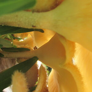
I have two versions of this, and I'd like to know how I can improve on them. I cannot for the life of me figure out how pale the skin should be in contrast to the flower, or if the skin should blend a little with it.

Also, if you favor one more than the other, or if you hate them altogether, please speak up! I'd love everyone's opinion on this. :)

flowerdownx.jpg


flower2x.jpg
 
Well, I seem to be the first to be seeing this - me being the least capable of all critics, but so there...

As far as preferences go: I prefer the first over the second. Even though I like to see eyes in portraits, I find these at an odd and slightly unnatural angle, which bothers me. Beautiful as the eye may be in colour.

In the first I like the high-key skin tone (if that is the expression to be used here?) and would not change the least bit about it, after you so worked on putting eyeliner and lipstick into the same colour category with the flower. Actually, that is the most appealing part of the picture and I am sure you wanted to achieve this effect and all I can say is: you did!

The cast-down look (or closed eye) creates a mood that I like along with the flower so close to the face and this mood is interrupted in the second with the chin up and so much of her neck showing - apart from the eye, but I have said that before.

The only thing that bugs me about the first is how obvious it becomes that the eyelashes are stuck to the lid...
 
I'm sure there is a way to fix the unsightly eyelashes, and to also make more eyelashes so the end of them is not so abrupt

Thank you so much for your advice!
 
for me i think the colours work much better in the second one, the first ones skin tones seem too blueish

my head tells me i should like the first one more, that the composition is better...

but my heart says the second one, and i think its because i can see the models eye

have you tried burning in around the bottom of the neck on the second one? i think this could take away a little bit of the distraction and really make the focus on the subject more
 
I like both of them. I agree about trying to fix the line of false eyelash in the top one - the viewer should never notice that kind of detail on the model! But I love the high key look of it, and the color interaction is great. Watch the skin tones.

I would prefer the second one because her eye is so clear and lovely - but try to get another focus point for it next time. I want to see some white on either side - it might not be as big a deal if BOTH eyes were visible, but with this crop it looks almost unnatural, as LaFoto was saying. And can we have the whole eyebrow, please? :)

She appears to be an excellent model for this type of thing; great face and skin - try again! I like the avatar image, as well. Good effort here. :thumbup:
 
I like the second one much more. Not only are the eyes very important for the emotion and the extra color, but the warm tones to the picture as a whole makes it more.... ok, I'm a chick, romantic and loving. thats the emotions that come to me.
The first is too cold and static for my taste.
the eyelash thing isn't so hard to fix.... if u feel it needs to be...
Great work!

Doli
 
Whoa! Creative thinking. Good job on the makeup. I like the second frame because of the warmer skin tone. The first frame works; depends on what you are trying to say.
 
Wow. I love both. I think MAYBE the second better because I love the eye. Awesome green eyes too.

I think the skin is fine in both. Especially the second. if there was pale skin like in the first it would hurt the picture.

The second is very sharp too. I love that.
 

Most reactions

Back
Top