C&C per req:
I'll assume that yours is a child photography website based on these images.
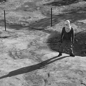
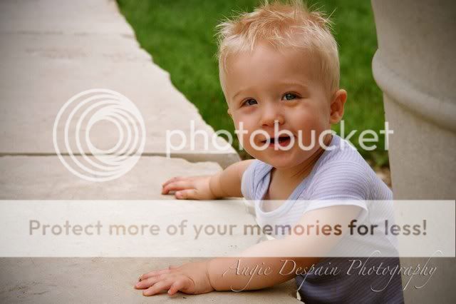
1. Nice capture, but the highlights are just a tad bright, especially given the light colour of his hair. I'd suggest down about 1/2 stop. The composition doesn't quite work for me in that the eye tends to follow the line of pilings right up and out the upper RH edge of the image.
2. Really nice, but the skin tones/WB seem just a bit warm to me. As well, the clipped hair is distracting.
3. This one seems just slightly soft to me, but good exposure.
4. I really like this one; this would be my vote for your website picture, but if you can, I'd suggest a re-shoot and have him looking just a little more toward you; not directly at the camera, but with just a bit more face visible.
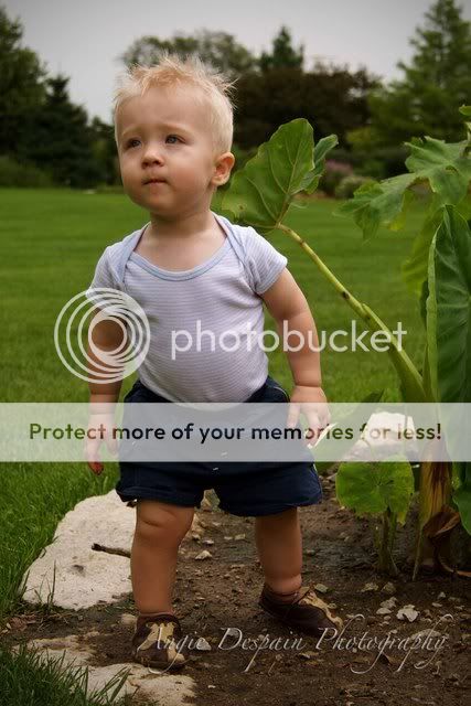
5. Another good capture, but he doesn't really look happy here; not what I'd suggest for advertising.
Just my $00.02 worth - your milage may vary
~John
They all seem pretty soft to me... are they not sharp overall, or maybe not sharpened for web viewing?
In any case.
IMO 1 is the best, but I wouldn't put it on my website as it lacks an emotional connection with the subject. It's still an OK picture, having the best direction of light used and also composition of all pictures shown.
The others seem like snapshots to me, with nothing spectacular calling out of them.
I want to say that first of all I am not a professional
#2 is my favorite.
One thing you should think about when doing this kind of work is the wardrobe your target is wearing. #1 would be really good but the color of his clothes does not blend with the background and it doesn't contrast. It should be one or the other IMO. I think you had the right idea and the picture looks nice overall, but that change in wardrobe to either blend or contrast a lot would help frame that better and deliver more emtion.
There is a lot of difference in personal preferences for child photograhy.
I tend to like brighter images when it comes to children and I don't feel that your highlights are too bright in #1. They might benefit from a small bit of dodging, but not much.
They do seem a tad bit soft, but you've got some great natural looking colors going on. 2 and 5 actually look a bit dark to me. I think it would be worth it to see how they look brightened up just a bit. They would be the two I'd pick for your website. #3 is cute, but just too much like a mug shot I think.
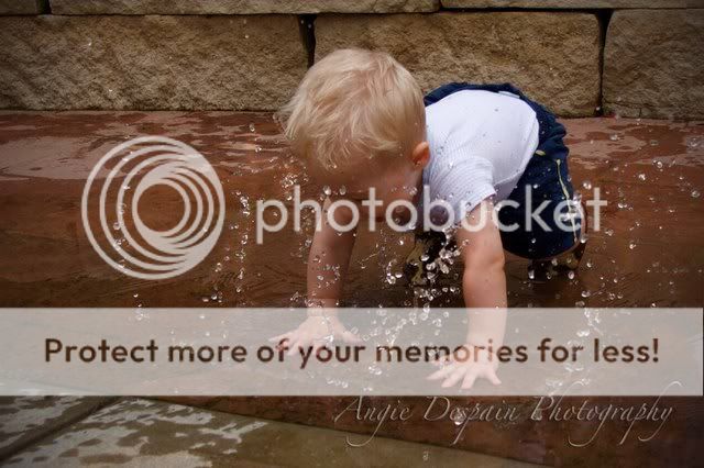
#4 is a cute action shot that I'm sure the parents will appreciate. It shows his fun personality.
You might also benefit from doing a bit of dodging on the eyes just to lighten them up a bit.
Overall I think you did a nice job.
I also think you have nice control of your depth of field. Your backgrounds are nicely blurred.
Crimsonandwhite and Ajay-
Thank you for your replies. I really appreciate them.
As for the softness of the pictures, I have figured out why and that will be fixed for further shoots. I have also already learned so much from reading these comments and figuring out what I need to do to improve. Thanks so much everyone!
Ok, did a few edits with your permission! These were quick so they might be a bit rough.
Basically I did a levels and curves adjustment to add some light and contrast. I also bumped the saturation to a 5 - might be too much, his skin went a little orangey. On the one where you can see his face I dodged his eyes just a bit to bring some more light into them.
I do have a bold editing style so they might be too much for your taste, but you kind of get an idea. They probably could do with a bit less saturation on my part. Anyway, the befores are on the left. I can go into more detail if you want.
I like them. Thanks for taking the time to show me how they can be improved. I've spent the morning figuring out a few things that will definitely be helpful and improve my pictures. Thanks again.


")


![[No title]](/data/xfmg/thumbnail/30/30877-ef8d8a8cf110d5566382bb4e8a76fd3f.jpg?1619734492)

![[No title]](/data/xfmg/thumbnail/30/30879-16ad830465e571dee0a784c7fa122909.jpg?1619734493)