spako
TPF Noob!
- Joined
- Jan 24, 2006
- Messages
- 1,097
- Reaction score
- 10
- Location
- Luxemburg
- Website
- spako.deviantart.com
- Can others edit my Photos
- Photos NOT OK to edit
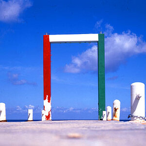
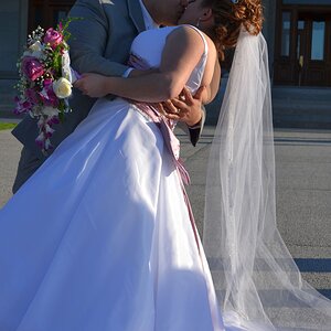
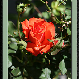
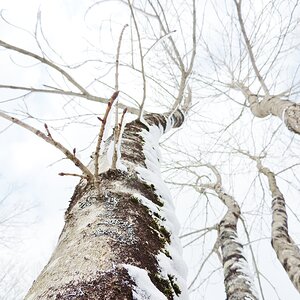
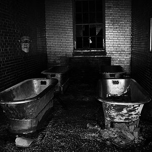
I can't decide which one of these looks best... could you help me out?
1.

2.

3.

4.

1.
2.
3.
4.
") cool title!
cool title!