Frequency
Been spending a lot of time on here!
- Joined
- Oct 17, 2010
- Messages
- 8,864
- Reaction score
- 683
- Location
- Calicut, Kerala,India
- Website
- www.photosenzitive.com
- Can others edit my Photos
- Photos OK to edit
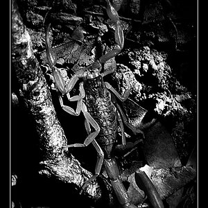
From old stocks

C&C please
Regards
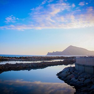
C&C please
Regards