Logo, Watermarks & Gorgeous ladies (NSFW)

cauzimme

No longer a newbie, moving up!
Joined
Nov 3, 2009
Messages
469
Reaction score
362
Location
Montreal
Can others edit my Photos
Photos OK to edit
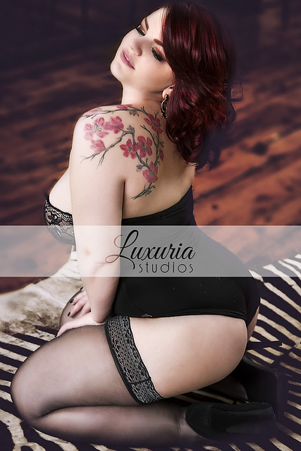
I've juste received my logo and some watermarks for my proofs :)
(Girls often pick more photos, and I've been screwed quite often so now my watermark will appear till full payment)

Oh and I did a shoot on wednesday, here's the first selected images.

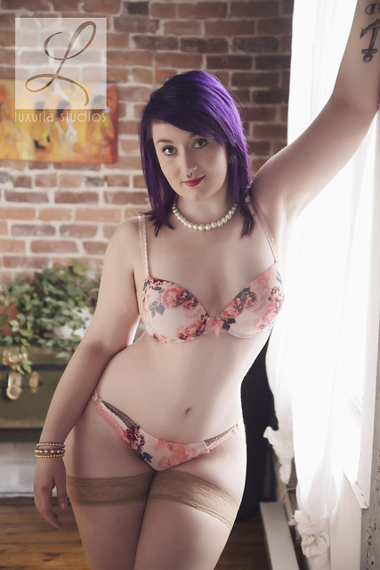
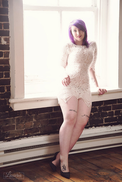
Please C&C the watermark and logo (I know you don't like them here, but think business wise?)
25595723393_8772a55b69_z.jpg


26198388795_cf5e36824b_z.jpg


25593640074_70551c4b29_z.jpg


26198368775_d47e7f74e6_z.jpg


26105920362_5a2b166459_z.jpg


25595706983_1142495c16_z.jpg
 
Last edited:
I like the logo and watermark (except the band across the photo). I know you've got a business to run, as do I. I have nothing against a watermark on unpaid photos like on Flickr and Facebook. It's not so much so people dont steal my photos, because you can't stop that, but more so people know who took the photo. If they want a copy, or want to hire me, they'll know where to find me.

The worst thing you can do is have an intrusive watermark that ruins the photo. Your pictures will inevitably be posted without your permission, the logo should look good when it happens.

I like yours.
 
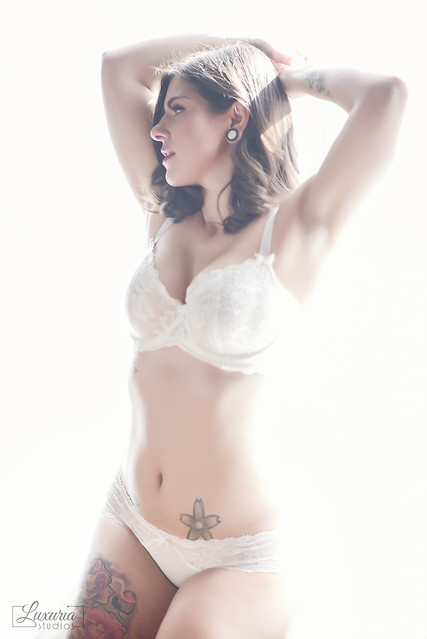
I think it looks great, but mostly the smaller one that you have in the bottom corner. I do something similar, that serves more as branding than protection. People still can-and will, still your images, but having the big watermarks across your photos just looks bad. Your smaller watermark looks nice, professional, and unobtrusive
 
Very nice set; the last one is cropped a little tightly for my taste, but that's minor. I like both the logo and watermark. As far as the band in #6, it's tastefully done, but I might drop the opacity a bit more, as it's seems a bit intrusive as-is.
 
I like the small logo a lot. As for the big band across the unpaid photo, (thinking business wise) I'm all for it! As John said a bit more opacity might be good but it's your choice.
 
Your small logo is nice, but I don't know that it adds either protection or branding to the photo. It is so small that it is relatively easy to crop or 'shop out, and even if it remains on the image it is hard to spot. Between the small size and the fine lines of the brackets and text, you have to hunt for it. You only really care if the photo shows up on someone else's site (if a viewer is seeing it on your site, they already know where to go so branding doesn't matter), and I find this size too easy to miss - there's no reason for the viewer to suspect it doesn't belong on that site, hence no reason to hunt for a logo.

The larger L-block logo is more suitable for both branding and protection. You could possibly make it a bit smaller or reduce the opacity a touch if you're worried about it interfering with the image, but even at a glance the L-block is apparent to the eye.

For proofing purposes I like the band across the middle. I've been known to do something similar, though mine actually includes the word "proof". That way it's clear that this might not be a final image, that a) it might not be the best representative of your work and b) it's probably being posted without your permission.

Just my $.02...
 
On unpaid photos I would lower the opacity slightly and put it on every proof photo I sent out. Anything smaller than that, you will have someone crop it out and steal the photo, even if the crop really mess up the photo.
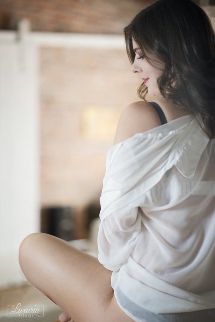
On paid photos, I really like your watermark as is! :) But watch your placement, on #3 the watermark is part way on her leg, It would look much better in the lower right. :)

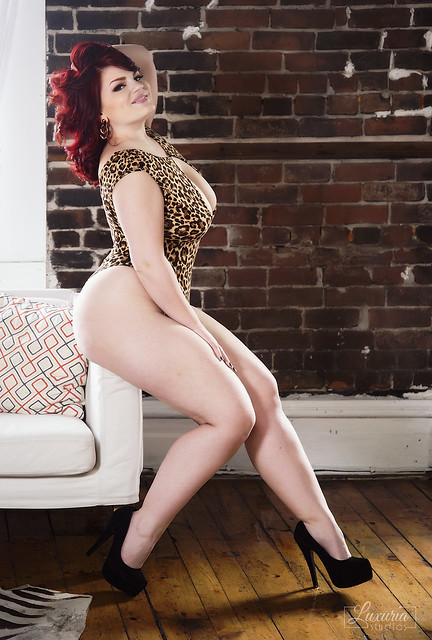
As for the photos, the whole set is really nice, and I love everything about #4!!!:Hail.sml:
 
I only watermark my photos because a mustache makes everything look better.
 
Thank you very much for the C&C, I was at first affraid that the logo would be too big for the girls, but so far no complaints. And for the watermark they understand my points. Overall I feel a logo is a small step, I feel more professionnal, I don't know it just seems more real, I now call myself a photographer XD
 
looks good. especially the small, rectangular one. the right combo of sensual and classy, which is what i imagine you're trying to project in your brand.
 
Multiple thoughts...

1. On the logo...depends up on the primary purpose. I think in most cases, it's as Trey and Jsecord....you want people to know it's you in order to get business. You've got a small, classy logo that looks lovely. The one branding question you should consider for that is if you want to use consistent placement (i.e.: lower left corner every time) or vary with the photo (so it's still there but doesn't detract). Pros and cons to each approach. As to the band....talk to a wedding photographer and they'll tell you how people steal proofs and make copies. So while I hate a band running across, I'm also not running a photo business and I completely understand the issue. I personally (for unpaid proofs) would be more likely to provide a lower quality photo with a large but faint logo in one corner that says "Luxuria Studio, sample (or proof). It's not perfect b/c many of your clients are just looking for photos for websites (so lower quality is fine for the purpose). The thing to keep in mind is that if someone REALLY wants to steal your work, they will and a logo won't stop it. So that's why I said it depends on the purpose. The small, classy logo in the corner encourages people to keep it there (rather than crop it) and hopefully gets you business. The proof version allows people to get a sense of the photo but still makes it a little tricky to try and steal it without paying you for your work.

2. On the photos...your work continues to improve on many levels. Your use of backgrounds/backdrops, staging the photo is so much better than the initial work you first submitted. The poses are much better. You're producing photos that don't have a head cut off or a face blurred out yet still show the ability to get a good photo while protecting privacy. Lighting is much more effective...not as extreme range. Purely from a technical standpoint, your work has improved significantly since you started submitting stuff here.

Personally, I love #3 and #4. Nice poses, lovely girl, good composition. #5--love the backlighting in her hair. #6 is also well done (though I think the angle probably makes her look heavier than she is). #1 and #2...nice photos but in #2 you cut off an arm (if you showed the rest of that arm going up, it would be a more interesting composition AND it would make her look a bit thinner). For #1, I think a slightly different pose--leaning against the window sill is going to expand those thighs, b/c her right arm is blow out, the right hand appears out of nowhere...to me that's the least effective of the 6 shots even though each photo has some appealing elements.

Good stuff--thanks for sharing!
 

Most reactions

Back
Top