London Calling

peter27

TPF Noob!
Joined
Mar 21, 2013
Messages
668
Reaction score
196
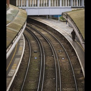
Following the recent discussion of selective colour, I have been looking at some of my photos with a view to seeing which might work with this method. I think this one does quite well:


View attachment 50974

All thoughts welcome
 
It might, IF the rest of the scene weren't so imposing. I look at this and wonder why you want me to look at a 'phone box when there's the tower clock and the tall buildings all around; it doesn't seem to work from that perspective, IMO.
 
It might, IF the rest of the scene weren't so imposing. I look at this and wonder why you want me to look at a 'phone box when there's the tower clock and the tall buildings all around; it doesn't seem to work from that perspective, IMO.

I think it depends. The title I've given this is London Calling, so it should obviously say London (and nothing says London like Big Ben), but at the same time the iconic red call box is the subject, and the selective colour focuses the attention on this - I think.

Edit: I see what you mean about the other domineering components, of course, and this was always MY bug with this photo as a colour shot - the call box was a bit swamped even though, for me, it was always intended as the real subject.
 
Last edited:
I think some tinkering with your image proves that tirediron has a valid point. And actually with this iconic London phobe box - do we really need Big Ben to prove that it is London? Most piople will immediately think London as soon as they see the red box. But back to your initial statement - yes, I think you are right, selective color can work with some objects. London red double decker bus is another one. Having said that a color picture of a red box on a natural monochrome background, like snow looks so much better. I have a good picture of a red box in a snow, but sadly can not post it here, it is not mine, and I do not have a link.

$london Calling (small).jpg
 
I think some tinkering with your image proves that tirediron has a valid point. And actually with this iconic London phobe box - do we really need Big Ben to prove that it is London? Most piople will immediately think London as soon as they see the red box. But back to your initial statement - yes, I think you are right, selective color can work with some objects. London red double decker bus is another one.

View attachment 50979

While not as imposing, this image certainly makes the use of selective colour seem much more appropriate (and, FWIW, you can't actually see Big Ben in any of the shots!).
 
I think some tinkering with your image proves that tirediron has a valid point. And actually with this iconic London phobe box - do we really need Big Ben to prove that it is London? Most piople will immediately think London as soon as they see the red box. But back to your initial statement - yes, I think you are right, selective color can work with some objects. London red double decker bus is another one. Having said that a color picture of a red box on a natural monochrome background, like snow looks so much better. I have a good picture of a red box in a snow, but sadly can not post it here, it is not mine, and I do not have a link.

View attachment 50979

I think some tinkering with your image proves that tirediron has a valid point. And actually with this iconic London phobe box - do we really need Big Ben to prove that it is London? Most piople will immediately think London as soon as they see the red box. But back to your initial statement - yes, I think you are right, selective color can work with some objects. London red double decker bus is another one.

View attachment 50979

While not as imposing, this image certainly makes the use of selective colour seem much more appropriate (and, FWIW, you can't actually see Big Ben in any of the shots!).

Thanks both for your valuable input, I really appreciate it.

Yes, the bell can't be seen here but Big Ben is what everyone knows this tower as - everyone except my eight year old daughter that is, who calls it Big Bob :)
 
OP, yes me too. (thinking about sel color) I was out shooting his weekend. I saw lots of shots I would try as selective color. But don't have the tech know-how to do it. I also don't know how the shots would work out (keeper or not), but would be willing to try.
 
Last edited:
I like the second crop without big Ben. Would like to see the inverse as well, I think it could have great impact if there phone box was in mono and everything else in colour.

Just a thought!

Sent from my Nexus 7 using Tapatalk HD
 
I think some tinkering with your image proves that tirediron has a valid point. And actually with this iconic London phobe box - do we really need Big Ben to prove that it is London? Most piople will immediately think London as soon as they see the red box. But back to your initial statement - yes, I think you are right, selective color can work with some objects. London red double decker bus is another one. Having said that a color picture of a red box on a natural monochrome background, like snow looks so much better. I have a good picture of a red box in a snow, but sadly can not post it here, it is not mine, and I do not have a link.

View attachment 50979


I like both crops! Could be a postcard, poster or sticker
 
Last edited:
Here is my selective color from 1974. I didn't know it was selective color back then.

ArtSlant - Coat Hanger

Here is the story from my book...

‘Coat Hanger’ ~ Los Angeles, CA 1974
 

This photograph (actually one similar, since the original was a one-of-a-kind) was the first photograph I had accepted into a museum. The story behind it is an interesting one. I had taken the photograph with a Hasselblad 500CM in the coat room at the company I was working for as a process cameraman. I didn’t like one of the work prints I had made at home, so I trashed it partially processed.

When I was emptying the trash can in my darkroom later that week, I noticed the print of the coat hanger had become solarized. It had also developed an interesting stained patina from the chemicals. So, I pulled it out of the trash and finished processing it. I dry mounted it and put it in my portfolio.

A while later, I was showing some of my prints at the Los Angeles County Museum of Art. (Back in the day, you could actually get the curator on the phone to set an appointment!) The then curator of photography liked the coat hanger photo and it was put in LACMA‘s permanent collection. I didn’t tell the curator the story behind it. But sometimes our mistakes can still pan out.


I'm glad no one told me selective color was crap back then. I would have never shown it to the curator. I got an issue now that is bothering me some. I got a shot I like that I am putting into a gift proposal to a museum. It is not selective color, but it may be as little 'spring break-ish / girls gone wild' type of pix. I like it anyway...esp the title. You never know what a museum likes or hates. Just got to put it out there. They have picked shots I would have never offered them.

ArtSlant - 'Princess of Ross County...in the Style of Cartier-Bresson's Rue Mouffetard Paris 1954'
 
I can understand everyone's critique, but in this instance I like the original selective color photo. Given the photo's title, the phone booth is given "life" and suggests an empty ringing phone booth.
 
I like the second crop without big Ben. Would like to see the inverse as well, I think it could have great impact if there phone box was in mono and everything else in colour.

Just a thought!

Sent from my Nexus 7 using Tapatalk HD

The crop with BB also has a nice comparison type of thing going on. 2 strong verticals.
 

Most reactions

New Topics

Back
Top