Look away

DramaDork626

TPF Noob!
Joined
Jun 21, 2005
Messages
294
Reaction score
0
Location
NJ
Website
www.dramadork626.deviantart.com
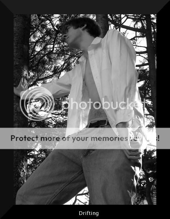
taken with olympus digital...no flash...*sigh* do i really have to go through all these details?
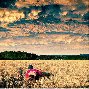
This was taken outside in a wooded area on my campus...
I told him not to look at the camera, cuz I wanted him to be seemingly drifting off in emotion...but you can still see his expression. So anyway, tell me what I can do to make it look better...
TOMUKUN.jpg
 
Not sure I like the angle it's taken from. His legs look huge compared to the rest of his body.

Colin
 
What exactly is it that you were going after here? Were you going for a moody picture, an emotion, or trying to accent his height? For me, the angle is accenting his height and makes him look like a giant b/c all you have for a reference is the trees. I think the manner in which you've cropped it also makes him look like a giant accenting height and little else.
The pose: I'm not sure the unbuttoned shirt and thumbs in the pocket (again) really does anything for this picture. Perhaps try a variety of poses to get a different look.
The crop: Why did you cut his right thumb off? Everything else is in frame (except his legs/feet of course which was obviously intentional) and I'm not sure cutting his thumb off was intentional. The crop at the top seems awkward for me as well, b/c to me, it almost looks as if he has to tilt his head to fit into the picture if that makes sense (kind of like a very tall person tilts their head when going through a low doorway).
I think any emotion that you were trying to capture is lost in the fact that you see little detail of the face and then only in profile.

Overall, I think the angle did most harm to this picture.
 
well I think the angle is the coolest part...tom is 6'7, he is gonna look tall no matter what, and quite frankly I wasn't going for TECHNICALITY! This is one of those images were you have to be observant for more than a second and look around the shot. Sorry I don't normally argue but this angle in the shot is something I don't want to change. And is isnt going to change. It's different, yes, but that is what makes it art. You don't have to agree with me. But this just had to be said. I do agree cropping off his thumb was kind of wierd, I didnt realize I did it till later. But I think that can be pardoned. The thing is tom is extremely tall and has long limbs, something of his usually ends up being cropped off...cant really help that. He is an exellent model though.
 
He probably IS an excellent model, but in this instance he looks like he is lurching through the woods, gangly and without form. I must agree with the others; this low angle isn't doing much to convey that he is "drifting off in emotion", which seems to be what you were after in this image.

If you believe you succeeded, then you are correct because art is subjective and we all see what we want to see. If you are basically satisfied with what you've accomplished, I would ask you to consider posting in the general gallery, rather than argue or debate the critiques or comments of other members in this one.

Remember, you must be mentally - and emotionally - prepared to hear things you may not like when you post here. :)

I like your idea, but maybe take him out again and get on a level with his eyes, so as a model he can convey the feeling you are trying to capture. Trying several angles, as was suggested, is a good idea. And make sure he is completely within your frame, so the unfortunate thumb-cropping doesn't happen again.
 
yah... i know i really shouldn't argue with people...and i do want it critiqued...I only argued about the angle because it was the part of the picture I was most proud of, everything else doesn't bother me...
 

Most reactions

Back
Top