WesternGuy
Been spending a lot of time on here!
- Joined
- Dec 23, 2010
- Messages
- 5,281
- Reaction score
- 1,219
- Location
- Calgary, Alberta, Canada
- Can others edit my Photos
- Photos NOT OK to edit
First impressions,
#1. Not sure why this is tilted(?) - people usually like to see flat horizons. Also the red in the trees in the background appears to be oversaturated.
#2. IMO, the best one of the bunch. You might want to think about using a polarizer for these types of scenics as it may help to cut the haze in the distance - not always, but sometimes and it might even darken the sky a bit. The image gets a little fuzzy in the distance, not sure if this is because of the compression that occurs when you shrink it for the web, or the glass you used, or the aperture you used for the image.
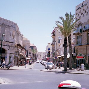
#3. Interesting street/building scene - needs to be straightened. In my opinion, the pipe(?) on the left should be vertical - compare it to the "poles" in #5, which are vertical. You took this looking up I'll bet, nevertheless, it is still possible to straighten it so it looks like it was taken on a "level" position.
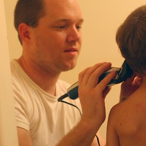
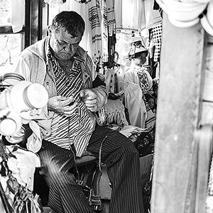
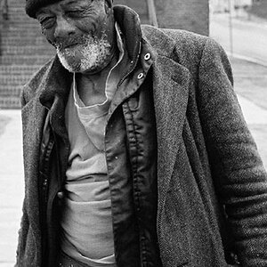
#4. Interesting street scene - you might want to think about shooting some of these using the portrait mode - landscape mode image here is a bit cluttered.
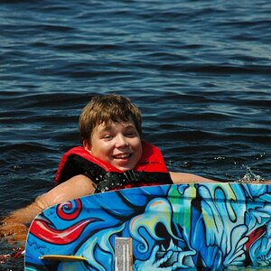
#5, 6 & 7. These do nothing for me - they are simply nice snapshots. #5 is way overprocessed IMO and the hood of the car is blown out. The flare in #6 is distracting and does nothing for the image, as well, the sky is blown out.
I think that you might benefit from doing some reading on compostion and I would encourage you to surf the web, but you could start with - Advanced Composition -- Part I - there are two following web sites with the links at the end of the site. As well, have a look at this one - PhotographyComposition Articles Library as there are a number of links to sites on composition. There are a number of books that have been written on composition - you might want to look at one by Bryan Peterson called Learning to See Creatively - Amazon.com: Learning to See Creatively: Design, Color& Composition in Photography (Updated Edition) (9780817441814): BryanPeterson: Books. There are lots of others.
My 0.02¢ FWIW.
Cheers,
WesternGuy
#1. Not sure why this is tilted(?) - people usually like to see flat horizons. Also the red in the trees in the background appears to be oversaturated.
#2. IMO, the best one of the bunch. You might want to think about using a polarizer for these types of scenics as it may help to cut the haze in the distance - not always, but sometimes and it might even darken the sky a bit. The image gets a little fuzzy in the distance, not sure if this is because of the compression that occurs when you shrink it for the web, or the glass you used, or the aperture you used for the image.
#3. Interesting street/building scene - needs to be straightened. In my opinion, the pipe(?) on the left should be vertical - compare it to the "poles" in #5, which are vertical. You took this looking up I'll bet, nevertheless, it is still possible to straighten it so it looks like it was taken on a "level" position.
#4. Interesting street scene - you might want to think about shooting some of these using the portrait mode - landscape mode image here is a bit cluttered.
#5, 6 & 7. These do nothing for me - they are simply nice snapshots. #5 is way overprocessed IMO and the hood of the car is blown out. The flare in #6 is distracting and does nothing for the image, as well, the sky is blown out.
I think that you might benefit from doing some reading on compostion and I would encourage you to surf the web, but you could start with - Advanced Composition -- Part I - there are two following web sites with the links at the end of the site. As well, have a look at this one - PhotographyComposition Articles Library as there are a number of links to sites on composition. There are a number of books that have been written on composition - you might want to look at one by Bryan Peterson called Learning to See Creatively - Amazon.com: Learning to See Creatively: Design, Color& Composition in Photography (Updated Edition) (9780817441814): BryanPeterson: Books. There are lots of others.
My 0.02¢ FWIW.
Cheers,
WesternGuy
As an Amazon Associate we earn from qualifying purchases.
")

![[No title]](/data/xfmg/thumbnail/42/42066-badd1780980376f04f261f985a608adf.jpg?1619739998)

![[No title]](/data/xfmg/thumbnail/37/37131-0af98967b391a8bd22ce1d14f6afb9cc.jpg?1619737884)