Looking for some constructive criticism for my portfolio!

adventureneed

TPF Noob!
Joined
Nov 6, 2016
Messages
1
Reaction score
0
Can others edit my Photos
Photos NOT OK to edit
Hello everyone!
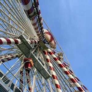
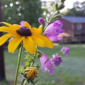
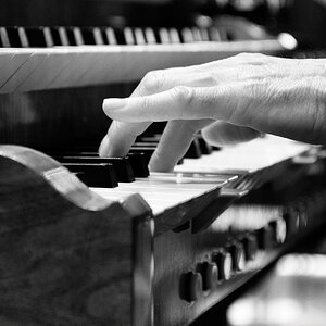
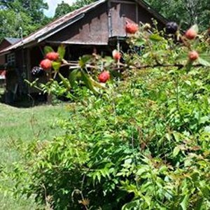
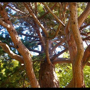
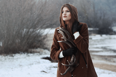
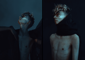
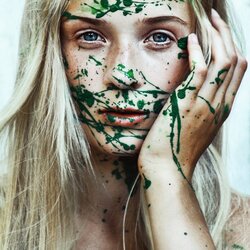
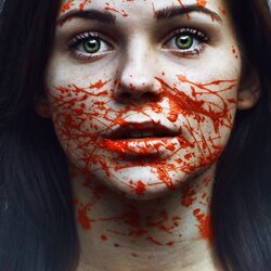
I'm 18 years old hobbyist photographer. I am a really fresh person in this forum, however, extremely pleased to have found this community. However, it's been a long time since I have had some kind of feedback about my photos. Take a look and any constructive criticism is welcome!
 

Attachments

  • IMG_0463x.png
    IMG_0463x.png
    242.6 KB · Views: 161
  • IMG_2192c.png
    IMG_2192c.png
    260.9 KB · Views: 163
  • IMG_8951bc.png
    IMG_8951bc.png
    240 KB · Views: 160
  • IMG_3874.png
    IMG_3874.png
    292.6 KB · Views: 168
  • IMG_4059.png
    IMG_4059.png
    294.9 KB · Views: 143
  • Untitled-2.png
    Untitled-2.png
    302.2 KB · Views: 159
  • IMG_7402app.jpg
    IMG_7402app.jpg
    110.3 KB · Views: 147
  • aaa.jpg
    aaa.jpg
    93.7 KB · Views: 182
  • IMG_5250aaa.jpg
    IMG_5250aaa.jpg
    85.1 KB · Views: 161
  • IMG_0208a.png
    IMG_0208a.png
    231.2 KB · Views: 158
  • IMG_0444.png
    IMG_0444.png
    161.9 KB · Views: 165
Mostly too dark for my taste. If you are not looking for them to be dark, is your monitor brightness turned up too high?
#1 I like (apart from being too dark)
# 2 I would prefer to see the top of the lass's head and less throat.
#3&4 I also like much as they are (but still too dark).
The rest are too contrived for me.
 
If you are shooting for images that convey dark and troubled, then you've nailed it, I suppose.

Not my bag, but to each his own.

The images convey a lot of work in post, so I suppose the lack of sharpness was intentional?
 
Welcome to the forum. :D
Apart from dark some of the images could be quite decent. I completely fail to understand though why you would take a pretty girl and splash paint across her face. Is that supposed to be artistic? I think you've got talent, get the basics right before you go arty farty. Arty will be cool to your friends but I doubt if your friends will turn into paying customers. Sorry to be blunt but I'm an oldie and I think you're wasting yourself on this genre. The only one I really like as is is the girl holding the antlers.
 
Agree with Granddad. You have a good eye and real talent, but the whole dark thing you're going for just doesn't do it for me. OTOH, my wife and some of her buddies met Garth Brooks where he was performing before he hit it big. They encouraged him to keep his day job, so what do we know, right? :D

BTW, welcome to the forum! Please stick around and share. We don't have to agree in order to profit from each other's opinions.
 
OTOH, my wife and some of her buddies met Garth Brooks where he was performing before he hit it big. They encouraged him to keep his day job, so what do we know, right? :D
:clap: :laugh2::laughing:

Don't let folks like us put you off! We have a point but one day we may have to eat our hats as your paint splash portraits sell for millions (I still won't buy one)! ;) :dob:
 
Many of these look like they were processed using a popular Lightroom overlay (preset) called New York Style...lowers the overall color of almost everything, except reds and oranges...

A few are weaker than the majority, like 208a, and untitled2, and would probably be better removed. You show a tendency toward putting the eyes very far toward the tops of vertical images, and of using unsymmetrical catchlights in the eyes (see 0463 and 208a), which hurts the images.

Lots of image processing going on here...more "processing" than "content". Subjects are young and beautiful, which makes a lot of sense for an 18 year-old photographer to shoot,m since you're likely surrounded by young, attractive people.

One thing about this processing style: it is very powerful. The BLACK splotches in 8952BC and in 2192 c really stand out in this overall diluted color type off processing; this is something that new York Style images tend toward: unnatural blackening in spots on skin-tones.

Hard to know what you want in terms of "constructive criticism" on a group of 11 images; too many to comment on in any substantive way, except to say that there are three that need to be eliminated, and to note that these are thematically related mostly by their processing style and similarity of subject matter.
 
IMO, post-processing needs to spring from the image and there should be an intrinsic meaning/connection between what was done and the underlying subject.
In all/most of your images the intended emotional impact of the editing just seems to be just laid on top of essentially neutral faces.
In this one, for example, why is it cropped so much on the top, yet her neck is included?
Why is she off center so much?
Why are there drops under her chin?
That red stuff doesn't look like blood, it doesn't follow gravity.
What relationship does the look of the editing have with the subject?

This is sort of emo gone wild.
Decent, even very nice, technical stuff but incoherent.

upload_2016-11-7_10-57-23.png
 
I find this batch of images flat, mundane and to much like all the other niche-stream photographs to be compelling in any meaningful way.
 
Welcome to the forum!

As Derrell mentioned, too many to really look at or critique, not that Im qualified anyway.

Attention span of people is like 10 seconds so try two three.

I like the general look you've shown here and have seen this kind of stuff on Flikr. I think there is a genre there where you take a portrait and mutilate it. I like that your mutilation ( paint) is obviously fake, the gore ones are a bit dark for normal/ public peoples taste.

Nothing wrong with low key but you got riped for it, why I dont know. My wife hates it ( low key) as well so Im forced to lean towards high key portraits in my work and learning curve.

Keep it up! Try posting something a bit different for critique next time or less pics at least, it sure seems like you have a talent and knowledge of the camera and post too.
 
Nothing wrong with low key but you got riped for it, why I dont know. My wife hates it ( low key) as well so Im forced to lean towards high key portraits in my work and learning curve.
There is a difference between low key and dark. In a low key picture, the dark tones dominate but the light tones should still be light - and the dark parts should still have texture. In a dark picture, there are no light tones and the dark parts have no detail.
 
Ok, well, thats not what I see so therefor the questioning why.

Some of the photos are actually quite light and therefor they have presented their capabilities of being able to do a wide range of tones.

@john.margetts do really only see " dark" here and not low key/ well lit?
2-3-4-5-7-8 all nicely lit, not even low key IMO.

Its the best set Ive seen here thats non- bird, in a long time so I think we could all be a bit more encouraging in or CC.

-And the thunder rolls.-

I'd go so far as to say that these are extremely well lit but once again I'm certainly not qualified besides having two eyes and devoting a few hours a day to photography.
 
No problem with the lighting. It is the processing - the shadows lack most of the detail that should be there. Some of the backgrounds are very light but not the subjects. In the third picture both the hat and coat are lacking detail -there is a streak of flare across the bottom of the picture which lightens the coat but flare is not the way to do it.
 
Ok, well, thats not what I see so therefor the questioning why.

Some of the photos are actually quite light and therefor they have presented their capabilities of being able to do a wide range of tones.

@john.margetts do really only see " dark" here and not low key/ well lit?
2-3-4-5-7-8 all nicely lit, not even low key IMO.

Its the best set Ive seen here thats non- bird, in a long time so I think we could all be a bit more encouraging in or CC.

-And the thunder rolls.-

I'd go so far as to say that these are extremely well lit but once again I'm certainly not qualified besides having two eyes and devoting a few hours a day to photography.
I don't really have a problem with the lighting it's just this style has been done too many times. The first time someone did it it was new and unique; the second time someone did it it was just redoing something new and unique but now it's become routine I like things that are different that's all and that's what I mentioned in my critique.
Dark imagery can be popular just look at Batman.
 

Most reactions

New Topics

Back
Top