deebert
TPF Noob!
- Joined
- Nov 10, 2010
- Messages
- 66
- Reaction score
- 3
- Location
- Missouri
- Can others edit my Photos
- Photos OK to edit
Hello! I've been mostly lurking all over TPF for the last month and I'm finally brave enough to post some of my photos. For now I am not accepting a dime (except from my brother who bought me my first NBA tickets out of the goodness of his heart) until I am more confident in my abilities. I know I can take good pictures but I'm not always consistent, so that is what I'm working towards.
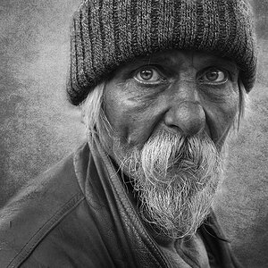
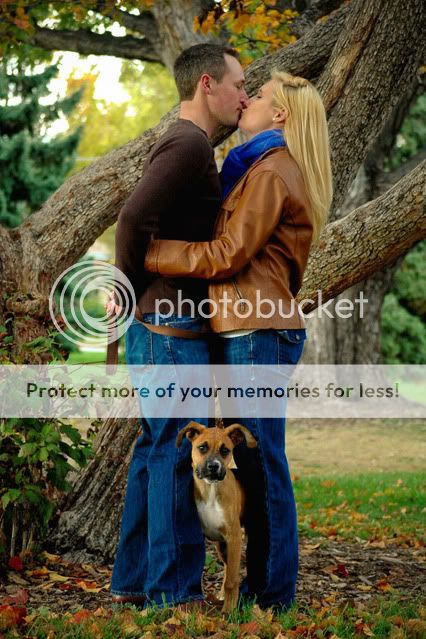
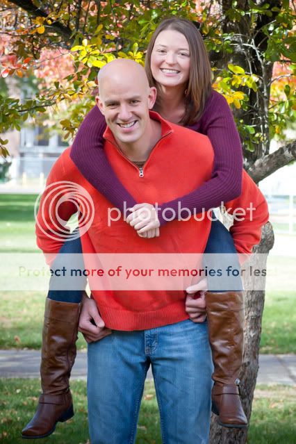
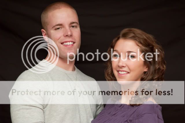
Here are a few examples of recent photoshoots that friends have graciously volunteered for (hey, they get free pictures, what have they got to lose!). I've learned something new each time (I shot in .jpg for my first few until I found this forum and didn't know how to change where my camera was auto focusing...if that is any indication) and have been incorporating this new knowledge using baby steps. I'm asking for C&C on anything that is standing out to you or that you think might make for a better photograph (lighting, PP, posing, angles, annoying things that should be cloned out that I missed, etc.).
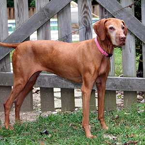
1.

2.
3.
These were both shot inside with a mix of light. There are 4 large windows behind me with my SB-400 bounced off of a reflector or the ceiling...now that the weather is getting cold I have been experimenting with indoor ideas. I realized after these 2 shoots that a black background is hard to work with if they have dark hair because the hair blends into the background. I'm thinking gray might be a better option? No budget yet to afford umbrellas or soft boxes, so I'm trying to work with what I have.
4.
5. (I should have directed her to wear long sleeves but they are both avid Nebraska fans and wanted to sport bright red...)
Thanks!
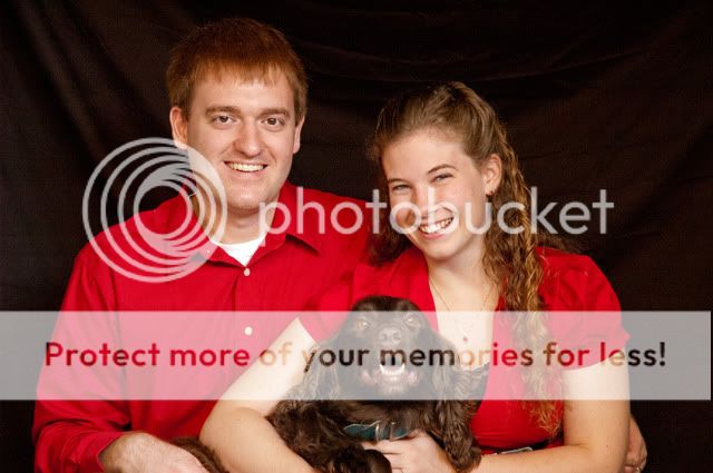
Here are a few examples of recent photoshoots that friends have graciously volunteered for (hey, they get free pictures, what have they got to lose!). I've learned something new each time (I shot in .jpg for my first few until I found this forum and didn't know how to change where my camera was auto focusing...if that is any indication) and have been incorporating this new knowledge using baby steps. I'm asking for C&C on anything that is standing out to you or that you think might make for a better photograph (lighting, PP, posing, angles, annoying things that should be cloned out that I missed, etc.).
1.
2.
3.
These were both shot inside with a mix of light. There are 4 large windows behind me with my SB-400 bounced off of a reflector or the ceiling...now that the weather is getting cold I have been experimenting with indoor ideas. I realized after these 2 shoots that a black background is hard to work with if they have dark hair because the hair blends into the background. I'm thinking gray might be a better option? No budget yet to afford umbrellas or soft boxes, so I'm trying to work with what I have.
4.
5. (I should have directed her to wear long sleeves but they are both avid Nebraska fans and wanted to sport bright red...)
Thanks!
Last edited:
")