Make Shift Studio Shots: C&C

JackRabbit

TPF Noob!
Joined
Dec 13, 2009
Messages
236
Reaction score
1
Location
Southern California
Website
www.flickr.com
Can others edit my Photos
Photos OK to edit
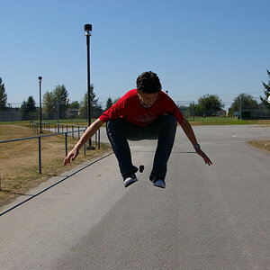
Josh came over and took a few pictures with me today. This was actually taken in front of a pretty decently wrinkled bed sheet and then heavily post processed to make it look right. Anyways, I think that this one really is a good shot.
Better when viewed in original size (click the image to view).

Critiques on better lighting positions/composition/anything else are much appreciated!!!

Strobist Info:
Canon 430EZ Speedlite: On camera and bounced off ceiling set to 1/4 power
Vivtar 283
Subject left, pointed away from subject and bounced off of a white board to soften the light up.


And the EDIT:
4273069349_504d654a60_b.jpg
 
Last edited:
Ugh, why does it seem like it is so dang difficult to get critiques. Why do people just click, look and then leave? Take a minute to tell me what you do or do not like (or both for that matter).
 
Firstly, I haven't been on the forum (or into photography) that long, but I personally try to click on anything that I find remotely interesting. If I don't have anything nice to add (or knowledgable for that matter) about the subject, I usually click the "Back" button on my browser. I'm sure some people feel the same. It is not a requirement for people to look at your work and leave a comment; you really shouldn't expect it. I know it makes it that much more difficult to improve without C&C though.

IMO I think it looks great. I do feel like it would look a little better if there was a little more light on the left side of his face. The composition, exposure, pose looks nice to me. I want to know what his cap says though...
 
His cap says BREED ahah. I don't know what it is. And yeah, it did have more light on it.. Flickr must have changed it. I'll edit and re-up in a second. And I understand what you mean about the 'no interest' subject. But even when I am not necessarily interested in something, I make sure to let the people know what makes the image not interesting. Typing a short 3 sentence comment takes only a minute or two, and, who knows? Maybe that little bit of advice is a HUGE help for that person...
 
Call me weird, but I actually like the first photo with the neutral cloth background the best by far. It looks very candid and natural, like something you might see in a National Geographic. The shots with the white background look a tad too processed for me, like the brightness of background is overpowering and distracting from the person in the photo. With the off-white cloth background, the subject himself is more attention-grabbing (though in a subtle, more natural manner) compared to the edited photos.
 
Using the 285 bounced off of a foam core board gave a larger light source that created a nice,diffused reflection off of his black leather jacket. I think that decision was the best one you made, followed by the edited version with the background allowed to show a tiny bit of texture, but still pretty white.
 
the full white background looks better imo, the re-edit with the slightly grey creases in the background makes it look like you did it in a "home studio" type setup. not that there's anything wrong with that considering all my my studio style portraits are taken in my room, the white just looks cleaner to me.
 
Last edited:
The crop is distracting cause my eyes keep going to his hands that were cut off. I like the second one best out of the 3.
 
the full white background looks better imo, the re-edit with the slightly grey creases in the background makes it look like you did it in a "home studio" type setup. not that there's anything wrong with that considering all my my studio style portraits are taken in my room, the white just looks cleaner to me.

I definitely agree with you Ian. However, I felt like the all white background had depth issues as it seemed there was no seperation between the subject and the backdrop. I agree that the all white looked more professional though, but the depth issues were troubling to me.


Derrel said:
Using the 285 bounced off of a foam core board gave a larger light source that created a nice,diffused reflection off of his black leather jacket. I think that decision was the best one you made, followed by the edited version with the background allowed to show a tiny bit of texture, but still pretty white.

Oh no, ahaha. I didn't use a fancy foam core board blah blah blah ahaha. I used a tv dinner tray like this vvv ahaha
31higAEontL._SL500_AA280_.jpg

and then i duct taped it to the back of a little wooden chair so that it would point at my subject ahaha
 
Ugh, why does it seem like it is so dang difficult to get critiques. Why do people just click, look and then leave? Take a minute to tell me what you do or do not like (or both for that matter).
Don't look at the number of views. Remember that there may be visitors (not members) who look through the forum...and I'm not sure about this, but I think that search engine spiders may be included in the number of views statistic.

As for the photo, I think the lighting on the subject is pretty good. I think he's looking or turned too far over because we can see too much of the whites of his eyes.

As for the background...I agree that the edited version still tends to have that 'cheap home studio' look to it. I used to do the same thing and it was always a PITA trying to fix in in post. At least this subject has a fairly constant outline...it's really a PITA when the subject has a lot of hair. It's so much easier to do this type of thing with light, rather than with processing. If you had two more lights, both pointed at the background and set to the proper level, the background should be nice and white, right out of the camera.
 
Ugh, why does it seem like it is so dang difficult to get critiques. Why do people just click, look and then leave? Take a minute to tell me what you do or do not like (or both for that matter).
Don't look at the number of views. Remember that there may be visitors (not members) who look through the forum...and I'm not sure about this, but I think that search engine spiders may be included in the number of views statistic.

As for the photo, I think the lighting on the subject is pretty good. I think he's looking or turned too far over because we can see too much of the whites of his eyes.

Yeah I remembered that last night.


Big Mike said:
As for the background...I agree that the edited version still tends to have that 'cheap home studio' look to it. I used to do the same thing and it was always a PITA trying to fix in in post. At least this subject has a fairly constant outline...it's really a PITA when the subject has a lot of hair. It's so much easier to do this type of thing with light, rather than with processing.

What about the non edited version? Same issue? And does anyone else agree with depth perception issues that I had with the original edit?

If you had two more lights, both pointed at the background and set to the proper level, the background should be nice and white, right out of the camera.

ahahah I know. But lights are expensive and money isn't as easy to come by when you are a high school student as when you have a full time job with a consistent income. And I don't mean to say that life is soooooo easy as soon as you are adult (I could see that flame fest coming from a mile away aahahah :)) but, at least for me, my mom always has to have a say as to how I use my money; which I appreciate and understand that it is to teach me to handle my finances intelligently. Basically what I am waiting for at the moment is for finals to be over and my mom to give me the ok and then I'll be purchasing 2 Quantaray PZ-1 flashes. So I'm definitely looking forward to that. But until then, post processing is my weapon of choice ahaha.
 
Not much to say that hasn't already been said really, except that I think his gold chain should be tucked inside his shirt rather than dangling over the edge of it.
 
I must say, I think the effect of your home-made studio is a very nice one; it looks professionally done and it's generally worked out very nicely. My only criticism of the photo would be that, in my opinion, the shadows of his face seem a little harsh to me, perhaps adding a reflector (or just a sheet of white card :p) to the right of the photo would help.
 

Most reactions

Back
Top