Making a new photography website

You spelled 'Portfolio' incorrectly but the tabbed out 'portfolio' is spelled correctly.
 
I would put my portfolio above gear on the menu personally.
 
I would put my portfolio above gear on the menu personally.

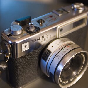
I would remove the gear portion completely. People dont care what camera you used they care what your images look like. the only time people may care is if you are perhaps using a large format film camera or doing some other alternative film process. And even then they dont care what type of camera or lens you have they want to know why you chose to shoot with a camera of that type over a digital one.

I personally like to look at photographers gear and will look at changing where the information is located, maybe an about me page. Thank you.

You do because you your a photographer. Unless your website is me to bettered toward other photographers the people going there wont care.
 
$31310536.jpg
 
Cool. In regards to the "Gear" dialogue, I think Light Guru nailed it on the head. You have to think of your audience of the website and if it's for your photography friends, or art buyers who will hire you. It looks like you're shooting commercial and the only professional commercial photography site I know of off-hand that lists his gear is Chase Jarvis, and he's doing it probably because he provides a lot of education on his site. That kind of thinking will help you simplify your site overall for the best path to business success.

Also, good luck with the wordpress theme. Unfortunately they don't always have a lot of support from the developers so I hope you nabbed one that does. I've gone through many wordpress themes in my day, and if you get stuck I've seen what squarespace sites in action and they look fantastic and simple to create.

One last thing, I'd highly recommend a logo redesign. Your logo font is pretty dated, you'll want a matching sans serif font that aligns well with the typography of the rest of the site, as well as the very modern construction of the site. That's my graphic designer past coming up.

Hope that helps, break a leg.
 
Since I'm late to the party and many changes have already been considered and implemented, I'll not offer any critique just yet save to say, so far I like it! I love the scrolling shots taking up the bulk of the page and the menu items off to the side yet still prominent enough to know where to go.
 
Cool. In regards to the "Gear" dialogue, I think Light Guru nailed it on the head. You have to think of your audience of the website and if it's for your photography friends, or art buyers who will hire you. It looks like you're shooting commercial and the only professional commercial photography site I know of off-hand that lists his gear is Chase Jarvis, and he's doing it probably because he provides a lot of education on his site. That kind of thinking will help you simplify your site overall for the best path to business success.

Also, good luck with the wordpress theme. Unfortunately they don't always have a lot of support from the developers so I hope you nabbed one that does. I've gone through many wordpress themes in my day, and if you get stuck I've seen what squarespace sites in action and they look fantastic and simple to create.

One last thing, I'd highly recommend a logo redesign. Your logo font is pretty dated, you'll want a matching sans serif font that aligns well with the typography of the rest of the site, as well as the very modern construction of the site. That's my graphic designer past coming up.

Hope that helps, break a leg.

Thank you kindly for the great ideas. The theme is pretty cool. There are lots of options I can use if I can figure out how to implement them, as you suggested. I am in dire need of an affordable (sorry) graphic designer. I have posted here on that subject and what you see is my attempt @ getting a logo up. Still looking.
 
One last thing, I'd highly recommend a logo redesign. Your logo font is pretty dated, you'll want a matching sans serif font that aligns well with the typography of the rest of the site, as well as the very modern construction of the site. That's my graphic designer past coming up.

I am looking for a designer on line...sugestions?
 
I don't like the gridded background, but thats just my opinion
 
I don't like the gridded background, but thats just my opinion

I may be over using it, good point. There are others I can use. By altering the image it adds to a background effect and the original can be viewed as well.
Thanks
 
Take the gear portion out entirely. The "About" section should be about you, your philosophy, etc. not the stuff in your bag.

If you want to include info about your gear, it should be 3rd or 4th on an info list. The only reason I included a gear list at all on my site was because so many people ask us about it for some reason...

Also, your site loads VERY slowly. I watched your full screen images crawl across the screen. Check the resolution you're uploading at, and the pixel density. You only need 72 pixels per inch.
 

Most reactions

Back
Top