Maroubra Beach - Can't decide.

Dollface

TPF Noob!
Joined
Apr 12, 2005
Messages
143
Reaction score
2
Location
Sydney
Website
www.dollface.net.au
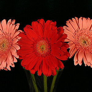
Hey everyone, I went and shot these last night. And I can't decide which colour scheme I like more. The first shot is "as is", the second shot has had it's levels adjusted (auto).

both shot on F11 @ 25sec, ISO 200 - 28mm lens at 5.30pm last night. No filters, Canon 10D.

Thank you for your input. ;)

Maroubra11.jpg


Maroubra14.jpg
 
are we supposed to critique the color schemes or like the whole image itself?

as for which one, i like the second better. the colors are quite intriguing IMO. on the other hand though, the posts look better in the first, as does the quality (especially the sky). When you adjust saturation and levels in photoshop, it increases noise.
 
Colour was the main area I was looking for input, but feel free to critique the image itsself. I am actually going back down there tonight, because I went to shoot the moon, and my batteries went dead just as it was rising.

Thanks!
 
I think I prefer the warmer tones of the first image, Dollface....just personal perference. :) And you might want to remember to clip off whatever is intruding in the frame on the lower left corner. ;) I like this image!
 
mountainlander said:
Wow, the colors in the second are truly awesome. I like it.

Is that noise I'm seeing in the sky on the second shot?

Yeah, I'd say it's noise.. I can't think what else it might be. It certainly wasn't raining yet ( It did about 20min later though...)
 
I agree with everyone but i think a mix of the two photos would be great :)
Another way of "in camera" adjusting to give yu a more vibrant sky around dusk/sunset is to switch the lighting level on your camera (10D - unsure of settings). I usually shoot on cloudy as it saturates the colour a bit more, but at dusk I'll switch it to incandescant (looks blue). and this gives me this kind of effect.....

15415067-M.jpg


might be worth playing with.....
 
I really enjoy the first frame. I love the calm water and and the slight mist. The light provides a warm feeling and gives the shot a nice depth. Throw in the brooding clouds and I am fully intrigued!!!

The second frame seems a little over worked. It is interesting how the mood changes. Depends on what your idea of the shot is.

White balance and auto correction is also a personal journey. I like to shoot for a flat image with colours leaning slightly toward the warmer side.
 
I don't like the auto levels here. The post processed image lacks a mood. In the original you got a very warm light on the poles.
 
The second is a bit overwrought for me, but I can see why it would appeal to many people, it has a stronger visual impact then the original. But I like the subtlety of tone and mood in the first better. I agree about cropping out the quay wall in the left hand corner too. Beautiful shot and conditions. Good luck with the moon.

Interesting tip Luckydog - will try it.
 
allright, my critique...

i have changed my mind about which one i like best :). the first one looks more natural (duh), and i think if you just added some contrast to the sky with some dodging and burning, it would give it just as much impact as the second photo. as for the composition, im not so sure about what i think of your vantage point. It seems a little frusterating that the waves are directly behind the posts. If you would have been closer to the posts, like 20 feet or so from the line of posts at the back, i think you could have made a better composition. I also would suggest getting more sky in the picture so the horizon isnt so directly in the middle, as well as the posts. This photo is very nice though, the lighting and long exposure are great! nice job
 
I like both - I think I like the more interesting tones in the second one, but the problem is that the sky looks a little artificial. Take the second and bring the sky down some, would be my suggestion.

Also - too much dead space on the bottom for me. My main suggestion is to try cropping it to a bit more horizontal. The bottom half just isn't as visual as the top.

That said, I like both pictres.
 
I much prefer the colour scheme in the first one. The second one doesn't look like a photo...definitely looks heavily photoshopped, which isn't necessarily a bad thing, just not my cup of diet coke.

Compositionally, I'd crop a lot of the dead water along the bottom...up to where the light starts to fall off. This photo is all about the varying light and contrast in the clouds...crop to focus on that...
 
All I can say is " Wow" - Thank you all for your kind and contructive criticisms, I was personally leaning towards the top pic, with the warmer tones, but then there was "something" about the second shot that just grabbed me.

I went down to shoot the moon, but of course it's been raining on & off now for the last week, and of course, it's no longer a full moon.. But I will take all of your comments on board, re-shoot and post the difference..

In regards to the composition, I would have moved around a bit, but my batteries did go dead after only 10 shots ( and I've only just found out that my cable release for my EOS300 doesn't fit the 10D.. not happy..) so i was holding the shutter down, and was bracketing as well.

Again, thank you all so much. This is such a wonderfully supportive community and all comments are appreciated.

:heart: :lovey:

Katie
 
I prefer the first one, more natural. The second one (to me) either says, "better get out of that storm!!" or "I like photoshop"

The colours are nice on both...the second looks dramatic, but I prefer if it were natural.
 

Most reactions

New Topics

Back
Top