eilla05
TPF Noob!
- Joined
- Aug 9, 2010
- Messages
- 144
- Reaction score
- 3
- Location
- Kentucky
- Can others edit my Photos
- Photos OK to edit
This morning I did a maternity/family/couple session. I am pleased with how they came out considering this is only about the 5 or 6th time I have done a shoot (yes I am tooting my own horn ") ). But as always I would love for those of you more experienced to give me your comments and suggestions:mrgreen:
). But as always I would love for those of you more experienced to give me your comments and suggestions:mrgreen:
If you want to make a comment about the guys hat or are wondering why he is wearing it, it is because he wanted to! And I want people to be as natural as they want to be
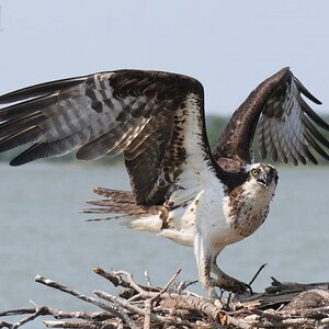
1.

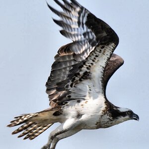
2.

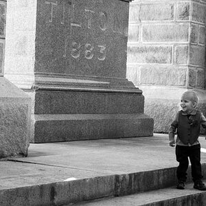
3.

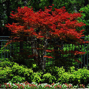
4.

). But as always I would love for those of you more experienced to give me your comments and suggestions:mrgreen:If you want to make a comment about the guys hat or are wondering why he is wearing it, it is because he wanted to! And I want people to be as natural as they want to be
1.

2.

3.

4.


![[No title]](/data/xfmg/thumbnail/41/41783-314fbf7e0c66dfa41b2a2d535aa3a9cd.jpg?1619739891)