Maternity

Big Mike

I am Big, I am Mike
Staff member
Supporting Member
Joined
Dec 16, 2003
Messages
33,896
Reaction score
1,853
Location
Edmonton
Website
www.mikehodson.ca
Can others edit my Photos
Photos NOT OK to edit
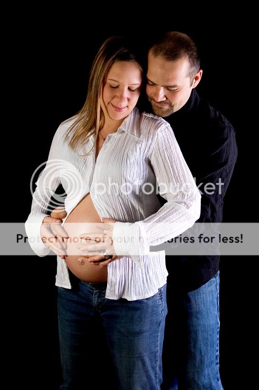
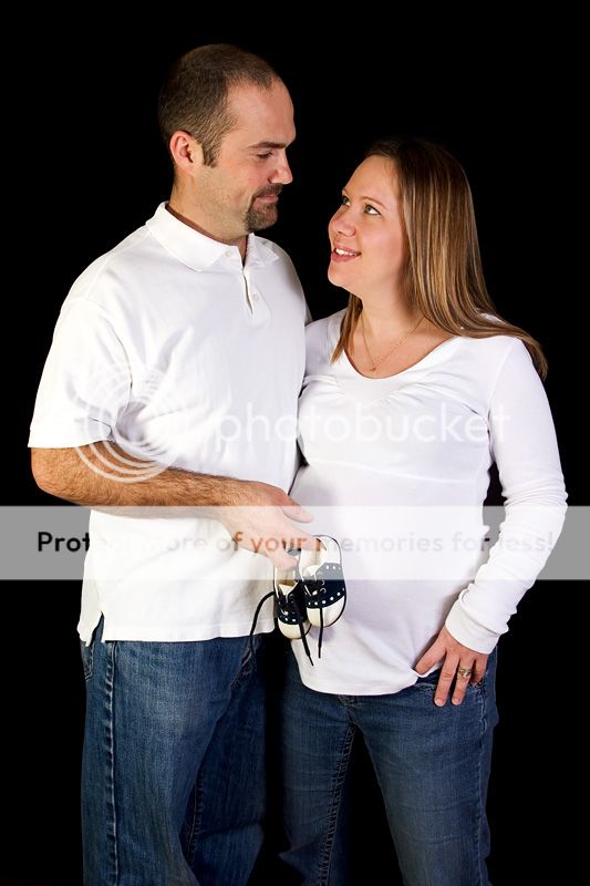
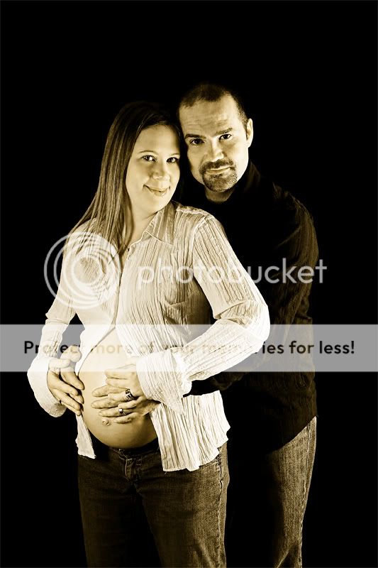
My first attempt at maternity photography. I have plenty of files from this shoot but I haven't made time to edit them yet. This is just one that I made up to show you all and get some feed back. What do you think?
#1
IMG_0957-1-web.jpg
 
I like the first one a lot although I think it might look better if her shirt were black (same style, but dark like his). I don't like the pose as much in the second one, it feels like the shoes are blocking the view of the baby. Because the rest of them doesn't blend in with the background in this shot, I think it could benefit from a hair light to keep their heads from dropping away.
 
Thanks for the feedback. I agree about the pose in the 2nd one, I suggested using the little shoes and it ended up being rather awkward. I liked that shot because of the expression I got on her and the way he's looking back at her.

Anyone else care to comment?
 
I really like the first, the lighting is really lovely (not that I know beans about lighting, but it's soft where it should be and overall gives a warmth to the shot)

I agree somewhat with the 2nd not being as strong, but not for the reasons previously stated.
For me, looking at it objectively, it's not as apparent that she's pregnant in the 2nd, I think it's the shirt and angle of her body that decieves her size.
I think the effect with the shoes would come across stronger had her stomach not blended in.
(The expressions are lovely.)

However, if I were the customer *I* would absolutely love the 2nd as well since *I* would know *I* was pregnant ;)
 
I love the expression in the second one too although her bump does get a little lost in it.
 
I do like the lighting on the first one as well. Nice job! The expression on the second-priceless! The little shoes were a good idea and (please I am one of the last folks who should give an opinion) but here goes...maybe just her hand being placed on her little bundle of joy just above the shoes or just below would have kept the bundle a little more obvious.
 
Here is another one, I've been playing with B&W & Sepia as it seems to fit with the style of image.

IMG_0961-01-sepia-web.jpg


b.t.w.....They had a little girl last week.
 
I prefer the expressions in the second, but the white shirts get a bit blown out so you lose the shape of her belly. I agree about the hair light.
 
Awe those are sweet. I think the shoe thing was a good idea but you know what may have worked out cuter? If she was sitting down by herself and you took a picture of her belly with the little shoes resting on the top of the belly. I think that might be cool. :wink:
 
I like the pics. What did you do for the black background?
 
Thanks for the comments.

What did you do for the black background?
I hung a black bed sheet up in their living room and tried to put as little light as possible onto the background. It still took a little bit of post processing work to finish it off though.
 
Mike, that sepia toned photo looks great. Nice pose and I really like the serious facial expression. Good work.

- Jason
 

Most reactions

Back
Top