Maynard Family | Blog Post | Harkness Again!

On the steps is choice!
 
I'd think about describing more than saying he's great/they're great, and find a balance between saying how creative they were in some posing ideas and making it sound like they did the posing more than you did. Blog entries usually seem comparable to a journal entry, if this were for another purpose it could use proofreading/editing.

To me these look quite processed, at least I found that's the first thing I noticed and to me it shouldn't be so noticeable. I love the composition of them in front of the gate but they border on looking somewhat artificial or almost photoshopped in, they look so bright compared to the surroundings.( I think that's what makes it seem processed, they don't look like there were in the same light as the scene).

The first one is the most light gray but those all seem grayscale rather than B&W(I don't see much if any black). I'd think about foregrounds and backgrounds too, the first one has a little clutter and goes a little far to the left out of focus. I like the one of the boys in the background but off to the left there's a post that's a little eye-catching. I like them on the steps expect for the hazy blob that obscures so much of the older boy.

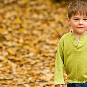
There's one in color of the younger boy that's a lot of flare, maybe a little too much of a good thing? The parents from behind is an interesting composition, I think it works because of the way they're posed together, but I feel like I'm looking thru a haze (and his sleeve looks transparent - don't know if it was how strong the light was from behind or the processing or exposure or what).

The two boys on the bench - where'd his left foot go?? lol I'd watch for that kind of thing when you're framing shots because that's a fun composition. You seem to engage your subjects well to get good reactions from them on camera.


Yeah, I find blog writing really tough for some reason. In terms of processing, I think that "artificial" look is my style. I usually do it in post or with flash, but I really like to separate my subjects from the scene. So I'm not sure if that'll ever really change. And the "flare" shot was more of me trying something new/different, so it definitely isn't perfectly executed. On paid gigs I like to take a few different shots and try some new things to both challenge myself and give the client something different than "the usual." And yeah, I do need to work on keeping my backgrounds cleaner. Thank you for the detailed response, I still have A LOT to work on. [emoji106]

Edit: and yeah, I tend to go more greyscale on BW's with people because I think the harsh contrast of a true black and white is not flattering on these type of portraits.

Jake
 
Seems to me to be some technical aspects that could be done differently. There's one photo with a blob of out of focus something up close to the camera. The large amount of light flare behind the head in the one photo doesn't add to the photo in my opinion. I generally like the photos but am not a qualified judge or anything.
 
Seems to me to be some technical aspects that could be done differently. There's one photo with a blob of out of focus something up close to the camera. The large amount of light flare behind the head in the one photo doesn't add to the photo in my opinion. I generally like the photos but am not a qualified judge or anything.


Thanks for the response. Yeah, both of those shots are me trying something different and the execution is less than perfect. There's a bit TOO much flare, and the blob in front was my attempt to frame them with foreground stuff. I think my problem is that I'm TOO close to the foreground stuff which renders it too blob-like... I'll keep at it!

Jake
 
Take a look at some well known iconic portrait photographers if you haven't already, to see what portraits in B&W can look like. (Arnold Newman, Helmut Newton, Phillippe Halsmann, Richard Avedon, etc.)

The look that's popular now may not always be, or some people might want more standard B&W.
 
Last edited:

Most reactions

New Topics

Back
Top