Miami skyline at night 1 hr ago

creisinger

TPF Noob!
Joined
Oct 19, 2009
Messages
470
Reaction score
2
Location
Miami
Website
www.stockphoto-images.com
Can others edit my Photos
Photos NOT OK to edit
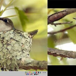
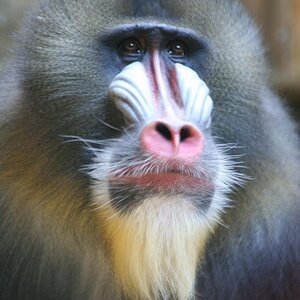
I was driving nuts to get something usable.
I shot with the 18-200mm VR and it's just a pain to get the images nice and sharp. Have to admit that my tripod is quite flimsy and it was a bit windy.
Anywho. Here you go.

sky2.jpg


sky1.jpg
 
1) the subject should take up more of the frame(you need a longer focal length)

2) There are 4 weird pitch black vertical reflections in the water that are very distracting ruining an otherwise awesome image, and I would crop out some of the water on the bottom so the crop isn't 50/50 with the water/sky

#1 - I know what you mean. However, I wanted to show the sheer unimportance of human architecture compared to the massive clouds that were passing through - just to call it something fancy. I just personally like the big motion of the clouds compared to the smaller focused and sharp area of the buildings.

#2 Those "shadows" are landing poles along the water wall. They are placed in 15 feet distance along the shore - no way to find a spot without them in the picture. I would have chopped them off if I had a chainsaw and a boat. Unfortunately there was no space left in the trunk...
 
I really like the first one, the big epic clouds against the sharpness of the city gives a great nature vs man kinda feel, the water looks good too but i would probably crop it a bit closer to the buildings.
And as peanut says... the name stamp is just a bit too "in your face" on this picture, maybe a more subtle watermark would work better.

Second one is nice too, again i love the clouds, but there is something about the city i cant put my finger on that puts me off of it.
 
If you replace your logo with a batman logo that would be awesome
 
Yeah crooked horizons, and those pylons blocking the city view really take away from what would be a nice image otherwise.
If you're good with the clone tool (and PS), you might be able to remove them.
 
Thanks for the feedback. Much appreciated.

These were just thrown together with minimal post processing. Of course I would still level the horizon and correct the lens distortion.

I was mostly looking for the feedback of the 4 "shadows" or landing poles in the foreground. And I got what I expected. So thanks.
 
love the pictures, especially the first one with the huge cloud... but the name stamp... not so fond of that. still, great work!
 
logo is too distracting! At least you can change the color of the logo to be other then green for different occasions :)
 

Most reactions

New Topics

Back
Top