Michelle and James

Leo

TPF Noob!
Joined
Jan 17, 2006
Messages
179
Reaction score
0
Location
San Antonio, TX
Can others edit my Photos
Photos OK to edit
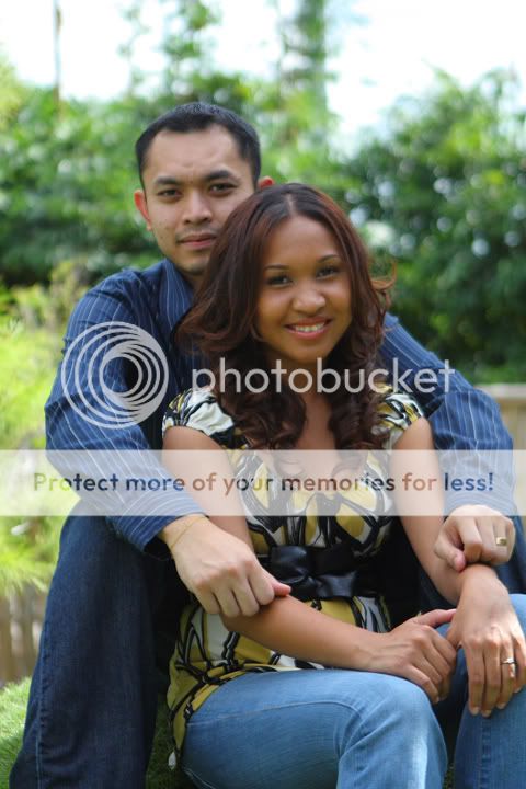
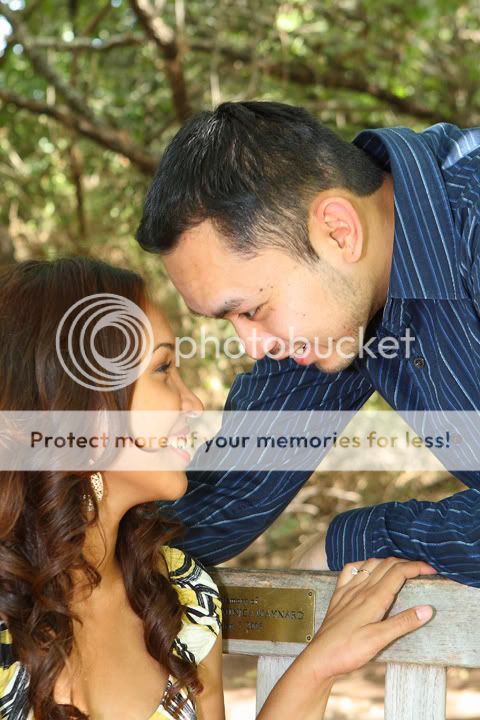
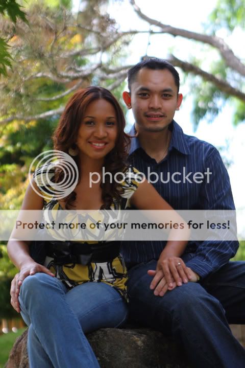
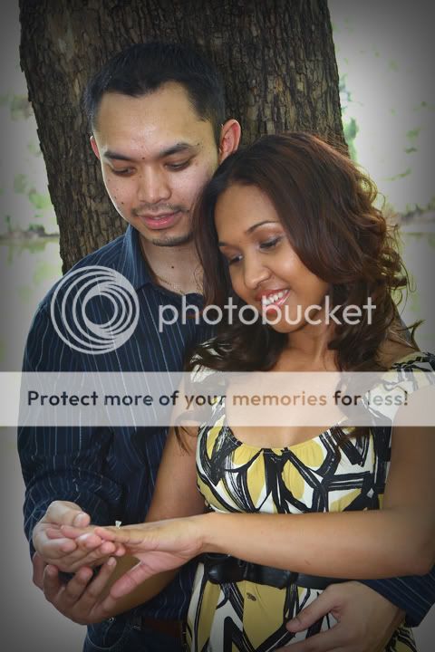
My latest engagement pictures. Please C&C, feel free to edit photos.
small_IMG_7796.jpg


small_IMG_7642.jpg


small_IMG_7827.jpg


small_IMG_7622.jpg
 
Great to see you posting Leo! These are excellent. I think you did very well with the lighting and composition in #1, #2, and #3. But #4 could be lighted a bit in the foreground. My favorite is #1. Good stuff. :)

NJ
 
3 is a great capture! :) Here's my tips:

1. I tend to not like vignetting when the edges are white, do you know what I mean? I think it looks very 80's when done then.
2. What was your SS? I see slight motion blur in a few.
3. I think they could be brightened a bit.

Thanks for posting!
 
3 is a great capture! :) Here's my tips:

1. I tend to not like vignetting when the edges are white, do you know what I mean? I think it looks very 80's when done then.
2. What was your SS? I see slight motion blur in a few.
3. I think they could be brightened a bit.

Thanks for posting!

1. I am not a fan of vignetting too but I just think the bright backgound in the edges were distracting, that's why I did the vignetting.
2. #1 f/5.6 1/100 Flash was On, Used a LumiQuest 80-20
#2 f2.8 1/5000
#3 f/5.6 1/60 Flash was On, Used a LumiQuest 80-20
#4 f/2.8 1/2500
3. My monitor is calibrated so I couldn't tell if I need to brighten them or not. I need to get me a calibrating monitor software.
 
#2 is a nice one of both. It would be very generous of you to do something about her roots - it baffles me that she wouldn't take care of that before the shoot, but anyway...

#1 is sweet, but his head is starting to blend into the tree just a tad - maybe lighten the tree around his head a notch? And could you sharpen up the ring, since that's a focal point (she's very proud of that ring - make it show up!)?

1 and 3 look a tad yellow on my monitor, but 2 and 4 look fine.

Her hair and smile look awesome in #3, she'll like that. I don't like the in memorium plate on the bench showing, though, particularly since it's readable.

I also agree about the lighting in the last one.

Sorry to be nitpicky.
 
First off, the guy is kind of tense in all but the third shot. Especially the last one. It's like he's trying to smile but couldn't and just let out an awkward one. I think the most important thing in portrait photography is getting your clients comfortable, otherwise it's hard not get snap-shot-ish poses even if your composition is good.

Second, there's no character at all (maybe some teeny bit, but not enough for a portrait). Staring at the ring, staring at each other, staring at the photographer while sitting together. It just doesn't work if there's nothing you are emphasizing effectively.

For number 1, give the ring a sparkle or something, exaggerate its importance, give it more focus. Have her held it against the tree bark to make it stand out, and change the pose accordingly.

For number 3, the lighting is flat. And I already had enough of the guy's smile. If he can't smile properly make it serious. Just have them look into each other moderately, thoughtfully. Of course that might not work, but the point is, try to see what they are more comfortable in terms of expression. Don't go with anything that look too forced and unnatural.

I think I might've sound too discouraging, but false flattery is just going to waste your time and stall your talent.
 

Most reactions

Back
Top