
Garbz
No longer a newbie, moving up!
- Joined
- Oct 26, 2003
- Messages
- 9,713
- Reaction score
- 203
- Location
- Brisbane, Australia
- Website
- www.auer.garbz.com
- Can others edit my Photos
- Photos NOT OK to edit
You can get a perfect match but the money spent on it would not make it worth while. Near enough is good enough and when you start getting used to the effects and limitations of the lab you can work around them regardless just by knowing what to expect.
Anyway I haven't been online all week but to answer your earlier query:
I haven't found any difference between the 32 and 52 point calibration other than it takes longer. I suggest you set to average low light measurements. I'm not sure how the Spyder 3 is but my colourimeter tends to drift a bit when things get dark. Factory calibration should only be used for primary colours if your colourimeter is unable to handle wide gamuts. This was the case with the Spyder2 and many of the SpectraView monitors. But really you should be measuring your primary colours when you calibrate or your monitor profile won't be right. Use auto-luminance is fine, what this option does is adjust your display backlight. If you don't do it it'll start a measurement session and ask you to manually adjust the brightness up and down to meet the required target. Doesn't affect me since I use the MaxPossible brightness target.
To match to a print this pdf here may give you some more pointers: http://leswalkling.com/texts/monitor.pdf Take note of the table of monitor values and recommended viewing and environmental conditions. Of note is that one standard requires a monitor setting of 75-100cd/m^2 which is pretty dark, while for softproofing requires lighting at 2500lux which is quite bright for the average room. Also of note is the recommended lighting, specifically that the lighting should be slightly warmer than monitor, the reason being that photo paper actually has the slightest blue tinge.
You should not be calibrating to a gamma point of 1.8. That hasn't been actively used since the days where Macs were fluro coloured toys with PowerPC processors. Gamma values should be 2.2 or if you're going to calibrate against a specific colour space then the sRGB curve (which is effectively almost 2.2) or the L* space. Of note is that whatever setting you use the software should compensate by loading the colour profile on the monitor. This means when comparing prints to images you need your software to load your colour profile and it needs to be set to soft-proof against the printer profile. If this is done correctly then it doesn't matter if you set your monitor gamma to 9000 and swap your red and blue channels. While the computer would be unusable photoshop should still display the photo correctly if it loads the monitor colour space.
Again note that unless you have a calibrated lightbox and ideal viewing environments you'll never match your prints perfectly. For photography you should be aiming for good enough. If you work for Pantone then it's a different story")
Anyway I haven't been online all week but to answer your earlier query:
I haven't found any difference between the 32 and 52 point calibration other than it takes longer. I suggest you set to average low light measurements. I'm not sure how the Spyder 3 is but my colourimeter tends to drift a bit when things get dark. Factory calibration should only be used for primary colours if your colourimeter is unable to handle wide gamuts. This was the case with the Spyder2 and many of the SpectraView monitors. But really you should be measuring your primary colours when you calibrate or your monitor profile won't be right. Use auto-luminance is fine, what this option does is adjust your display backlight. If you don't do it it'll start a measurement session and ask you to manually adjust the brightness up and down to meet the required target. Doesn't affect me since I use the MaxPossible brightness target.
To match to a print this pdf here may give you some more pointers: http://leswalkling.com/texts/monitor.pdf Take note of the table of monitor values and recommended viewing and environmental conditions. Of note is that one standard requires a monitor setting of 75-100cd/m^2 which is pretty dark, while for softproofing requires lighting at 2500lux which is quite bright for the average room. Also of note is the recommended lighting, specifically that the lighting should be slightly warmer than monitor, the reason being that photo paper actually has the slightest blue tinge.
You should not be calibrating to a gamma point of 1.8. That hasn't been actively used since the days where Macs were fluro coloured toys with PowerPC processors. Gamma values should be 2.2 or if you're going to calibrate against a specific colour space then the sRGB curve (which is effectively almost 2.2) or the L* space. Of note is that whatever setting you use the software should compensate by loading the colour profile on the monitor. This means when comparing prints to images you need your software to load your colour profile and it needs to be set to soft-proof against the printer profile. If this is done correctly then it doesn't matter if you set your monitor gamma to 9000 and swap your red and blue channels. While the computer would be unusable photoshop should still display the photo correctly if it loads the monitor colour space.
Again note that unless you have a calibrated lightbox and ideal viewing environments you'll never match your prints perfectly. For photography you should be aiming for good enough. If you work for Pantone then it's a different story
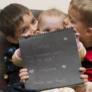
![[No title]](/data/xfmg/thumbnail/38/38261-db20f6f92ee8f0d4c5cf1536e308638b.jpg?1619738546)
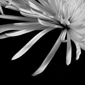
![[No title]](/data/xfmg/thumbnail/38/38263-ad5e4c9e677626ddb5b1e7cdf9ebe40e.jpg?1619738548)
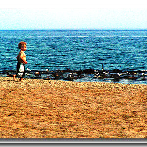
![[No title]](/data/xfmg/thumbnail/32/32165-6bb394c486dda7ec16d8fee786f03151.jpg?1619735234)