More flowers

HannahRebekah

TPF Noob!
Joined
Oct 19, 2009
Messages
366
Reaction score
3
Location
Michigan
Website
www.hannahrebekahphotography.webs.com
Can others edit my Photos
Photos NOT OK to edit
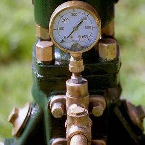
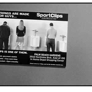
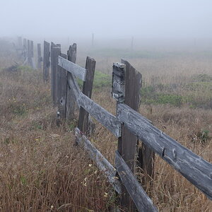
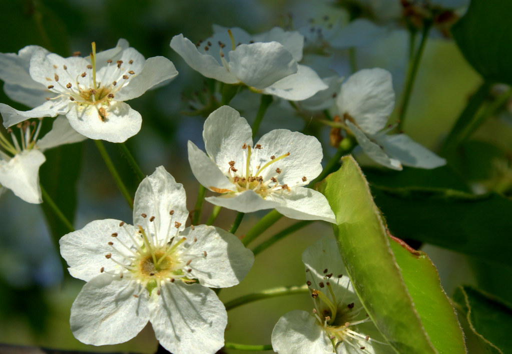
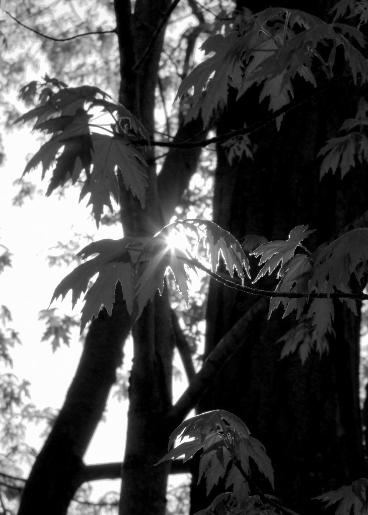
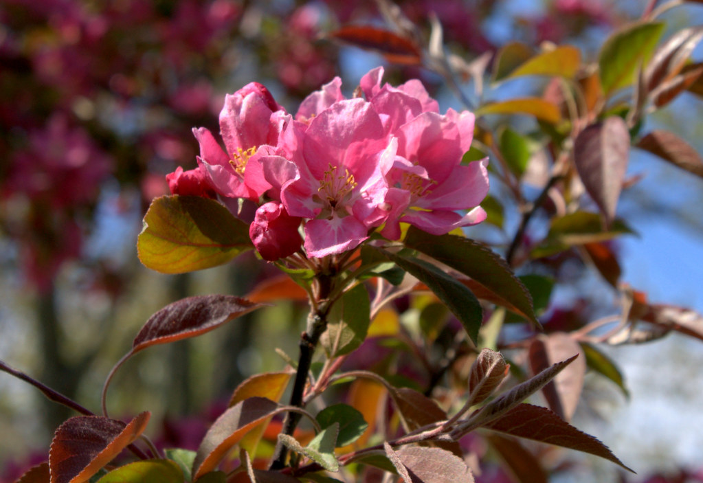
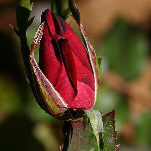
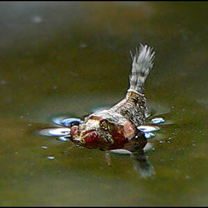
A few shots taken a couple days ago. C&C always appreciated.

1
4546568753_5a035f5497_b.jpg


2
4546566011_82c8517bbc_b.jpg


3
4546575757_921f157991_b.jpg


4
4547201010_af38448e62_b.jpg


5
4547202736_4cc40ca437_b.jpg
 
To me personally none of them seem "amazing" - Quite nice, but they dont make me go "wow"
I like the colours on number 2, but to me its seems like the focused on the boriest part of the plant. The background looks far more interesting.
 
I happen to think the second one is the best! I like the feeling that the subject is coming to life. I do think all the images are soft though. Do you remember your settings on these shots?
 
I like #4 and #5 but they need a closer crop imo. Too much in the background on them.. it's like I want to zoom in on the flowers.

In #3 I really like the contrasts of light and dark. I think this works well in black and white. The little bit of light shining through on the far right side, I'd edit that out.. just to keep the photo polarized, so to speak.

The first two aren't really doing it for me, composition-wise. I will say that you did a good job on #1 in keeping the whites from blowing out. #2 is exposed well and the colors are great - I'm not sure about the square crop though..

Good stuff, and I'm sick of flowers - but good job :)
 
I happen to think the second one is the best! I like the feeling that the subject is coming to life. I do think all the images are soft though. Do you remember your settings on these shots?

Thank you! I thought the leaf was a different approach from what most would take.

Lower shutter speeds (60 - 200 range), aperture 9 - 12ish, iso 100, using a tripod. Any softness is from the lens itself (I am afraid I shall always get called out for that). I don't have the money to own good lenses yet.
 
I like #4 and #5 but they need a closer crop imo. Too much in the background on them.. it's like I want to zoom in on the flowers.

In #3 I really like the contrasts of light and dark. I think this works well in black and white. The little bit of light shining through on the far right side, I'd edit that out.. just to keep the photo polarized, so to speak.

The first two aren't really doing it for me, composition-wise. I will say that you did a good job on #1 in keeping the whites from blowing out. #2 is exposed well and the colors are great - I'm not sure about the square crop though..

Good stuff, and I'm sick of flowers - but good job :)

Cropping further is funny to me because you didn't see what I cut out. Another one of those 'it's good to have an outside opinion' things.

Nice eye on that spot, I would usually edit those things out, but I didn't notice it this time.

To be honest, I wasn't sure about the square either, but it was what got what I wanted in, in, and out, out.

When it's spring, you get flowers! When it's fall, you get leaves, when it's winter you get snow, etc. People will always take pictures of what they see as 'new', even if everyone else is doing it too.
 

Most reactions

New Topics

Back
Top