
Rosy
No longer a newbie, moving up!
- Joined
- May 9, 2011
- Messages
- 1,289
- Reaction score
- 328
- Location
- Raleigh NC
- Can others edit my Photos
- Photos OK to edit
I know there's lots CC on any would be appreciated
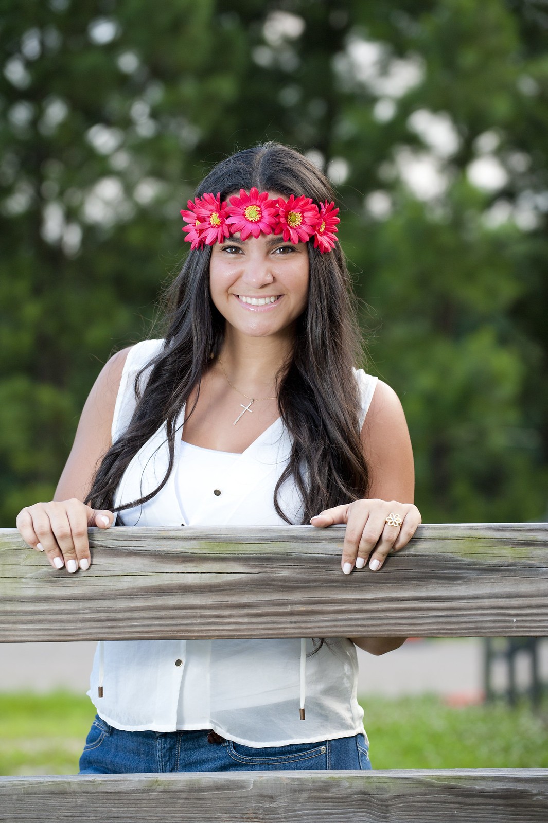
1:

2:
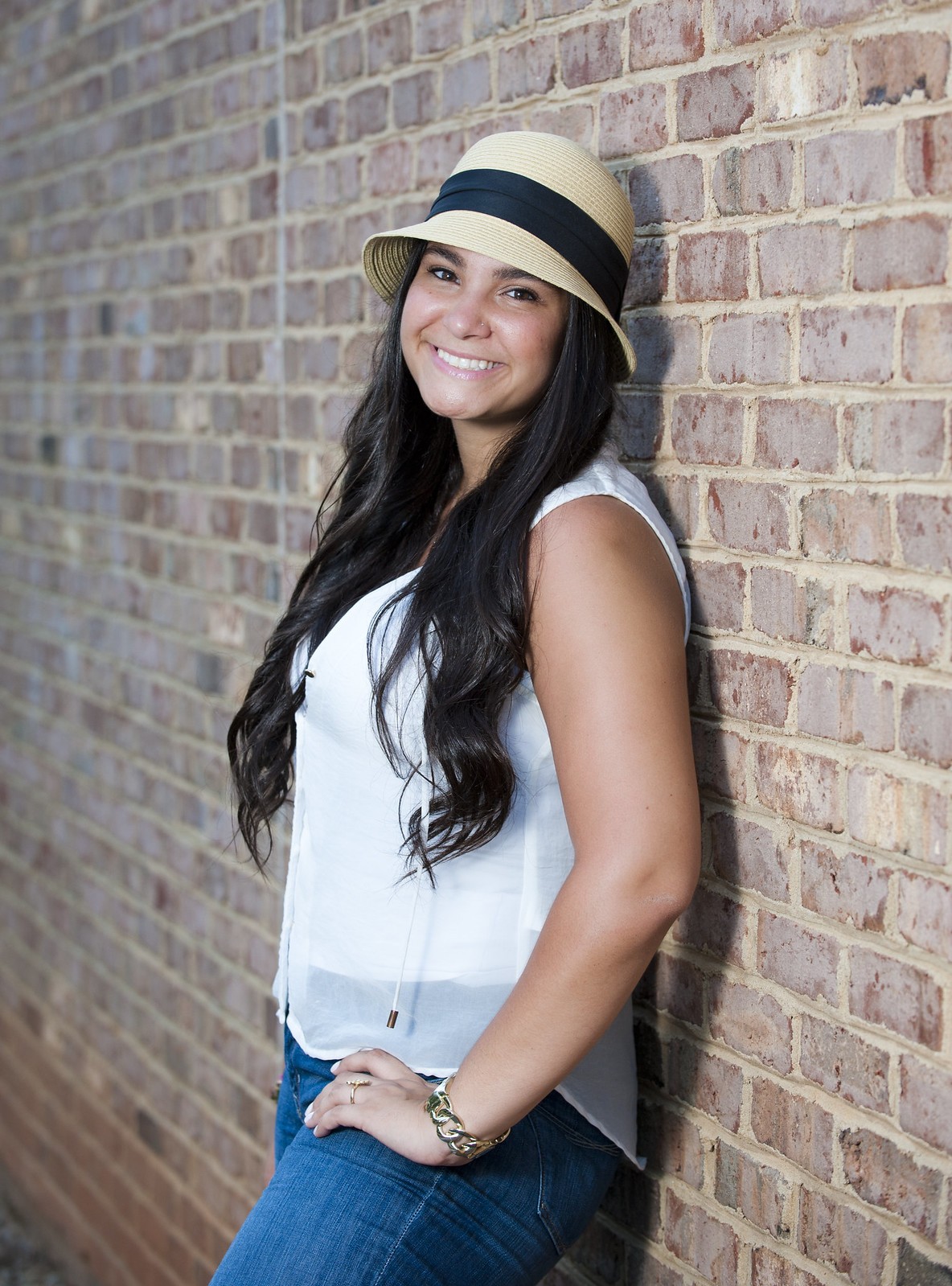
3:

4:
5:

6
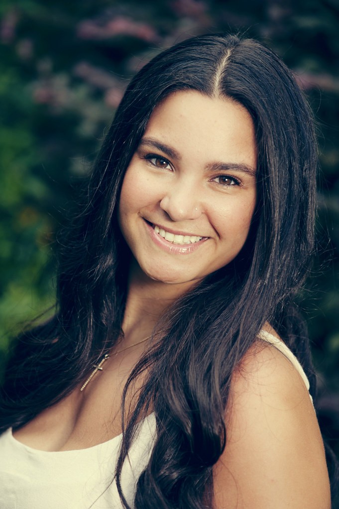
1:
2:
3:
4:
5:
6
![[No title]](/data/xfmg/thumbnail/37/37104-99933b18ee16678a8299f12747336d48.jpg?1619737882)


![[No title]](/data/xfmg/thumbnail/34/34062-c0c9c0a752bc1af58237eff1ec850163.jpg?1619736259)


![[No title]](/data/xfmg/thumbnail/37/37107-df85b207aa6d9b7f6b88f682e493a52e.jpg?1619737882)

![[No title]](/data/xfmg/thumbnail/34/34065-43f99c081a04bd087c00711d2fe010ee.jpg?1619736261)