newrmdmike
TPF Noob!
- Joined
- May 8, 2006
- Messages
- 2,107
- Reaction score
- 1
- Location
- it varies.
- Can others edit my Photos
- Photos NOT OK to edit
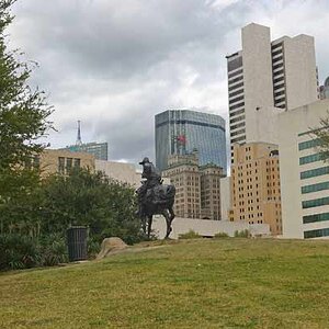
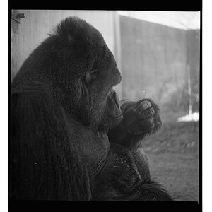
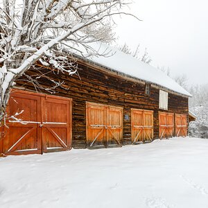
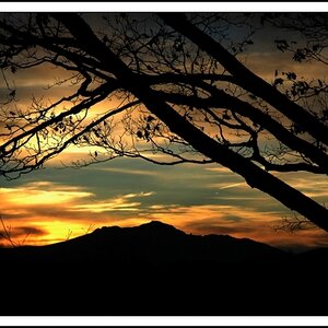
here are a few more from last weekends jobs, will post more from the children later. feel free to critique even if its harsh. all i ask is that you dont edit my stuff.
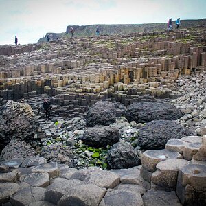
what do you think?


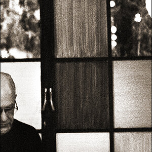
what do you think?
")