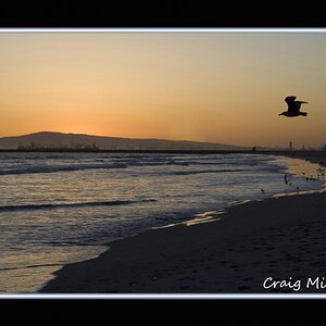
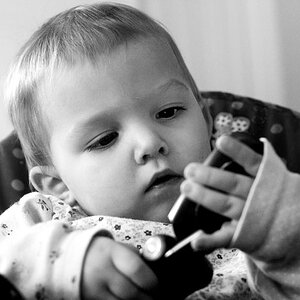
very nice shot. I tend to like high contrast in my B&W also. But as I do more and more printing, I find that you can get great looks with lower contrast. A photo teacher I had once told me that my prints where to dark (look great to me) He said that high contrast adds a "pop" to the photo, but that pop can also be "an easy way out." So over time, I have become more and more aware of the contrast in my prints. Some picture still need the high contrast, but I try to keep this in mind when I am taking to picture as well as when I am printing.


![[No title]](/data/xfmg/thumbnail/35/35880-9a6926237907ab72b42781d9a09698a6.jpg?1619737209)